In ggplot2, the term “theme” refers to the visual styling applied to a plot without altering its data content. For instance, the theme determines the title font, the color of the background panel, and the line widths of the axes. The default theme of ggplot2 is adequate for most purposes, but individual use cases may require modifications.
In this chapter, we will first survey various pre-installed themes in ggplot2 (Section 13.1). Afterward, you will learn how to customize any existing theme using the theme() function (Section 13.2).
13.1 Pre-Installed Themes
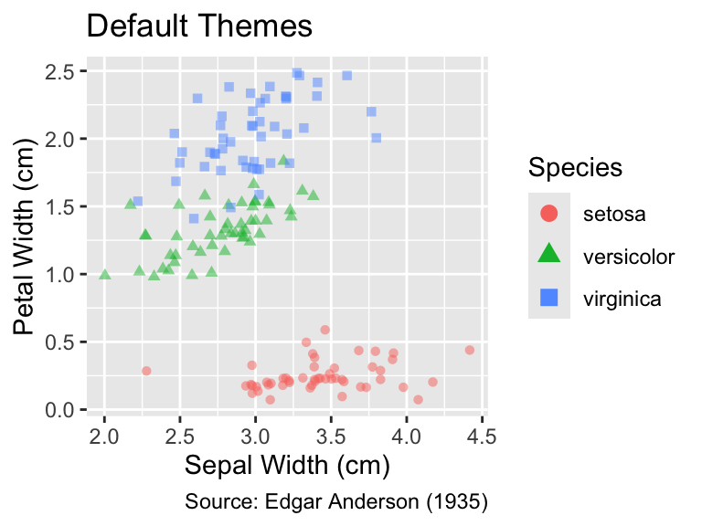
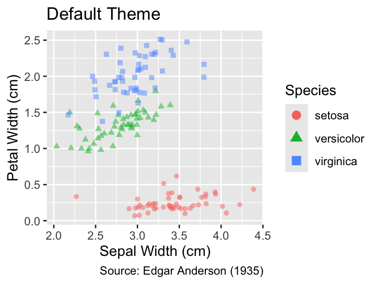
By default, ggplot2 uses a theme that includes a gray background and white grid lines:
library(tidyverse)gg_iris<-ggplot(iris,aes(Sepal.Width, Petal.Width, color =Species, shape =Species))+geom_jitter(alpha =0.5)+labs( x ="Sepal Width (cm)", y ="Petal Width (cm)", caption ="Source: Edgar Anderson (1935)")+guides(color =guide_legend(override.aes =list(alpha =1, size =3)))gg_iris+labs(title ="Default Themes")
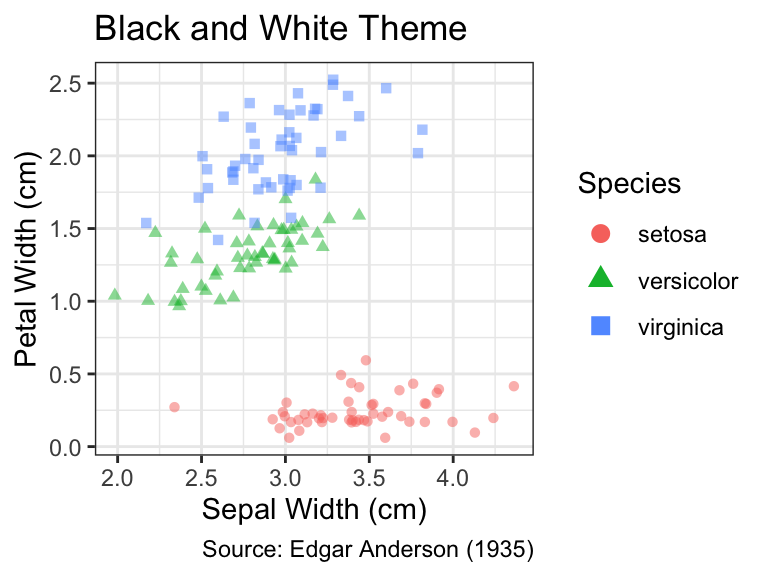
Despite the subdued overall appearance of the default theme, the gray background introduces a moderate amount of non-data ink. If you prefer a cleaner look that highlights your data more effectively, you can switch to one of ggplot2’s built-in alternatives, such as theme_bw(), which uses a white background:
gg_iris+theme_bw()+labs(title ="Black and White Theme")
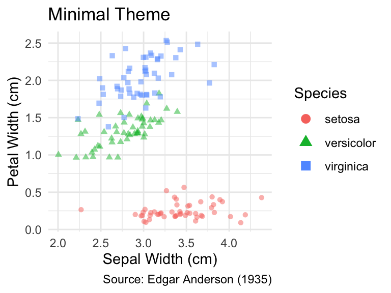
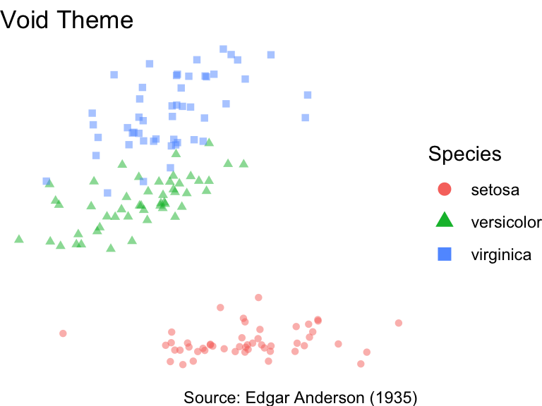
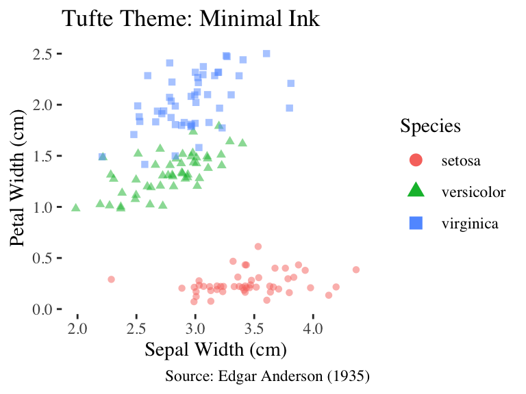
The theme_minimal() function goes beyond theme_bw() by removing almost all background annotations. An even more extreme approach is taken by theme_void(), which produces a completely empty theme:
If left unmodified, theme_void() provides too little context to the readers. However, theme_void() is useful when you want to build a plot from scratch, applying only a bare minimum of visual distraction from the data.
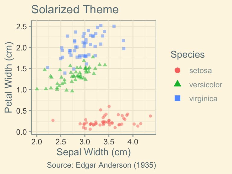
In addition to theme_bw(), theme_minimal(), and theme_void(), ggplot2 ships with several other built-in themes, which are listed under ?theme_bw. Third-party packages, such as ggthemes, expand your options even further. The following code snippet shows examples:
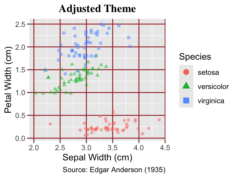
The theme() function gives you fine control over nearly every aspect of plot appearance. Most arguments follow the pattern element.name = element_*(), where element.name refers to a particular feature of the plot (e.g., legend.title) and element_*() is a ggplot2 helper to style that component. For example, the following call to theme() changes the color of the major grid lines to brown, renders the title bold, and centers it horizontally:
Use theme() for setting individual properties of the plot appearance. Most arguments follow the pattern element.name = element_*().
gg_iris+labs(title ="Default Theme")gg_iris+theme( panel.grid.major =element_line(color ="brown"), plot.title =element_text( family ="serif", face ="bold", hjust =0.5))+labs(title ="Adjusted Theme")
The ggplot2 documentation lists all elements under ?theme. Table 13.1 presents a selection of the most commonly used elements, and Table 13.2 summarizes the most important element-styling functions and their parameters.
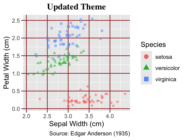
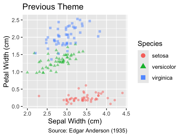
The theme_update() function allows you to adjust an existing theme. The updates will then be applied to all subsequent plots, which helps to reduce repetitive code. The previous theme is returned by theme_update(), so you can save its output and restore your original settings later:
old_theme<-theme_update( panel.grid.major =element_line(color ="brown"), plot.title =element_text( family ="serif", face ="bold", hjust =0.5))gg_iris+labs(title ="Updated Theme")theme_set(old_theme)# Restore old themegg_iris+labs(title ="Previous Theme")
13.3 Conclusion
Themes in ggplot2 allow styling almost every non-data feature of a plot. While the default theme is suitable for exploratory data analysis, publication-quality plots must often adhere to specific styles. Some pre-installed themes in ggplot2 and add-on packages, such as ggthemes, offer a convenient starting point. The theme() function lets you tweak individual components. If you find yourself reapplying the same customization, streamline your workflow by defining a new default theme with ggplot2’s theme_update() function.
13.4 Exercise
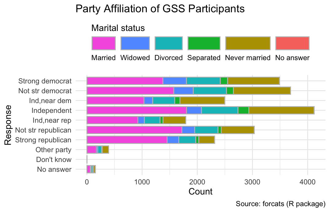
The fill legend of Figure 7.2 is arranged vertically, whereas the bars are horizontal. Change the legend to be also horizontal and place it at the top of the plot: