library(tidyverse)
cranlogs::cran_downloads("ggplot2", when = "last-month") |>
  pull(count) |>
  sum() |>
  format(big.mark = ",")
[1] "1,855,859"The ggplot2 package is a milestone in data visualization. Firmly embedded in the tidyverse, it is one of the most frequently downloaded R packages. Here is the number of downloads just in the last month:
library(tidyverse)
cranlogs::cran_downloads("ggplot2", when = "last-month") |>
pull(count) |>
sum() |>
format(big.mark = ",")[1] "1,855,859"The first two letters “gg” of the name “ggplot2” are derived from the title of the book “The Grammar of Graphics” by Wilkinson (2005). The term “grammar” might initially evoke memories of tedious school lessons and rote learning. However, this chapter aims to showcase ggplot2’s potential through illustrative examples rather than laborious grammar lessons. Through this approach, I hope you will discover that visualization with ggplot2 is enjoyable despite (or, rather, because of) its adherence to grammatical rules.
Your exploration of ggplot2 starts in Section 6.1 with creating scatter plots, a fundamental visualization type to elucidate relationships between two variables. Then, Section 6.2 will present a variety of plot types designed to visualize the distribution of a single quantitative variable and its potential dependence on a categorical variable (e.g., the dependence of physical traits on species). Finally, Section 6.3 will showcase examples for adjusting the dimensions of a plot, ensuring that its elements appear in good proportion with each other and the surrounding document.
Scatter plots are fundamental tools for exploring relationships between two variables. In these plots, each point is positioned on a two-dimensional Cartesian coordinate system, with one variable on the horizontal x-axis and the other on the vertical y-axis. When both variables are quantitative, scatter plots enable analysts to discern the strength and direction of the association between the variables under investigation.
This section illustrates the creation of scatter plots using ggplot2. Section 6.1.1 will introduce basic geometric layers (also termed “geoms”) for scatter plots. Section 6.1.2 will explain the difference between geom_path() and geom_line() for connecting points in a scatter plot, while Section 6.1.3 will suggest effective mitigation strategies for overplotting (i.e., the obfuscation of data due to overlapping geometric objects), which is a common problem when using scatter plots. Concluding this section, Section 6.1.4 will demonstrate techniques for integrating smooth trend curves.
To start your exploration of scatter plots, let us define a simple data frame with x-coordinates and y-coordinates of three points as follows:
Section 6.1.1.1 will guide you through the process of initiating a plot using this data frame. Subsequently, Section 6.1.1.2 will demonstrate the addition of geoms to enhance the plot.
ggplot()
The first step in creating a plot using ggplot2 is to invoke the ggplot() function. Typically, two arguments are passed to ggplot(). The first argument specifies the data frame, and the second argument defines the aesthetic mappings, which describe how data values are mapped to visual properties in the plot. Aesthetic mappings are constructed by the aes() function. In a scatter plot based on Cartesian coordinates, the aesthetic mappings convert one column in the data frame into horizontal positions and another column into vertical positions. The respective column names are passed to the aes() function through the x and y arguments:
Aesthetic mappings convert data values into visual properties in a plot. Use the pattern ggplot(dfr, aes(...)) to initiate a plot, where dfr must be a data frame. The arguments passed to aes(), such as x and y, determine the aesthetic mappings.
Because x and y are the most common aesthetic mappings, it is customary to match these two arguments by position rather than name when calling aes():
The ggplot() function returns an object of the ggplot class:
class(g)[1] "ggplot2::ggplot" "ggplot" "ggplot2::gg" "S7_object"
[5] "gg" You can use the is_ggplot() function to verify that g is a ggplot object.
is_ggplot(g)[1] TRUEUpon execution, a ggplot object displays a plot. However, the plot generated by g currently consists only of a coordinate system:
g
To visualize data in this coordinate system, a layer needs to be added using the + operator. Layers are created by functions starting with geom_. For instance, drawing one point for each row in the dfr data frame requires a call to the geom_point() function:
Use geom_point() to add points to a plot.
g + geom_point()
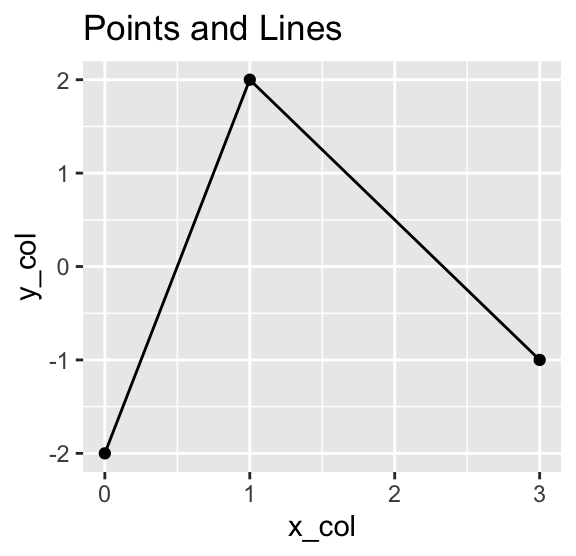
Instead of placing point symbols, you can also draw lines between the points, either by using geom_path() or geom_line(). While geom_path() connects the points in the order they appear in the data frame, geom_line() connects them in the order of their x-coordinates. The following example shows both geoms, adding a plot title using the labs() function to distinguish between them:
Use geom_path() to connect points in the order they appear in the data frame. Use geom_line() to connect them in the order of their x-coordinates.

Use labs(title = ...) to add a title to a plot.
Furthermore, it is possible to display points and lines simultaneously in the same plot by adding layers for both geometries:
Use the + operator to add multiple geom_...() layers to a plot.
g +
  geom_point() +
  geom_path() +
  labs(title = "Points and Path")
g +
  geom_point() +
  geom_line() +
  labs(title = "Points and Lines")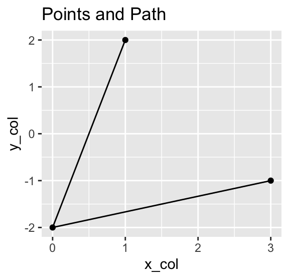
geom_path() and geom_line()
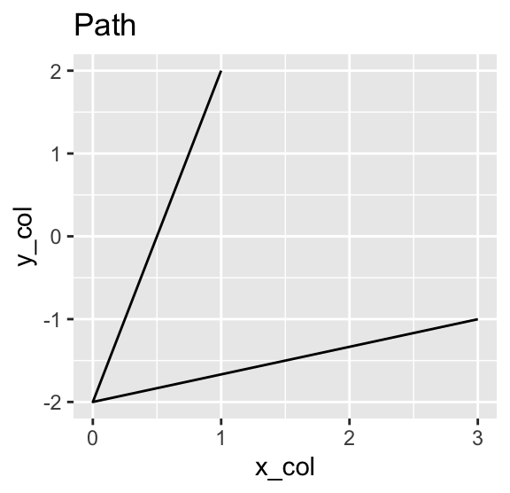
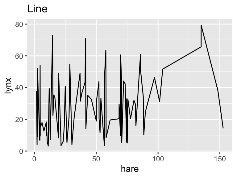
The choice between geom_path() and geom_line() hinges on the specific characteristics of the data at hand. Consider the following data set containing the number of lynx pelts (in thousands) versus the number of hare pelts (also in thousands) purchased by the Canadian Hudson Bay Trading Company between the years 1845 and 1935. The data are available as time series objects, belonging to R’s ts class, from the astsa package. The following code converts the columns to numeric vectors because these are more easily handled by ggplot2 than ts objects:
library(astsa)
pelts <- tibble(
  hare = as.numeric(Hare),
  lynx = as.numeric(Lynx),
  year = as.numeric(time(Hare))
)
pelts
# A tibble: 91 × 3
hare lynx year
<dbl> <dbl> <dbl>
1 19.6 30.1 1845
2 19.6 45.2 1846
3 19.6 49.2 1847
4 12.0 39.5 1848
5 28.0 21.2 1849
6 58 8.42 1850
7 74.6 5.56 1851
8 75.1 5.08 1852
9 88.5 10.2 1853
10 61.3 19.6 1854
# ℹ 81 more rowsThe following code chunk creates plots of the data using either geom_path() or geom_line():
ggplot(pelts, aes(hare, lynx)) +
  geom_path() +
  labs(title = "Path")
ggplot(pelts, aes(hare, lynx)) +
  geom_line() +
  labs(title = "Line")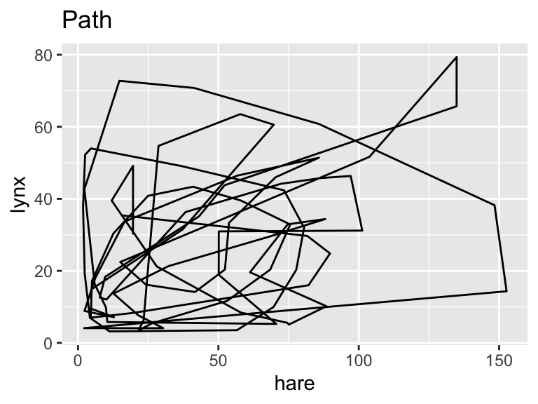
The reason for the different appearance of these two plots becomes evident when you add an aesthetic mapping from the year variable to the color property of the points. The following code chunk also illustrates labeling the axes, providing a title to the color bar, and adding a caption using the labs() function.
Use labs() to add axis labels, legend titles, and captions.
gg_pelts <-
  ggplot(pelts, aes(hare, lynx, color = year)) +
  geom_point() +
  labs(
    x = "Hare pelts (in thousands)",
    y = "Lynx pelts (in thousands)",
    color = "Year",
    caption = "Source: astsa (R package)"
  )
gg_pelts +
  geom_path() +
  labs(title = "Path")
gg_pelts +
  geom_line() +
  labs(title = "Line")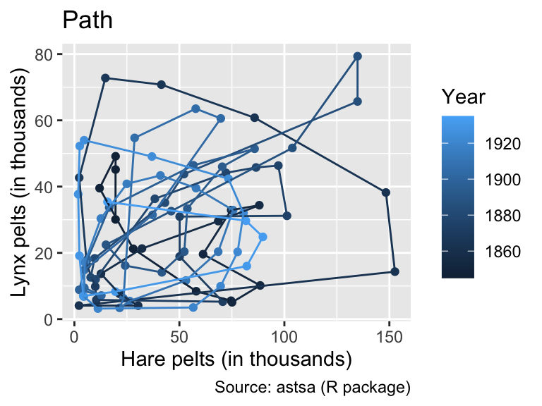
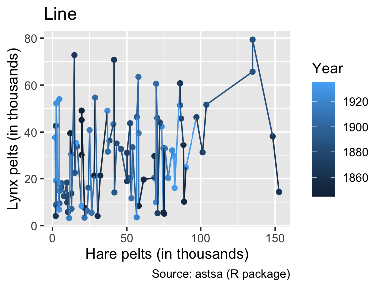
While geom_path() connects points of similar color, the colors of geom_line() exhibit no apparent pattern from left to right. This feature indicates that, for these input data, geom_path() is the correct option, connecting the data points in chronological order.
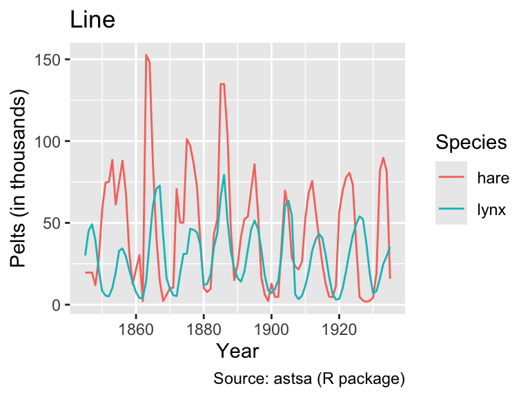
A different way to visualize the data is to plot year along the x-axis and the numbers of pelts along the y-axis, using colors to distinguish between the species. For this purpose, it is best to pivot the data into longer format such that each combination of year and species appears in its own row:
pelts_long <- pivot_longer(
  pelts,
  -year,
  names_to = "species",
  values_to = "thousands"
)
pelts_long
# A tibble: 182 × 3
year species thousands
<dbl> <chr> <dbl>
1 1845 hare 19.6
2 1845 lynx 30.1
3 1846 hare 19.6
4 1846 lynx 45.2
5 1847 hare 19.6
6 1847 lynx 49.2
7 1848 hare 12.0
8 1848 lynx 39.5
9 1849 hare 28.0
10 1849 lynx 21.2
# ℹ 172 more rowsNow, the time series can be plotted by mapping years to the x-coordinate, thousands to the y-coordinate, and species to the color aesthetic. In this case, geom_path() and geom_line() produce the same output:
gg_pelts_long <-
  ggplot(pelts_long, aes(year, thousands, color = species)) +
  labs(
    x = "Year",
    y = "Pelts (in thousands)",
    color = "Species",
    caption = "Source: astsa (R package)"
  )
gg_pelts_long +
  geom_path() +
  labs(title = "Path")
gg_pelts_long +
  geom_line() +
  labs(title = "Line")
However, when the data are shuffled randomly, the difference between geom_path() and geom_line() becomes apparent:
pelts_shuffled <- slice_sample(pelts_long, n = nrow(pelts_long))
gg_pelts_shuffled <-
  ggplot(pelts_shuffled, aes(year, thousands, color = species)) +
  labs(
    x = "Year",
    y = "Pelts (in thousands)",
    color = "Species",
    caption = "Source: astsa (R package)"
  )
gg_pelts_shuffled +
  geom_path() +
  labs(title = "Path")
gg_pelts_shuffled +
  geom_line() +
  labs(title = "Line")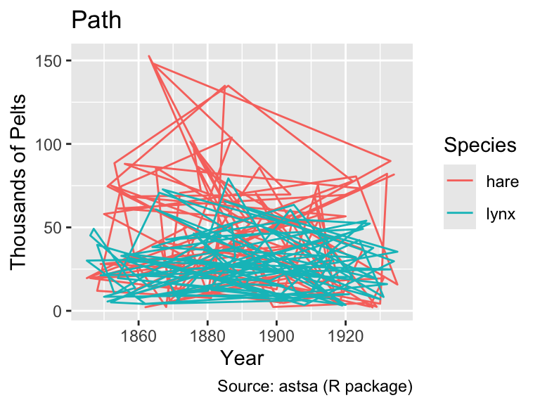
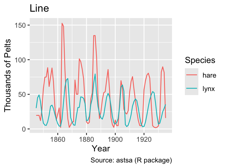
As this example demonstrates, it is generally advisable to use geom_line() when the x-axis represents time because it ensures an interpretable plot even when the rows in the data frame are not in chronological order.
Looking at the line plot, it appears plausible that both hare and lynx populations oscillate with the same frequency. However, the hare population tends to peak before the lynx population, consistent with simple mathematical predator-prey models (e.g., governed by the Lotka-Volterra equations). However, as Novozhilov (2024) points out, the data were aggregated from various sources. Hence, conclusions about the real ecological dynamics should be drawn with caution.
Overplotting occurs when multiple point symbols are plotted at the same or extremely close positions, making it impossible to discern individual data points. To demonstrate the issue of overplotting, this section uses R’s built-in iris data frame, which contains 150 measurements of iris flowers by Anderson (1935):
count(iris) n
1 150head(iris) Sepal.Length Sepal.Width Petal.Length Petal.Width Species
1 5.1 3.5 1.4 0.2 setosa
2 4.9 3.0 1.4 0.2 setosa
3 4.7 3.2 1.3 0.2 setosa
4 4.6 3.1 1.5 0.2 setosa
5 5.0 3.6 1.4 0.2 setosa
6 5.4 3.9 1.7 0.4 setosaThe following code chunk plots the petal width versus the sepal width, using the geom_point() function to display the data points:
Overplotting refers to the phenomenon of multiple symbols being plotted on top of each other or so close together that distinguishing them is impossible.
iris_labs <- function(...) {
  labs(
    x = "Sepal Width (cm)",
    ...,
    caption = "Source: E. Anderson (1935)",
  )
}
ggplot(iris, aes(Sepal.Width, Petal.Width)) +
  geom_point() +
  iris_labs(
    y = "Petal Width (cm)",
    title = "Overplotting",
  )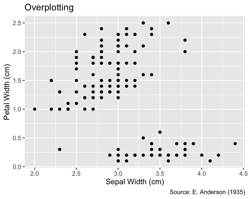
While not immediately apparent, some points in this plot correspond to multiple iris flowers with identical sepal and petal widths. The presence of duplicated values can be confirmed by applying the distinct() function to the Sepal.Width and Petal.Width columns, which results in a data frame with fewer rows than those in iris:
Various strategies can reveal overplotting and indicate, at least approximately, the number of data points occupying the same location. Commonly used strategies include jittering combined with partial transparency of the overplotted symbols (Section 6.1.3.1) and representing counts by symbol areas (Section 6.1.3.2).
A common method for alleviating overplotting is to add a small amount of randomness to the coordinates of the points using geom_jitter() instead of geom_point(). The amount of randomness added to the coordinates can be adjusted by passing numeric width and height arguments, measured in the units of the corresponding coordinates. If both width and height are set to zero, the result of geom_jitter() is indistinguishable from geom_point(). If only one of width and height is set to zero, the result is one-dimensional jittering, which is useful if overplotting is caused by the discreteness of one but not the other variable. If width or height are not specified by the user, geom_jitter() uses the default value of 40% of the data resolution, defined as the smallest non-zero difference between the coordinates.
Even after jittering, points may still partially overlap. Thus, jittering is frequently accompanied by the use of partially transparent point symbols so that overlaps result in darker areas. This effect is visible in the example below, particularly evident in the bottom of the plot. Please note that the opacity, which is the opposite of transparency, is determined by an object’s alpha argument, which ranges from 0 to 1. If alpha = 0, the objects are invisible, whereas the default value alpha = 1 renders them completely opaque. The following output is generated with an intermediate value of alpha = 0.5:
One option to mitigate overplotting is the use of geom_jitter() and rendering points partially transparent by setting the alpha argument to a value between 0 (invisible) and 1 (fully opaque).
gg_iris_jitter <-
  ggplot(iris, aes(Sepal.Width, Petal.Width)) +
  geom_jitter(alpha = 0.5) +
  iris_labs(
    y = "Petal Width (cm)",
    title = "Jittering",
  )
gg_iris_jitter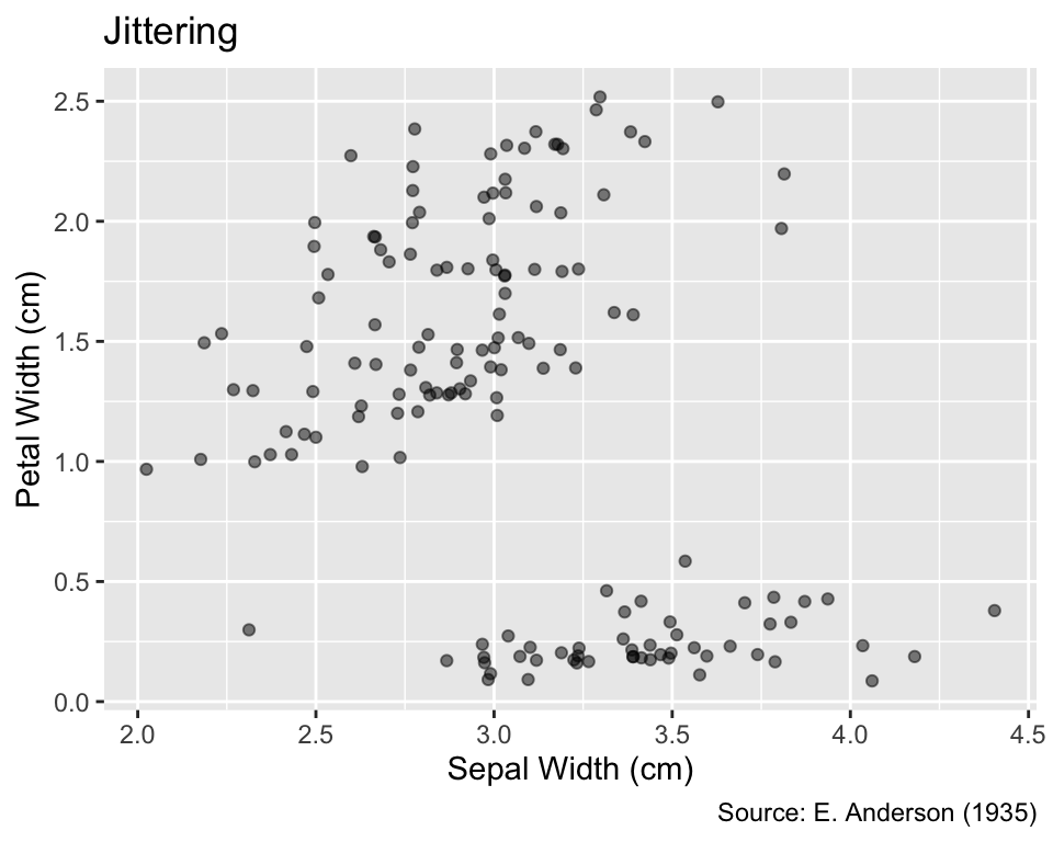
Another mitigation strategy for overplotting is the use of geom_count(), which draws only one point symbol at each distinct position while counting the number of observations at each location. When followed by scale_size_area(), the area of each symbol is scaled proportionally to the number of observations at that position, consistent with Tufte’s area principle. (Section 9.4.1 will provide more background on area scaling.) The scale_size_area() function accepts a max_size argument that scales the point sizes. Its default is 6, but smaller values might reduce overlaps between nearby values. Compared to geom_jitter(), geom_count() offers the advantage of centering each symbol exactly on its corresponding data value. However, nearby point symbols may still partially overlap; hence, it might still be necessary to render them partially transparent:
Use geom_count() followed by scale_size_area() to represent the number of observations at each location by the area of the point symbol.
ggplot(iris, aes(Sepal.Width, Petal.Width)) +
  geom_count(alpha = 0.5) +
  iris_labs(
    y = "Petal Width (cm)",
    size = "Count", # Title of the size legend
    title = "Count of Overlapping Points",
  ) +
  scale_size_area(max_size = 4)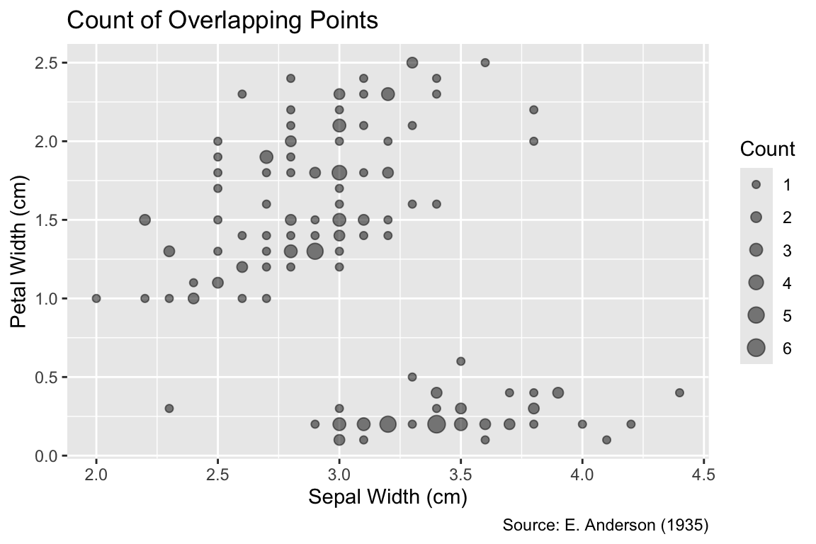
By connecting all observed values, geom_line() tends to accentuate details of the data that are influenced by randomness rather than the underlying process. An alternative is geom_smooth(), which fits a smooth curve to the data, not necessarily passing through all observed points. The default method for curve fitting is locally estimated scatter-plot smoothing (LOESS) if there are fewer than 1,000 data points, as in the following example, and a generalized additive model otherwise. For clarity, it is recommended to specify the smoother using the method argument; LOESS requires method = "loess", whereas the generalized additive model can be invoked using method = "gam". In the following plot, the dark grey ribbon surrounding the LOESS curve represents the estimated 95% confidence interval for a given x-coordinate. R’s default message “geom_smooth() using formula = ‘y ~ x’” is intended to remind the user that y-values are regarded as outcomes, whereas x-values are treated as predictors:
Use geom_smooth() to fit a smooth curve to the data.
gg_iris_jitter +
  geom_smooth(method = "loess") +
  labs(title = "Default Smoothing")
`geom_smooth()` using formula = 'y ~ x'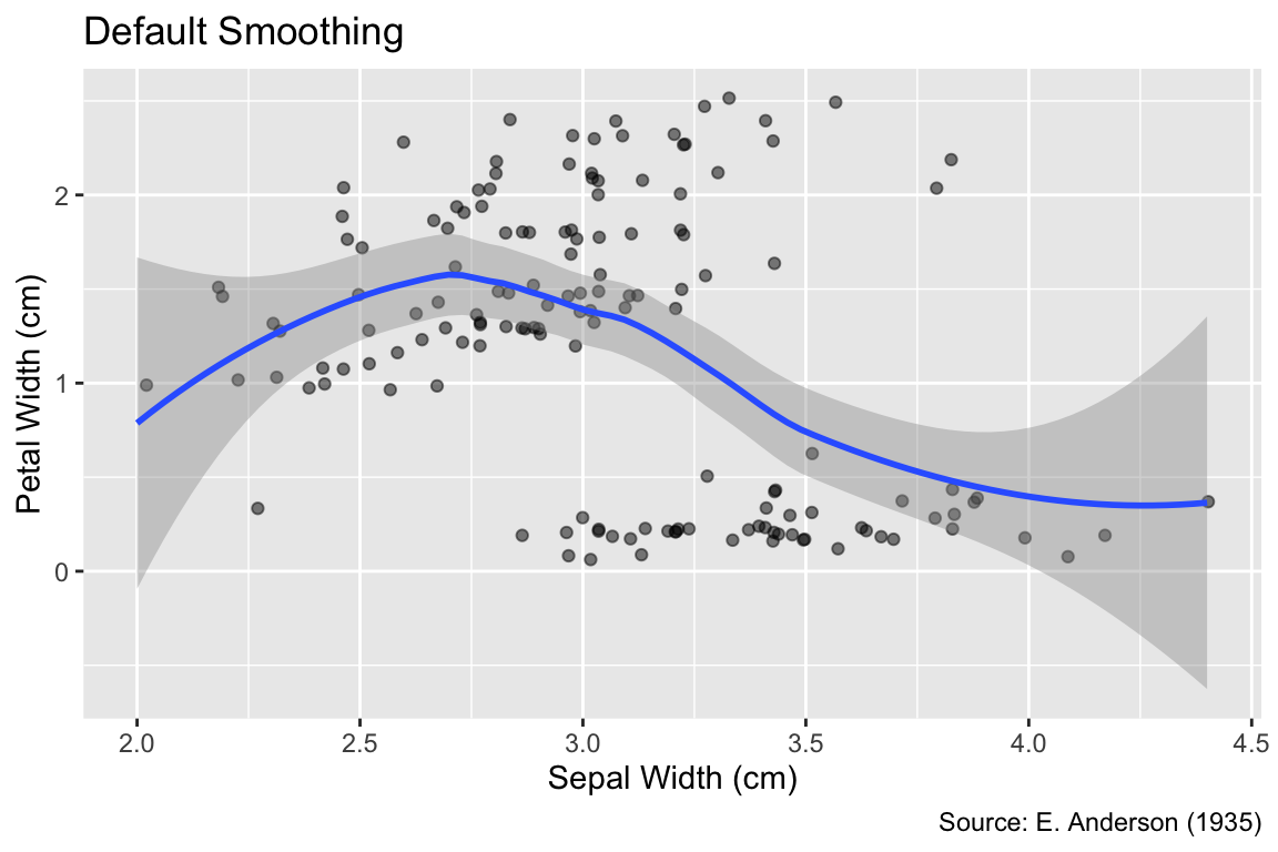
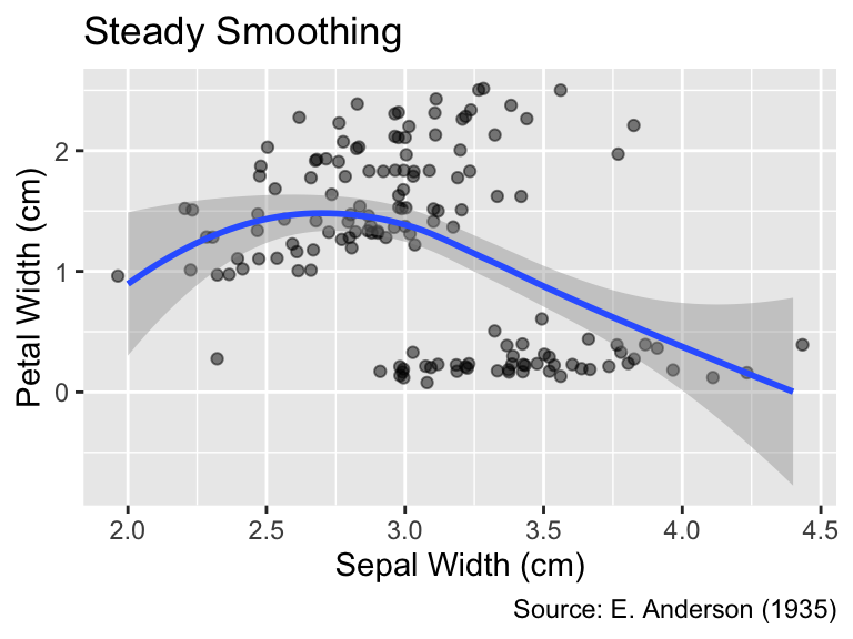
When using LOESS, you can control the degree of smoothing by setting the span argument of geom_smooth() to a value between 0 and 1. A smaller span value results in a wigglier curve that comes closer to each data point, whereas a larger span value produces a smoother curve better representing the overall trend. The default is span = 0.75:
When method = "loess", the span argument of geom_smooth() determines the degree of smoothing.
gg_iris_jitter +
  geom_smooth(span = 0.4) +
  labs(title = "Wiggly Smoothing")
gg_iris_jitter +
  geom_smooth(span = 1.0) +
  labs(title = "Steady Smoothing")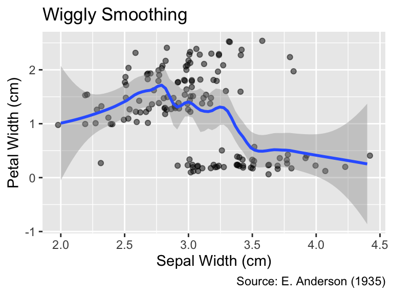
The linear model provides an important alternative method for curve fitting. It can be invoked using the method = "lm" argument. While a linear model may not be appropriate for data exhibiting strongly curved trends, it can succinctly express the overall trend with only two parameters—slope and intercept:
Use geom_smooth(method = "lm") to fit a linear model to the data.
gg_iris_jitter +
  geom_smooth(method = "lm") +
  labs(title = "Linear Model")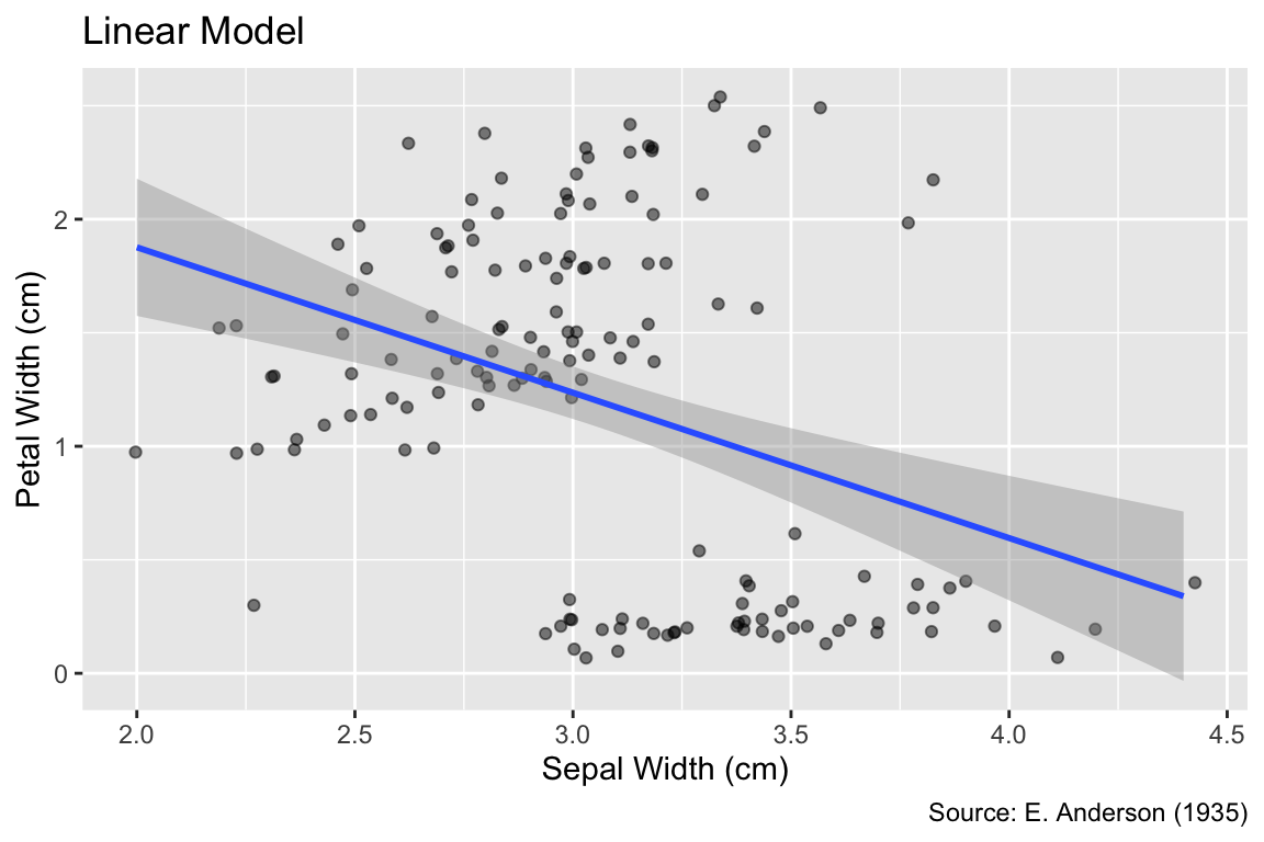
This section has introduced the foundational steps toward data visualization using ggplot2. Plots are initiated by the ggplot() function, which specifies the data and aesthetic mappings. Geometric layers are then added to the plot using the + operator. Table 6.1 lists the geom_...() functions for creating different types of layers that have been covered in this section. Through the labs() function, the user can set the labels for the axes and legends, such as color bars, as well as the plot title and caption. Moreover, this section has discussed strategies for alleviating the impact of overplotting and for adding smooth trend curves to scatter plots.
| Geom | Description |
|---|---|
geom_point() |
Plots points at x and y coordinates. The values are retrieved from the data-frame columns you pass as arguments to the aes() function. |
geom_path() |
Connects points in the order they appear in the data frame. |
geom_line() |
Connects points in the order of the x variable. |
geom_jitter() |
Adds a small amount of randomness to coordinates, mitigating the effect of overplotting. |
geom_count() + scale_size_area() |
Represents the multiplicity of overlapping points by the area of the point symbols. |
geom_smooth() |
Adds a smooth trend curve to the plot. |
While scatter plots excel at visualizing relationships between two quantitative variables, other plot types are often more effective for revealing and comparing quantitative data distributions. This section will use the iris data frame, which you already encountered in Section 6.1.3, focusing on the distribution of sepal widths. The data consist of 50 measurements each for three different species of iris (setosa, versicolor, and virginica). The distribution can be visually represented in various ways. For example, geom_count() could be used, with sepal width on the x-axis and species on the y-axis:
ggplot(iris, aes(x = Sepal.Width, y = Species)) +
  geom_count(alpha = 0.5) +
  iris_labs(
    y = "Species",
    size = "Count",
    title = "Jitter Plot of Sepal Widths by Species",
  ) +
  scale_size_area()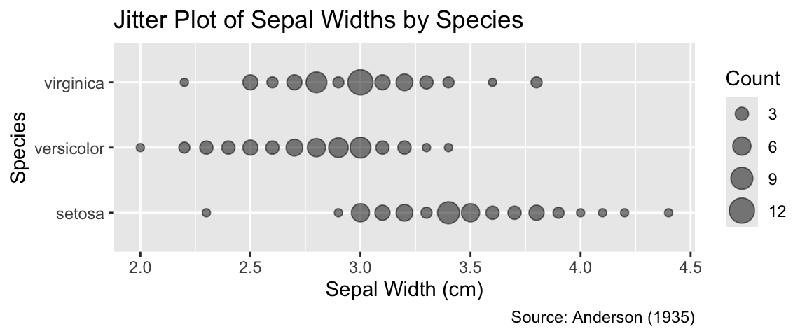
While geom_count() is, for these data, an adequate option, there are several other geoms that are more suitable, as explained in the following sections. Section 6.2.1 presents plot types for visualizing the distribution of all 150 measurements, disregarding the species identity. Subsequently, Section 6.2.2 explores visualizations facilitating the comparison between distributions of sepal widths for different species.
As a starting point for exploratory data analysis, it is often helpful to visualize the distribution of a quantitative variable, initially ignoring any additional variables that might obscure overarching trends. For instance, it is reasonable to study the distribution of all iris sepal widths before investigating differences between iris species. Plot types commonly employed for exploratory data analysis comprise histograms (Section 6.2.1.1), frequency polygons (Section 6.2.1.2), rug plots (Section 6.2.1.3), smoothed density estimates (Section 6.2.1.4), and box plots (Section 6.2.1.5).
Histograms constitute arguably the most prevalent type of plot used for visualizing quantitative distributions. A histogram first divides the variable’s range into smaller intervals termed “bins.” Afterward, the data points in each bin are counted. Finally, a rectangle is drawn with edges parallel to the coordinate axes such that the width of the histogram occupies the extent of the bin and the height spans from 0 to the count of data points.
A histogram partitions the range of a quantitative variable into bins and uses a rectangle for each bin whose height is proportional to the number of observations it contains.
The geom_histogram() function offers a convenient tool for histogram generation. While the geoms you encountered for scatter plots in Section 6.1 require both x and y arguments, geom_histogram() accepts only one of them. The other coordinate is automatically set to equal the count of data points in each bin, a calculation performed by geom_histogram() behind the scenes.
Use geom_histogram() to create histograms.
It is good practice to compare histograms for the same data using a varying number of bins because different resolutions can highlight different characteristics of the distribution. The approximate number of bins can be adjusted using the bins argument of the geom_histogram() function. A smaller number of bins emphasizes overall trends, whereas a larger number of bins accentuates details of the distribution. The following code generates histograms for different bin widths. To avoid code duplication, an auxiliary function, named gg_hist_bins(), is defined. The .data pronoun is used for referring to columns in the data frame, which is a requirement of the lintr package to ensure that the variable Sepal.Width is correctly identified by the function as a column of the iris data frame:
Use the bins argument to explore different features of the distribution.
gg_hist_bins <- function(n_bins) {
  ggplot(iris, aes(x = .data$Sepal.Width)) +
    geom_histogram(bins = n_bins) +
    iris_labs(
      y = "Count",
      title = str_c("Histogram Using ", n_bins, " Bins")
    )
}
gg_hist_bins(20)
gg_hist_bins(40)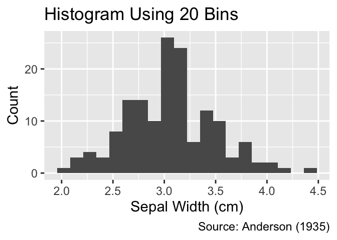

As depicted in these examples, geom_histogram() defaults to filling all rectangles with dark gray. When applied to ungrouped data, filling the rectangles adds unnecessary ink to the plot, which can be avoided by setting fill = NA. It is worth noting that, in ggplot2, fill generally refers to the color of an object’s interior, whereas color refers to its outer boundaries:
For ungrouped data, use fill = NA to remove the interior color of the rectangles.
gg_unfilled_hist <-
  ggplot(iris, aes(x = Sepal.Width)) +
  geom_histogram(bins = 20, fill = NA, color = "black") +
  iris_labs(y = "Count")
gg_unfilled_hist +
  labs(title = "Histogram Using Unfilled Rectangles")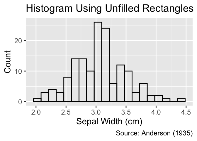
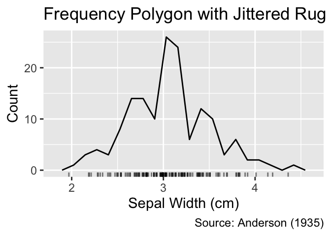
Like histograms, frequency polygons represent distributions by tallying data points within bins. However, while histograms portray counts using rectangles, frequency polygons connect adjacent counts, mapped to the y-coordinate, using lines. Frequency polygons are less visually obtrusive than histograms, but the line segments may create a false sense of continuity between their end points.
Frequency polygons count data points within bins and connect counts in adjacent bins by lines.
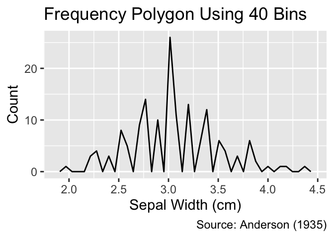
The geom_freqpoly() function can be used to create frequency polygons. Similar to histograms, it is advisable to vary the number of bins during exploratory data analysis to uncover different features of the distribution:
Use geom_freqpoly() to create frequency polygons.
gg_freqpoly_bins <- function(n_bins) {
  ggplot(iris, aes(x = .data$Sepal.Width)) +
    geom_freqpoly(bins = n_bins) +
    iris_labs(
      y = "Count",
      title = str_c("Frequency Polygon Using ", n_bins, " Bins")
    )
}
gg_freqpoly_bins(20)
gg_freqpoly_bins(40)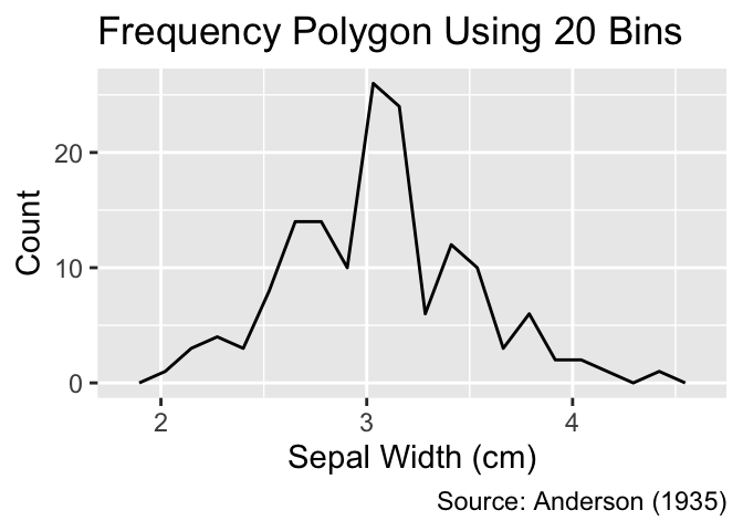
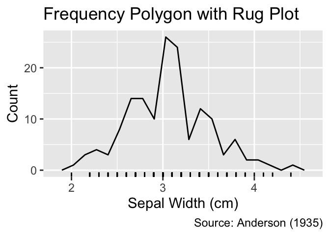
While histograms or frequency polygons provide insights into the distribution of data points, they obscure the precise position of individual data points inside the bins. In contrast, rug plots reveal exact positions by representing each data point using a short line perpendicular to the coordinate axis. They are added as a ggplot2 layer using the geom_rug() function:
Rug plots, generated using geom_rug(), display each data point as a short tick mark along the axis.
gg_unfilled_hist +
  geom_rug() +
  labs(title = "Histogram with Rug Plot")
gg_freqpoly_bins(20) +
  geom_rug() +
  iris_labs(y = "Count", title = "Frequency Polygon with Rug Plot")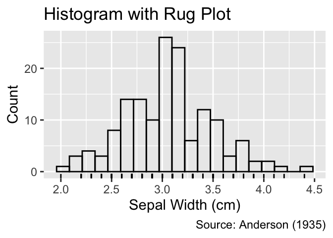
In this example, the rug plot evidently suffers from significant overplotting, which can be alleviated using jittering, as you learned in Section 6.1. To jitter the rug lines, pass the position_jitter() function as argument to geom_rug(). As geom_rug() requires a y-aesthetic, we map the y-coordinate to the dummy value of 0:
geom_jittered_rug_aes <- function(...) {
  geom_rug(
    aes(y = 0, ...),
    position = position_jitter(height = 0),
    alpha = 0.5,
    sides = "b" # "b" for bottom
  )
}
gg_unfilled_hist +
  geom_jittered_rug_aes() +
  labs(title = "Histogram with Jittered Rug")
gg_freqpoly_bins(20) +
  geom_jittered_rug_aes() +
  iris_labs(title = "Frequency Polygon with Jittered Rug")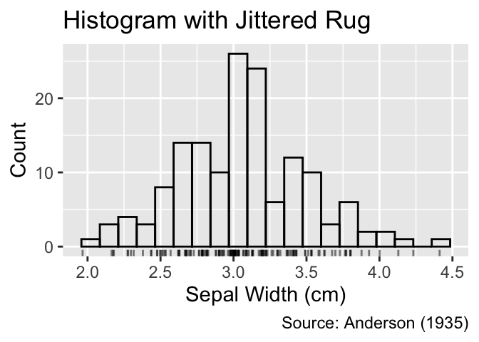
In contrast to histograms and frequency polygons, which display raw counts of data points within bins, density plots use kernel density estimation, a mathematical procedure that approximates the empirical distribution with a smooth probability density function. The approximation is normalized so that the area under the curve equals 1.
Density plots approximate the empirical distribution by a smooth probability density.
To generate density plots in ggplot2, you can employ the geom_density() function. Below is the default density plot for sepal widths in the iris data set:
Use geom_density() to plot smoothed density estimates.
ggplot(iris, aes(Sepal.Width)) +
  geom_density() +
  geom_jittered_rug_aes() +
  iris_labs(y = "Density", title = "Smoothed Estimate (Adjust = 1)")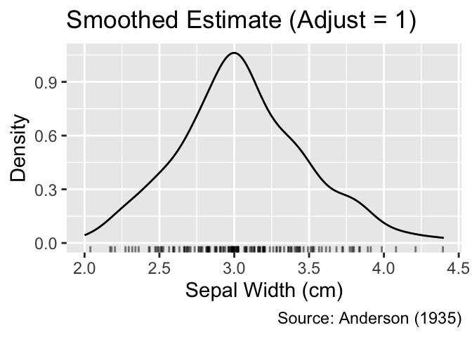
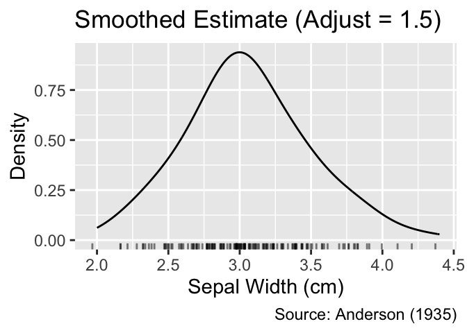
The smoothness of the curve is governed by the bandwidth of the kernel, controlled by the adjust argument of the geom_density() function. By default, the bandwidth is set to 1. Smaller values lead to stronger fluctuations of the curve, whereas larger values blur more details of the distribution:
The adjust argument of geom_density() controls the smoothness of the curve.
gg_density_adjust <- function(adj) {
  ggplot(iris, aes(.data$Sepal.Width)) +
    geom_density(adjust = adj) +
    geom_jittered_rug_aes() +
    iris_labs(
      y = "Density",
      title = str_c("Smoothed Estimate (Adjust = ", adj, ")")
    )
}
gg_density_adjust(0.5)
gg_density_adjust(1.5)
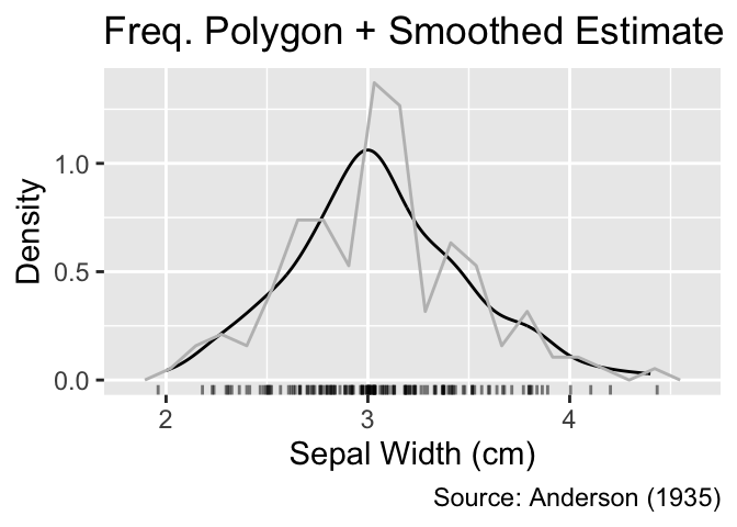
For a more comprehensive view, you can overlay a smoothed density estimate with a histogram or frequency polygon. In such cases, the y-coordinates of the histogram or frequency polygon need to be adjusted such that the cumulative area in the rectangles equals 1 to match the area under the smoothed density estimate. This normalization can be achieved by setting the y aesthetic to after_stat(density). Furthermore, it is advisable to use a subdued color for the histogram or frequency polygon to reduce visual clutter:
When combining a histogram or frequency polygon with a smoothed density estimate, y needs to mapped to after_stat(density).
gg_density_with_jittered_rug <-
  ggplot(iris, aes(Sepal.Width, y = after_stat(density))) +
  geom_density() +
  geom_jittered_rug_aes() +
  iris_labs(y = "Density")
gg_density_with_jittered_rug +
  geom_histogram(bins = 20, fill = NA, color = "gray") +
  labs(title = "Histogram + Smoothed Estimate")
gg_density_with_jittered_rug +
  geom_freqpoly(bins = 20, color = "gray") +
  labs(title = "Freq. Polygon + Smoothed Estimate")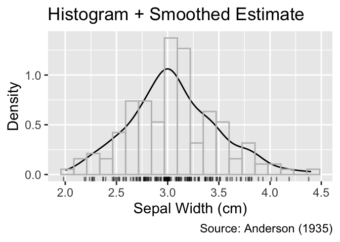
A box plot, generated using geom_boxplot(), summarizes quantitative data using fewer numbers than histograms or frequency polygons. Consider the example displayed in Figure 6.1 The thick black vertical line inside the box represents the median (3 cm), and the vertical edges of the box denote the lower and upper quartiles (2.8 and 3.3 cm, respectively). The difference between these quartiles is termed the interquartile range. Thin lines, called “whiskers,” extend from the box to illustrate the data range. The left whisker stretches to the smallest data value greater than the lower quartile minus 1.5 times the interquartile range (2.2 cm), while the right whisker extends to the largest data value smaller than the upper quartile plus 1.5 times the interquartile range (4 cm). Any data points beyond the whiskers are displayed as small circles.
Box plots display the median as a thick line, the lower and upper quartile as edges of a box, and the remaining range of data points as whiskers and circles. Invoke geom_boxplot() to create a box plot.
When applied to ungrouped data, the y-axis lacks quantitative significance. Thus, it is advisable to remove any tick marks, labels, and horizontal grid lines using the scale_y_continuous() and guides() functions, as will be discussed in more detail in Section 9.1.2 and Section 10.3:
ggplot(iris, aes(Sepal.Width)) +
  geom_boxplot() +
  iris_labs(title = "Box Plot") +
  scale_y_continuous(breaks = NULL) +
  guides(y = "none")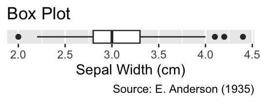
iris data set.
Box plots can be combined with other plot types to provide a more comprehensive perspective on the distribution. For instance, the following code integrates a histogram, a slim box plot, and a rug plot. As this example demonstrates, boxes do not need to be thick for effectively conveying the essence of the distribution:
Keep boxes thin.
gg_unfilled_hist +
  geom_jittered_rug_aes() +
  geom_boxplot(aes(y = -1.5), width = 1.5) +
  labs(title = "Histogram, Box Plot, and Rug Plot")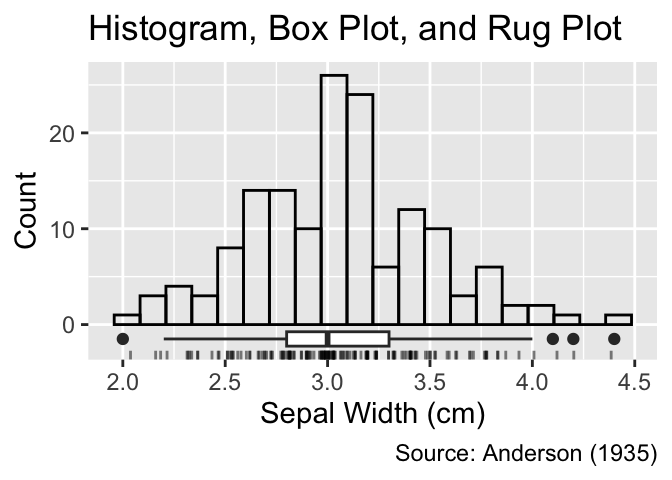
Although plotting the distribution of all quantitative observations is insightful as a first step, further data analysis typically involves comparing the distributions across different groups. For instance, for the iris data set, one might inquire whether sepal widths differ between the three species (setosa, versicolor, and virginica) included in the sample. Suitable plot types for comparing distributions across multiple groups encompass stacked, dodged, and faceted histograms (Section 6.2.2.1). Alternatively, frequency polygons and smoothed density estimates can also be either stacked or dodged (Section 6.2.2.2), while side-by-side box plots and violin plots (Section 6.2.2.3) offer more compact representations of the distribution.
Groups can be distinguished in histograms by using different fill colors. In each bin, the differently colored rectangles can then be stacked on top of each other, as the following code demonstrates. Here, the fill color is mapped to the iris species:
Set the fill argument in aes() equal to a grouping variable for creating a stacked histogram.
ggplot(iris, aes(Sepal.Width, fill = Species)) +
  geom_histogram(bins = 20, color = "gray") +
  iris_labs(y = "Count", title = "Stacked Histogram")
The y-coordinate at the top of each bin corresponds to the count of observations in that bin, accumulated over all groups. However, the y-coordinate of the top of each individually colored rectangle is not directly meaningful because the y-coordinate at the bottom needs to be subtracted from it to obtain the count for a specific group.
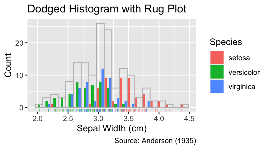
Alternatively, the bottoms of differently colored rectangles can all be lined up along the y-axis using the position = "dodge" argument in geom_histogram(). Dodging offers the advantage that the top of each rectangle corresponds to the count of observations for the respective group:
Use position = "dodge" to create a dodged histogram.
ggplot(iris, aes(Sepal.Width, fill = Species)) +
  geom_histogram(bins = 20, position = "dodge") +
  iris_labs(y = "Count", title = "Dodged Histogram")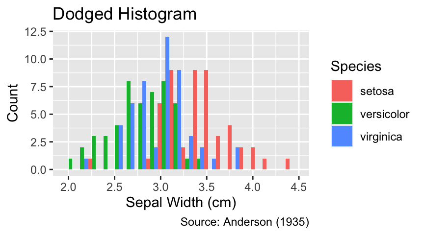
A disadvantage of dodging is that each bin is vertically split into as many parts as there are groups. Hence, the actual bin used for counting is wider than any displayed rectangle. To clarify this issue, it can be helpful to indicate the position of each observation using a rug plot:
If different geoms use different aesthetic mappings, move the respective arguments of aes() to the geoms where they are used.
ggplot(iris, aes(Sepal.Width, fill = Species)) +
  geom_histogram(bins = 20, position = "dodge") +
  geom_jittered_rug_aes(color = Species) +
  iris_labs(
    y = "Count",
    title = "Dodged Histogram with Rug Plot"
  )
Regardless of whether stacked or dodged, combining histograms for different groups in the same plot tends to appear cluttered. In such instances, faceting can be a useful alternative. Faceting involves breaking up a plot into multiple panels, each displaying data for a different group. The following code chunk illustrates creating a faceted histogram using the facet_wrap() function, lining up all panels in a single column due to the ncol = 1 argument. Thanks to faceting, it is now evident that setosa tends to have the thickest and versicolor the slimmest sepals, with virginica having intermediate widths:
Use facet_wrap() to create a plot with one facet for each grouping variable.
ggplot(iris, aes(Sepal.Width)) +
  geom_histogram(bins = 20, fill = NA, color = "black") +
  facet_wrap(vars(Species), ncol = 1) +
  iris_labs(y = "Count", title = "Faceted Histogram")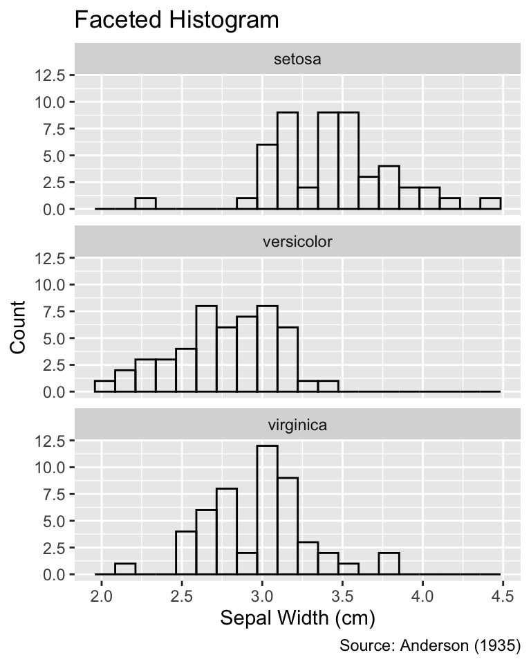
When faceting, any additional geoms, such as rug plots, are also automatically split into the corresponding groups:
Faceting can be applied to multiple geoms. The data for each geom is split into the corresponding groups.
ggplot(iris, aes(Sepal.Width)) +
  geom_histogram(bins = 20, fill = NA, color = "black") +
  geom_jittered_rug_aes() +
  facet_wrap(vars(Species), ncol = 1) +
  iris_labs(title = "Faceted Histogram with Rug Plot")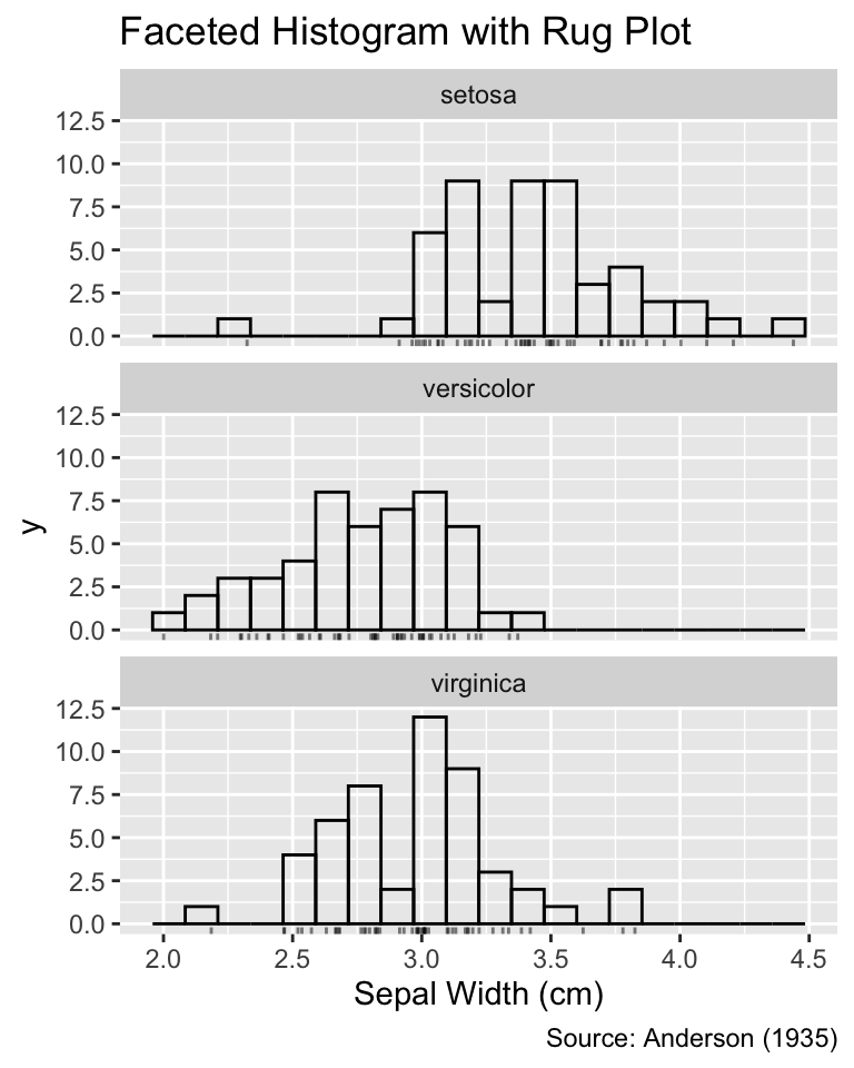
While less cluttered than stacked and dodged histograms, faceting generally requires more space. Thus, if the number of groups is large, histograms may not be the optimal approach for comparing distributions split by group.
Frequency polygons or smoothed density estimates for multiple groups can be integrated into the same plot using different colors for each group. Compared to stacked or dodged histograms, the resulting plots are less cluttered because the distributions are visualized by lines rather than filled areas:
Set the color argument in aes() equal to a grouping variable for plotting a grouped frequency polygon or smooth density estimate.
gg_grouped_freqpoly_with_rug <- function(...) {
  ggplot(iris, aes(.data$Sepal.Width, ...)) +
    geom_freqpoly(bins = 20) +
    geom_jittered_rug_aes(...) +
    iris_labs(y = "Count", title = "Frequency Polygon")
}
gg_grouped_density_with_rug <- function(...) {
  ggplot(iris, aes(.data$Sepal.Width, ...)) +
    geom_density() +
    geom_jittered_rug_aes(...) +
    iris_labs(y = "Density", title = "Smoothed Estimate")
}
gg_grouped_freqpoly_with_rug(color = Species)
gg_grouped_density_with_rug(color = Species)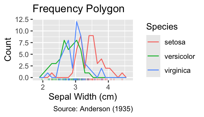
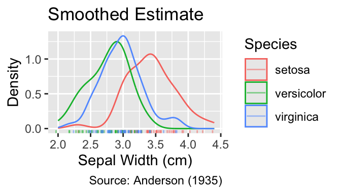
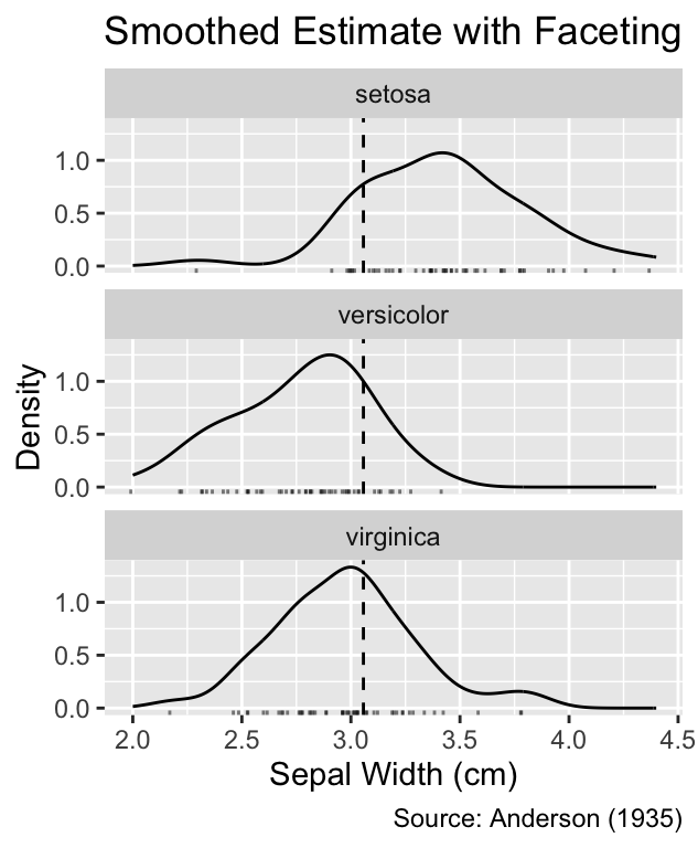
Faceting can be employed to declutter the plots further. Because faceting shifts the curves into separate panels, adding a vertical anchor line, for example at the mean, can aid comparisons between groups. Vertical lines can be drawn using the geom_vline() function, which requires the xintercept argument to specify the position of the line:
Use geom_vline() to add vertical lines to a plot.
plot_vline_and_facet <- function(gg) {
  gg +
    geom_vline(xintercept = mean(iris$Sepal.Width), linetype = "dashed") +
    facet_wrap(vars(.data$Species), ncol = 1)
}
plot_vline_and_facet(gg_grouped_freqpoly_with_rug()) +
  labs(title = "Frequency Polygon with Faceting")
plot_vline_and_facet(gg_grouped_density_with_rug()) +
  labs(title = "Smoothed Estimate with Faceting")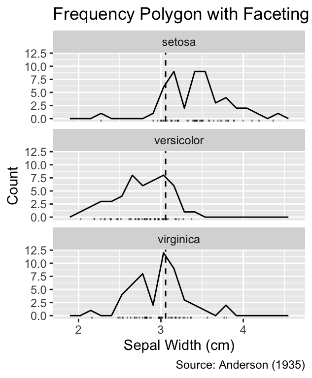
While box plots provide limited quantitative information for ungrouped distributions, they are valuable when comparing distributions across multiple groups. The following code generates a grouped box plot by mapping Species to the y-coordinate:
ggplot(iris, aes(Sepal.Width, Species)) +
  geom_boxplot() +
  iris_labs(title = "Side-by-Side Box Plot")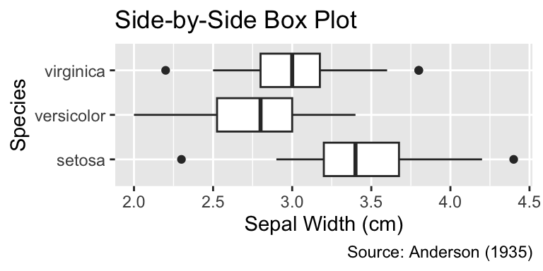
If box plots are deemed insufficient for portraying details of the distribution, they can be replaced with violin plots—density plots mirrored symmetrically along the quantitative axis (the x-axis in our example). The ggplot2 function for generating violin plots is geom_violin(). Please note that violin plots should only be used for grouped data; for ungrouped data, geom_density() should be used instead:
Violin plots are axially symmetric density plots. Use geom_violin() to create a violin plot. Violin plots should only be used for grouped data.
ggplot(iris, aes(Sepal.Width, Species)) +
  geom_violin() +
  iris_labs(title = "Side-by-Side Violin Plot")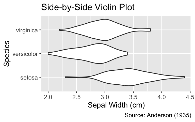
By adjusting the width of the boxes, it is also possible to display box plots inside the violins, facilitating the comparison of medians, lower and upper quartiles between groups:
ggplot(iris, aes(Sepal.Width, Species)) +
  geom_violin() +
  geom_boxplot(width = 0.2) +
  iris_labs(title = "Side-by-Side Violin Plot")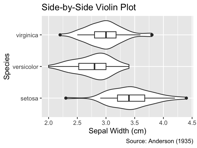
This section has introduced several methods for visualizing the distribution of a quantitative variable, including histograms, frequency polygons, and smoothed density estimates. Additionally, it has demonstrated how to compare distributions across multiple groups using faceting, side-by-side box plots, and violin plots. Along the way, this section has emphasized that combining different plot types might reveal more aspects of the distribution than relying solely on one plot type. The best choice of visualization depends on the specific research question and the characteristics of the data.
To create a professional-looking plot, it is essential to scale it such that it seamlessly integrates into the surrounding text. Crucial factors to consider are the amount of empty space within and around the plot, as well as the font size. To optimize the plot dimensions, it is advisable to use the execution options fig-width and fig-height to adjust the width and height, respectively. Figure 6.2, Figure 6.3, and Figure 6.4 show examples in which the fig-width value is too small, about right, and too large, respectively. As a rule of thumb, optimal fig-width values usually fall within the range from 3 to 5.
```{r}
#| label: fig-width-too-small
#| fig-width: 2
#| fig-cap: "A `fig-width` value of 2 is too small because the plot title is
#|   cut off by the right margin."

g <-
  ggplot(iris, aes(Sepal.Width, Species)) +
  geom_violin() +
  geom_boxplot(width = 0.2) +
  labs(title = "Violin-Box Plot")
g
```
fig-width value of 2 is too small because the plot title is cut off by the right margin.
```{r}
#| label: fig-width-about-right
#| fig-width: 4
#| fig-cap: "A `fig-width` value of 4 enables viewing the entire title
#|   alongside the overall shape of the violins."

g
```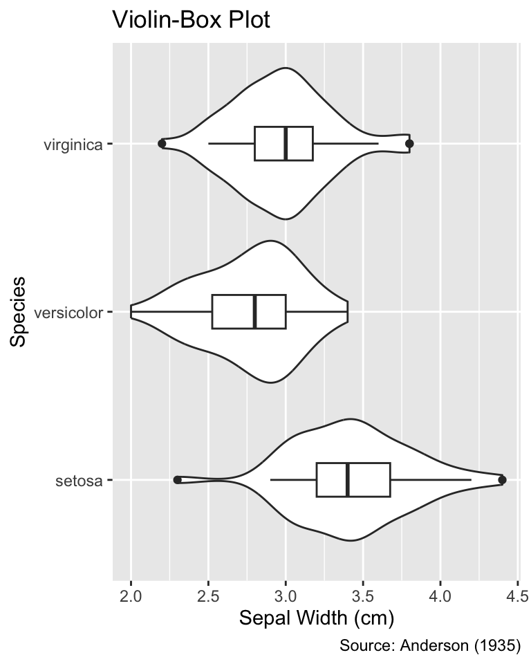
fig-width value of 4 enables viewing the entire title alongside the overall shape of the violins.
```{r}
#| label: fig-width-too-large
#| fig-width: 8
#| fig-cap: "A `fig-width` value of 8 is too large because the violins appear
#|   huge compared to the text elements, such as axis labels."

g
```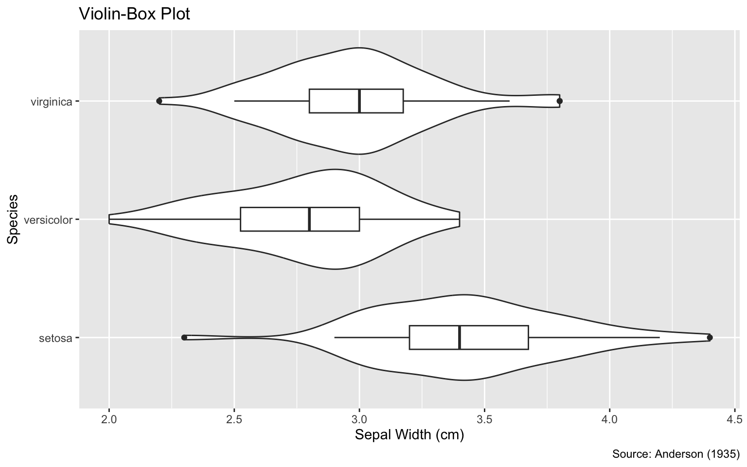
fig-width value of 8 is too large because the violins appear huge compared to the text elements, such as axis labels.
After setting fig-width, the next execution option to adjust is fig-height, which has a default value of 5. The criteria for the optimal fig-height value are similar to those for the optimal fig-width value; the only difference is that now you are adjusting the vertical instead of the horizontal direction. Figure 6.5, Figure 6.6, and Figure 6.7 show examples in which the fig-height value is too small, about right, and too large, respectively. As a general guideline, the optimal fig-height value tends to be approximately 25% smaller than the optimal fig-width value.
```{r}
#| label: fig-height-too-small
#| fig-width: 4
#| fig-height: 1.5
#| fig-cap: "A `fig-height` value of 1.5 is too small because the plot elements
#|   are too compressed to be easily readable."

g
```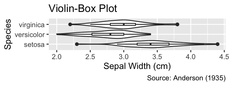
fig-height value of 1.5 is too small because the plot elements are too compressed to be easily readable.
```{r}
#| label: fig-height-about-right
#| fig-width: 4
#| fig-height: 3
#| fig-cap: "A `fig-height` value of 3 results in a good proportion of the
#|   plot elements' heights to the font size."

g
```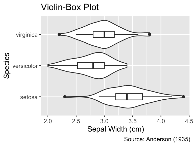
fig-height value of 3 results in a good proportion of the plot elements’ heights to the font size.
```{r}
#| label: fig-height-too-large
#| fig-width: 4
#| fig-height: 6
#| fig-cap: "A `fig-height` value of 6 is too large because the plot elements
#|   appear huge compared to the text elements."
g
```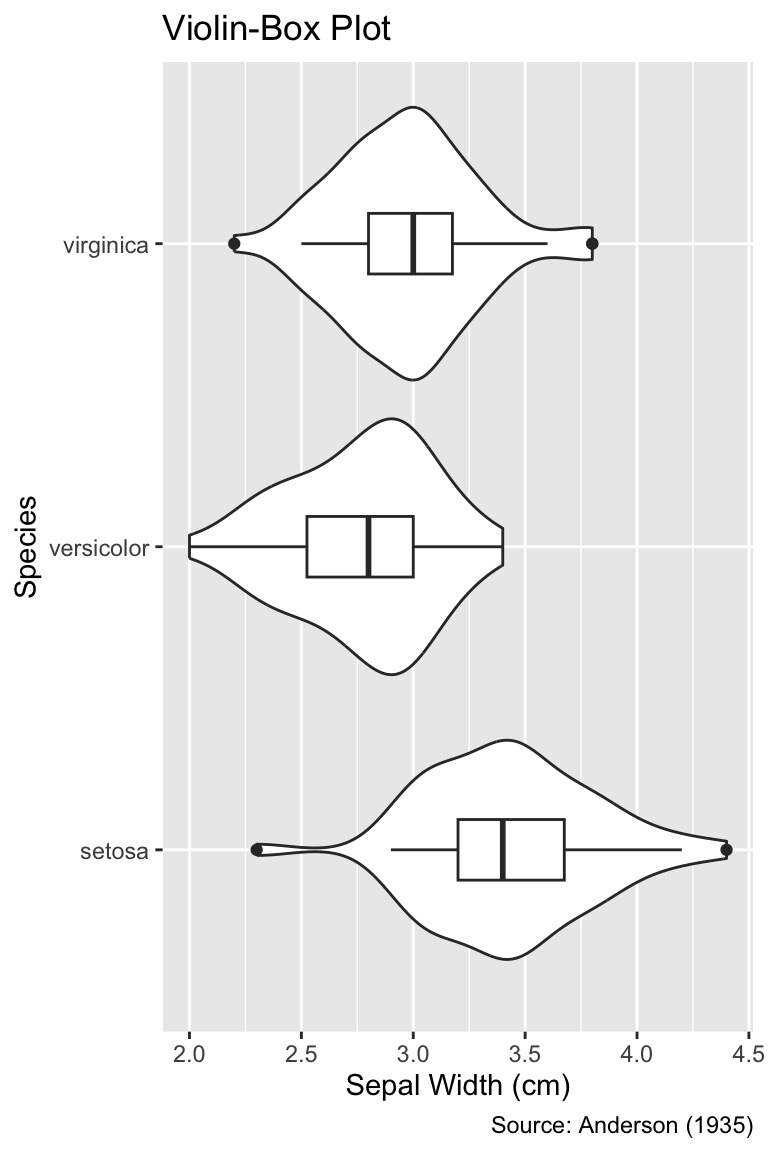
fig-height value of 6 is too large because the plot elements appear huge compared to the text elements.
This chapter has introduced basic use cases for the ggplot2 package. It has introduced various plot types, such as scatter plots, histograms, and box plots. You have also learned how to adjust the figure width and height using Quarto’s fig-width and fig-height execution options.
This chapter has chosen a hands-on approach instead of providing a theoretically motivated discussion of ggplot2’s underlying grammatical rules. Furthermore, this chapter has not aimed to produce highly polished plots. A more principled introduction to the grammar, required for fine-tuning plots, will be the focus of the following chapters.
In a sunflower plot, overplotted points are depicted as “sunflowers,” with each “petal” representing the number of data points at that location. Create a sunflower plot for the iris data set using ggplot2. The plot should display the sepal width on the x-axis and the petal width on the y-axis. The plot should have a title and a caption.
Note: Hints are available at Stack Overflow.
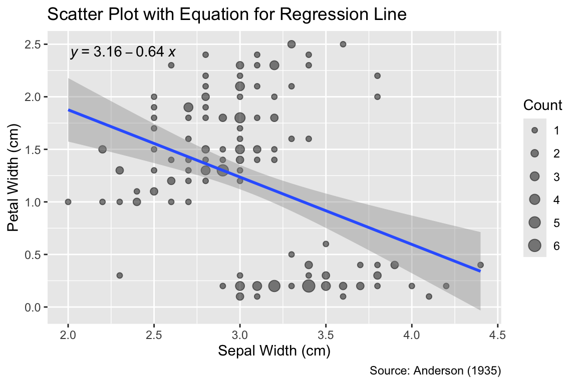
Create a scatter plot for the iris data set with the sepal width on the x-axis and the petal width on the y-axis. Add the regression line obtained by a linear model to the plot, and print the slope and intercept of the line on the plot, as shown in Figure 6.8.