
12 Faceting
Faceting is a technique that partitions a data set into subsets and displays each subset in its own panel. Also called trellising—a term borrowed from the lattice structures used by gardeners to grow climbing plants—faceting produces so-called “small multiples”: a series of smaller plots splitting the information into bite-sized chunks, in contrast to combining all data into a single-panel plot with grouped data. Faceting is especially valuable when plotting all groups together would result in cluttered or hard-to-interpret graphics. You already saw an example of faceting in Section 6.2.2.1. In this chapter, we examine faceting in greater depth. First, we demonstrate faceting by a single grouping variable using ggplot2’s facet_wrap() function (Section 12.1). Then, we explore faceting by two grouping variables with facet_grid().
12.1 Faceting by a Single Grouping Variable
To demonstrate faceting, we will use the built-in penguins data frame, which contains measurements of Pygoscelis penguins collected at Palmer Station, Antarctica (Gorman, Williams and Fraser, 2014). Pygoscelis penguins are characterized by their black and white plumage and a distinctive swimming technique called porpoising, where they leap out of the water in a series of rapid jumps to breathe air. This genus includes three species: the Adélie penguin (Pygoscelis adeliae), the gentoo penguin (Pygoscelis papua), and the chinstrap penguin (Pygoscelis antarcticus). Here we focus on species differences in these two variables:
-
body_mass: body mass in grams, plotted along the y-axis -
bill_len: bill length in millimeters, plotted along the x-axis
Initially, we drop missing values from the data frame to avoid complications during plotting:
Next, we prepare a non-faceted scatter plot of bill length versus body mass, colored by species. The alpha aesthetic is set to 0.5, rendering the points semi-transparent to mitigate overplotting:
gg_penguins <-
  ggplot(penguins_no_na, aes(body_mass, bill_len, color = species)) +
  geom_point(alpha = 0.5) +
  labs(
    x = "Body mass (g)",
    y = "Bill length (mm)",
    color = "Species",
    caption = "Source: Gorman et al. (2014)"
  )
gg_penguins +
  guides(color = guide_legend(override.aes = list(alpha = 1, size = 3)))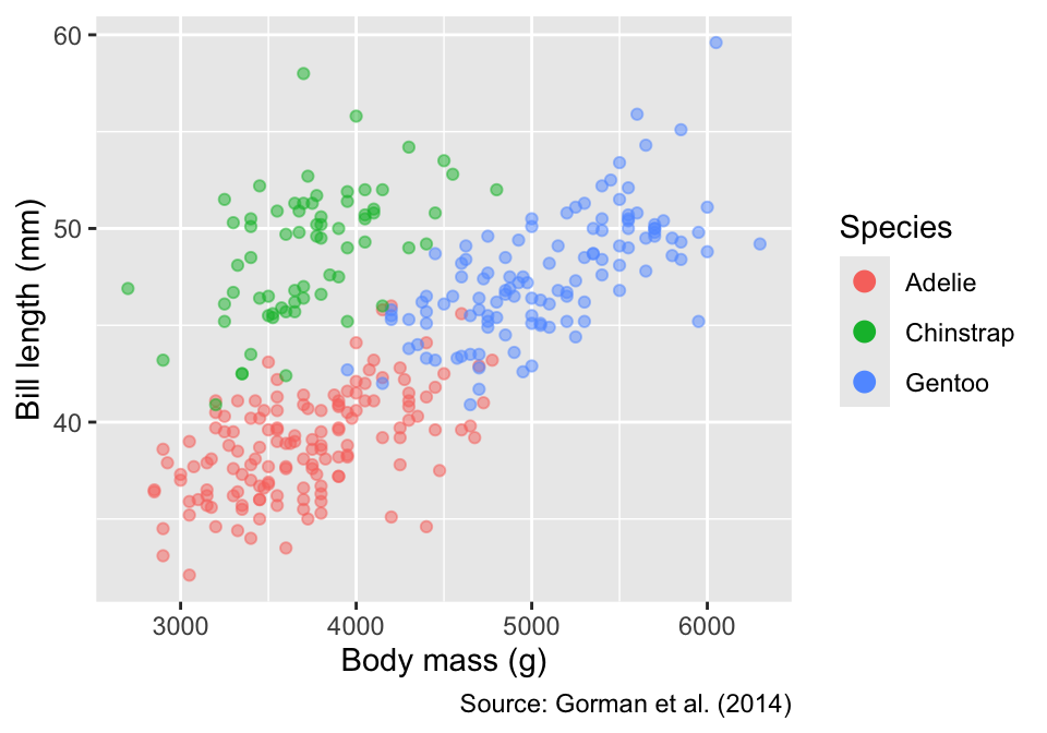
labs(title = "Non-Faceted Plot")<ggplot2::labels> List of 1
$ title: chr "Non-Faceted Plot"Although species differences in bill length and body mass are clearly discernible, faceting by species offers an alternative way to display these patterns. To facet by a single grouping variable—species in our example—the facet_wrap() function can be used anywhere in the ggplot object, specifying the variable using ggplot2’s vars() helper function. Because each panel is automatically labeled with the corresponding species, the color legend is redundant; therefore, we remove it using the guides() function:
Faceting splits a data set into subsets and displays each subset in its own panel. Pass the variable used for splitting through the vars() function to facet_wrap(): facet_wrap(vars(...)).
gg_penguins <- gg_penguins + guides(color = "none")
gg_penguins +
  facet_wrap(vars(species)) +
  labs(title = "Faceted by Species")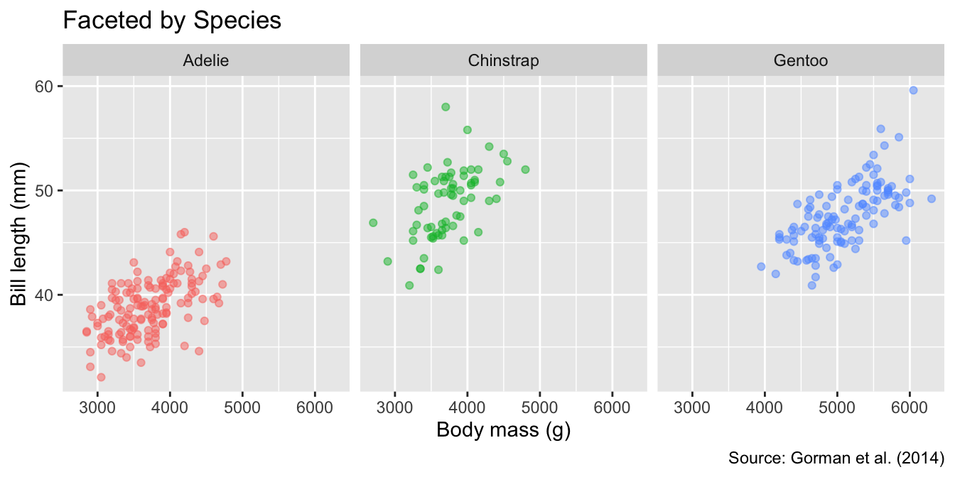
By default, all panels share the same axis limits. Although you can set different axis limits for each panel by specifying facet_wrap()’s scales argument as "free_x", "free_y" (in one direction), or "free" (in both directions), the default is more intuitive because readers may not immediately notice that the axes differ:
Default axis limits are shared across all panels. To set different axis limits for each panel, use the scales arguments "free_x", "free_y", or "free".
gg_penguins <- gg_penguins + guides(color = "none")
gg_penguins +
  facet_wrap(vars(species), scales = "free") +
  labs(title = "Free Scales")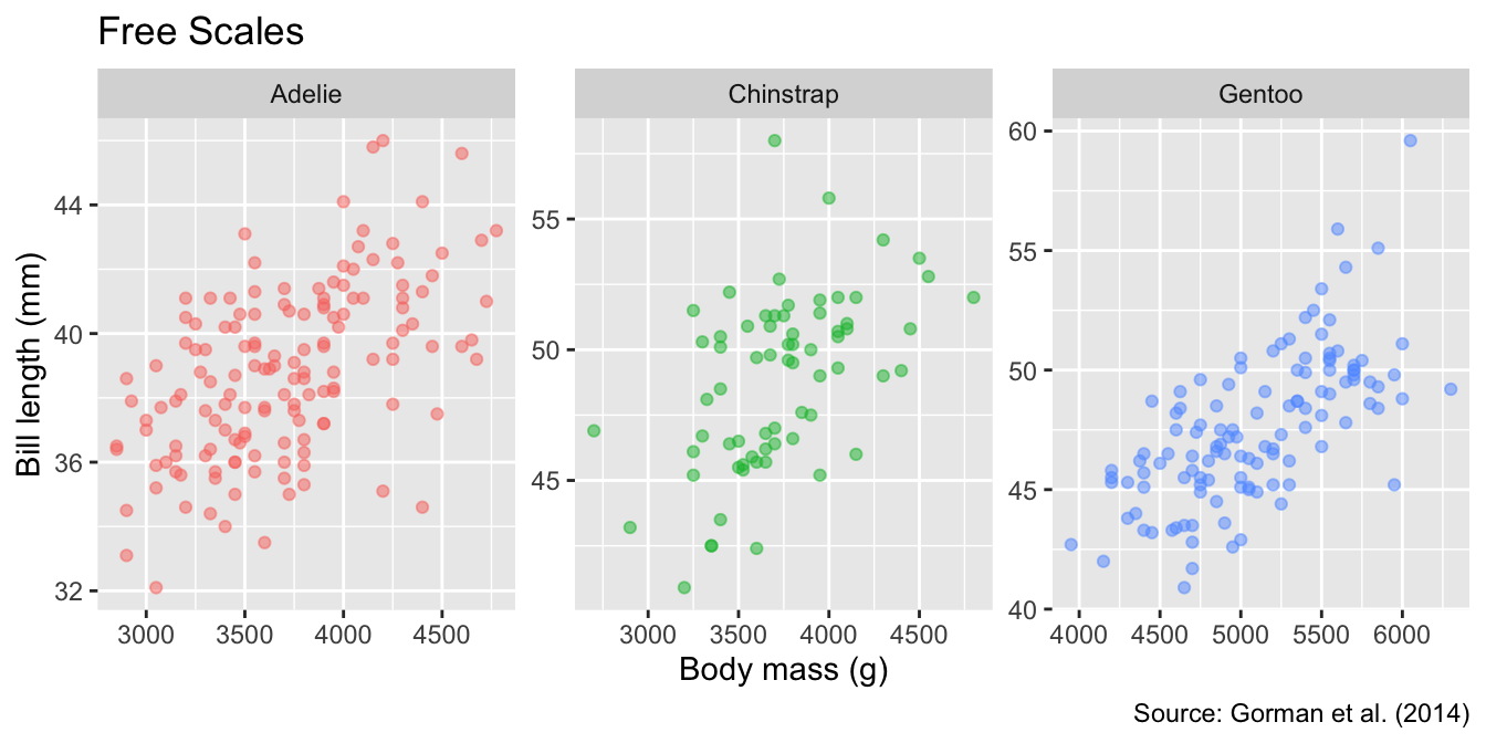
Another customization permitted by facet_wrap() is the panel arrangement. You can specify the number of rows or columns using the nrow or ncol arguments, respectively. For example, to arrange the panels in two rows, you can use:
Use nrow or ncol to specify the number of rows or columns in the facet layout.
gg_penguins +
  facet_wrap(vars(species), nrow = 2) +
  labs(title = "Facets Arranged as Two Rows")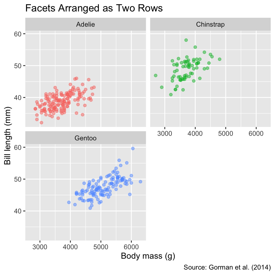
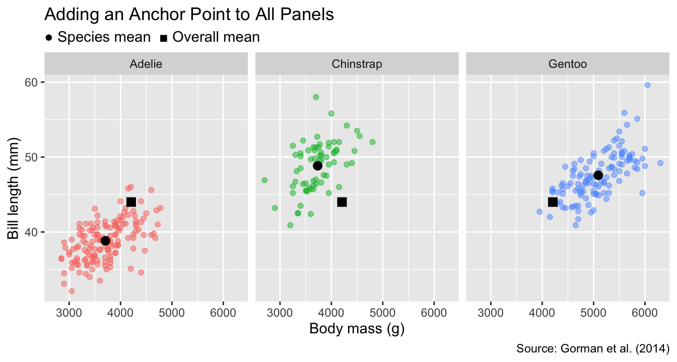
To facilitate comparisons between groups across different panels, it is often helpful to add anchor points or lines that represent overall trends of the data, summarized across all groups. For instance, let us insert a black square to represent the overall mean of bill length and body mass across all penguins. The meaning of the symbol will be explained in the subtitle. By including the black squares as anchor points alongside the species-dependent means (black circles), it becomes evident that Adélie penguins have the smallest bill lengths and body masses, while gentoo penguins have the longest bills and heaviest weights. In contrast, chinstrap penguins combine long bills with low mass:
To add anchor points or lines to the panels, create a data frame with summary statistics and pass it as the data argument to a geom_*() function.
# Function to calculate group means
mean_by <- function(by = NULL) {
  summarize(
    penguins_no_na,
    bill_len = mean(.data$bill_len),
    body_mass = mean(.data$body_mass),
    .by = all_of(by)
  )
}

# Function to plot group means
geom_mean <- function(group, pt_symbol) {
  geom_point(
    data = mean_by(group),
    color = "black",
    size = 3,
    shape = pt_symbol
  )
}

# Function to add anchor points
gg_penguins_with_anchors <- function(groups) {
  gg_penguins +
    geom_mean(groups, 16) +
    geom_mean(NULL, 15)
}
gg_penguins_with_anchors("species") +
  facet_wrap(vars(species)) +
  labs(
    title = "Adding an Anchor Point to All Panels",
    subtitle = "● Species mean  ■ Overall mean"
  )
12.2 Faceting by Every Combination of Two Grouping Variables
In some applications, data can be split into groups defined by every combination of two categorical variables. For example, the penguins data frame contains sex as a category in addition to species. To arrange panels in a grid such that each row represents a specific sex and each column a specific species, we can use the facet_grid() function.
To facet by two categorical variables in a grid layout, use facet_grid(). Specify the grouping variables for rows and columns using the rows and cols arguments, respectively.
This function requires two arguments—rows and cols—which specify the grouping variables for the rows and columns, respectively. As with facet_wrap(), variable names passed to facet_grid() need to be specified using the vars() function. In our case, we will use sex for the rows and species for the columns:
gg_penguins_with_anchors(c("sex", "species")) +
  facet_grid(rows = vars(sex), cols = vars(species)) +
  labs(
    title = "Gridded Facet Layout",
    subtitle = "● Mean by sex and species  ■ Overall mean"
  )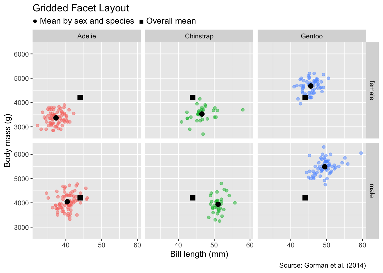
Compared with the single-category version in Figure 12.2, we see that, for all species, males tend to have longer bills and heavier masses than females.
12.3 Conclusion
Faceting is a useful option for visualizing data partitioned into groups defined by one or two categorical variables. It creates small multiples, which can reduce the clutter of non-faceted plots. For data split by a single categorical variable, use facet_wrap(), whereas facet_grid() is more suitable when grouping by combinations of two categorical variables. Both functions allow adding anchor points or lines to the panels, facilitating comparisons across groups. Despite these advantages, faceting should not be applied indiscriminately because the spatial separation between panels can impede comparisons between groups.