While scales provide a mapping from data values to a perceivable aesthetic value, guides perform the inverse mapping. That is, guides enable the user to infer the data value from the displayed aesthetic value. The most commonly used guides are coordinate axes and legends.
Guides can be adjusted using the guides() function, which accepts functions of the guide_*() family as arguments. The most important members of this family are guide_axis(), guide_legend(), guide_colorbar() for continuous color scales, and guide_colorsteps() for binned color scales.
This chapter will show how to use the guides() function for the following purposes:
Section 10.4: Reverse the direction in which legend values are sorted
Furthermore, as Section 10.5 illustrates, it can occasionally be useful to adjust the aesthetic mappings of legend symbols to improve the readability of a plot.
10.1 Changing Axis Positions
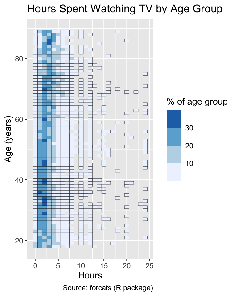
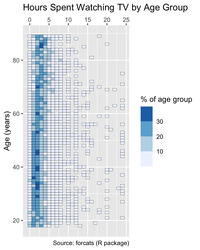
Sometimes, it is desirable to change the position of the axes in a plot, which can be achieved by setting the position argument of the guide_axis function. For example, if the title of a plot can also serve as the title of the x-axis, it is beneficial to move the x-axis to the top of the plot. One such case is the plot of the hours spent watching TV by age group, created in Section 9.3.1. The version plotted on the left below needlessly repeats the word “Hours” in the titles of both the plot and the x-axis. The version on the right creates more space below the plot by moving the x-axis to the top and removing the x-axis title, using the title = NULL argument of the guide_axis() function:
Use guide_axis() to customize coordinate axes (e.g., by changing axis positions or titles).
tv<-gss_cat|>drop_na(age, tvhours)|>count(age, tvhours, name ="group_size")|>mutate( cohort_size =sum(group_size), pct =100*group_size/cohort_size, .by =age)gg_tv<-ggplot(tv, aes(x =tvhours, y =age, fill =pct))+geom_tile(color ="black")+labs( x ="Hours", y ="Age (years)", fill ="% of age group", title ="Hours Spent Watching TV by Age Group", caption ="Source: forcats (R package)")+scale_fill_fermenter(palette ="Blues", direction =1)gg_tvgg_tv+guides(x =guide_axis(title =NULL, position ="top"))
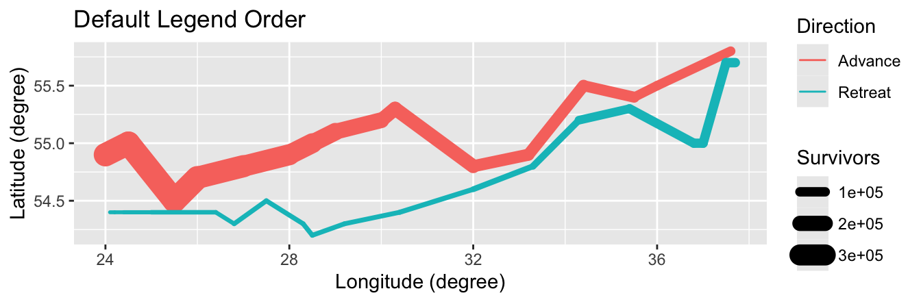
10.2 Order of the Legends
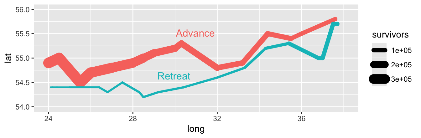
If multiple legends are present in a plot, it is difficult to predict the order in which they will be placed. For instance, let us consider again the path of the French main army during Napoleon’s Russian campaign, which we visualized in Section 8.2.2. In this case, the color legend is plotted above the line-width legend by default:
library(HistData)army_1<-Minard.troops|>filter(group==1)|># Only trace the main armymutate(direction =fct_recode(direction, Advance ="A", Retreat ="R"))gg_army_1<-ggplot(army_1, aes(long, lat, linewidth =survivors, color =direction))+geom_path(lineend ="round")+labs( x ="Longitude (degree)", y ="Latitude (degree)", color ="Direction", linewidth ="Survivors")gg_army_1+labs(title ="Default Legend Order")
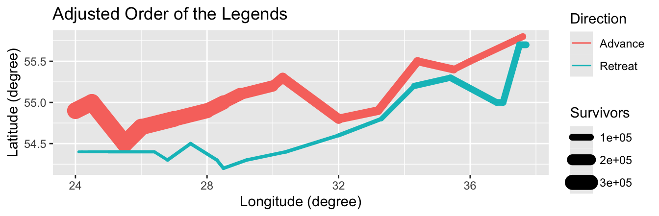
To change the order of the legends, we can use the order argument available for all guide_*() functions. The argument value can be either 0, which is the default, or a positive integer less than 99. If the value equals 0, then ggplot2 chooses the position of the legend on behalf of the user. Otherwise, the larger the value of order, the more likely the legend is moved to the bottom. The following plot demonstrates this effect:
Use the order argument of guide_*() functions to adjust the order of legends. Argument values range from 1 to 99, where larger values move the legend further down.
gg_army_1+labs(title ="Adjusted Order of the Legends")+guides( color =guide_legend(order =99), linewidth =guide_legend(order =1))
10.3 Removing a Legend
Occasionally, legends are superfluous and ought to be omitted from the plot. This situation arises especially when direct labeling is applied, as illustrated by the examples in Section 7.3.4 and Section 8.3.2. For instance, in the plot of the French invasion of Russia in 1812, the following code replaces the color legend with direct labels. To remove the color legend, set the color argument of the guides() function is set to "none". Similarly, other legends can be removed by setting the corresponding argument (e.g., linewidth, shape, etc.) to "none":
Legends can be removed by passing "none" to the corresponding guides() argument.
gg_army_1_direct<-ggplot(army_1, aes(long, lat, color =direction))+geom_line(aes(linewidth =survivors), lineend ="round")+directlabels::geom_dl(aes(label =direction), method ="smart.grid")+xlim(24, 38)+ylim(54, 56)+guides(color ="none")gg_army_1_direct
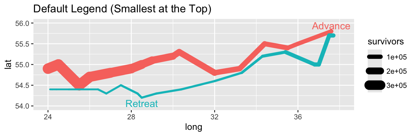
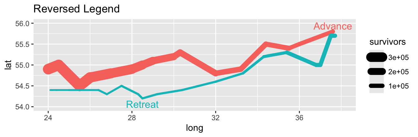
10.4 Reversing the Legend Directions
When displaying a legend for the symbol size or line width, ggplot2 places the smallest value at the top and the largest value at the bottom. Considering that the conventional direction of the y-axis is the opposite (i.e., increasing from the bottom to the top), one might argue that this default behavior is counterintuitive. For greater consistency, it is possible to reverse the order of the legend symbols using the reverse argument of the guide_legend() function.
Use the reverse argument of a guide_*() function to reverse the order of legend symbols, placing the largest value at the top.
The first plot below shows the default legend, with the smallest values at the top, whereas the second plot reverses the legend, placing the largest values at the top:
gg_army_1_direct+labs(title ="Default Legend (Smallest at the Top)")gg_army_1_direct+labs(title ="Reversed Legend")+guides(linewidth =guide_legend(reverse =TRUE))
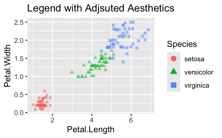
10.5 Overriding the Aesthetics
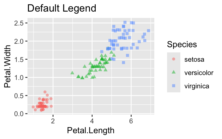
When a plot uses transparency or small symbols to reduce overplotting, it is advisable to adjust the corresponding aesthetic in the legend using the override.aes argument in guide_legend(). The argument must have the format list(aesthetic_1 = value_1, aesthetic_2 = value_2, ...). In the following example, override.aes is used to render the legend symbols fully opaque and increase their size, rendering them easier to read:
Use the override.aes argument of guide_legend() to adjust aesthetics in the legend, such as opacity or symbol size, for improved readability.
Guides are essential plot components, enabling the user to deduce concrete data values from the visual properties. Most guides take the form of coordinate axes or legends. In this chapter, we learned how to customize both guide types using ggplot2’s guides() and guide_*() functions. Equipped with this knowledge, you can now change axis positions, adjust the order of legends, remove unnecessary legends, reverse the direction of legend values, and override aesthetic mappings in legends if it improves readability.
10.7 Exercise
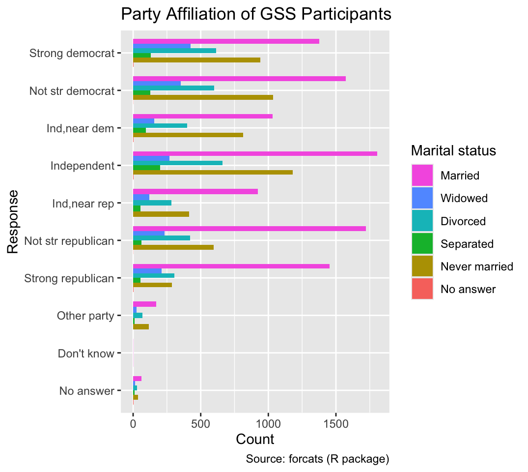
The fill legend in Figure 7.3 is sorted in the opposite order than the bars. For example, “Married” is at the bottom of the legend but at the top of the bars. Change the order of the legend to match the order of the bars, as shown in Figure 10.1:
Figure 10.1: Dodged bar chart with the color legend of Figure 7.3 reversed.