[1] "white"         "aliceblue"     "antiquewhite"  "antiquewhite1"
[5] "antiquewhite2" "antiquewhite3"8 Aesthetic Mappings
In the previous chapters, you learned that aesthetic mappings in ggplot2 are applied through the use of the aes() function. Most geoms—such as geom_point(), geom_path(), and geom_line()—require a mapping from data values to x-coordinates and y-coordinates. This chapter provides an overview of the most important other types of aesthetic mappings in data visualization:
- Color (Section 8.1)
- Size (Section 8.2)
- Shape and line type (Section 8.3)
- Aesthetic mappings for all or for individual geoms in a plot (Section 8.4)
- Geom-specific arguments instead of aesthetic mapping (Section 8.5)
- Statistical weights attributed to individual data points (Section 8.6)
- Assignment of data points to groups (Section 8.7)
8.1 Color
Color perception is an integral part of how we experience the world around us. Nature uses colors to signal attractiveness and warnings. Similarly, thoughtful use of colors in data visualization can optimize communication with the audience.
R recognizes 657 colors by name, listed by the colors() function:
Several websites, such as Kyle W. Brown’s “Colors in R”, display the color names alongside the color.
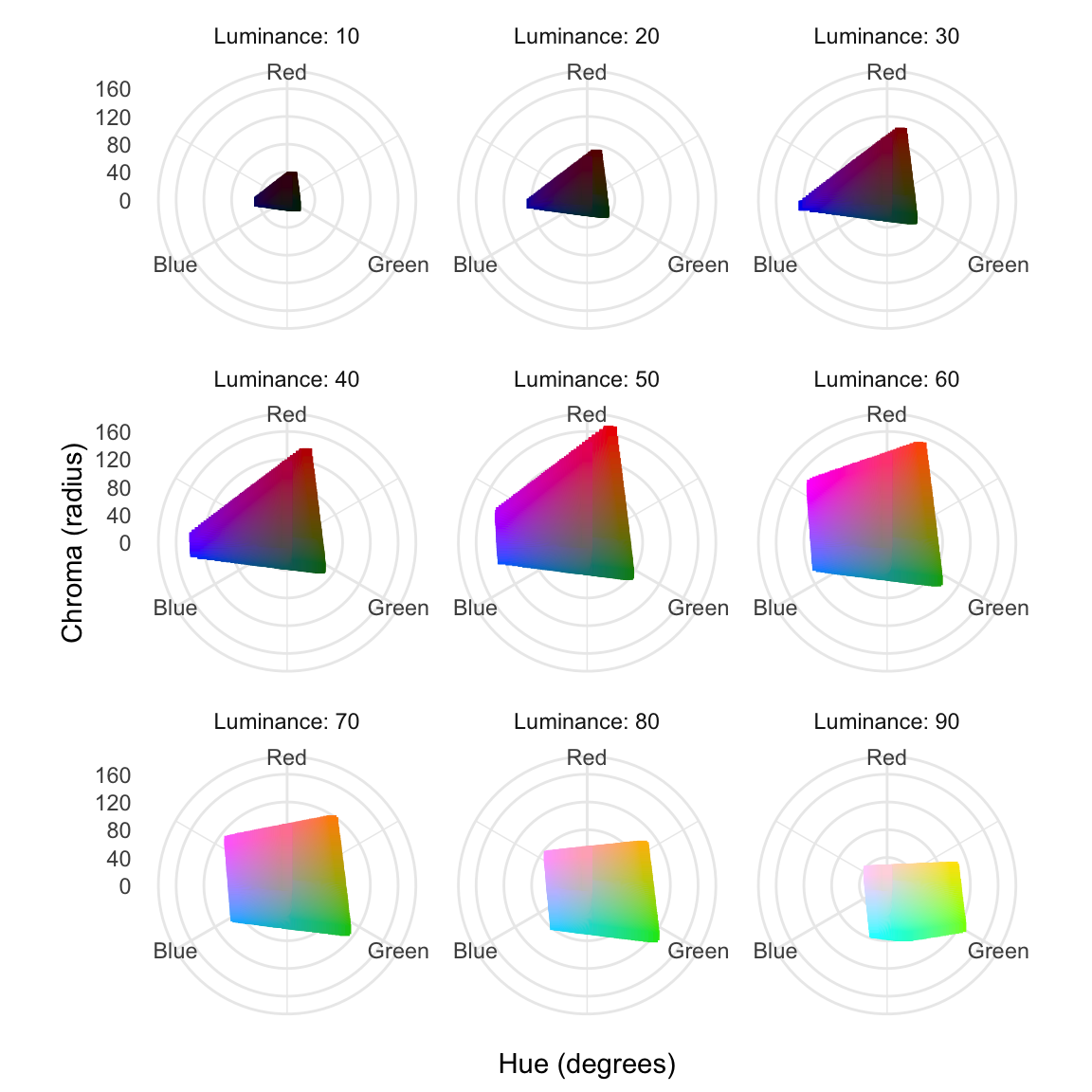
Although it is enjoyable to mix and match one’s own combination of colors, the result usually appears haphazard and suboptimal. A more principled approach is based on the use of color models, such as hue-chroma-luminance (HCL), where the name-giving properties are defined as follows (Fairchild, 2013, pp. 88–90):
The hue-chroma-luminance (HCL) color model provides a principled approach to quantifying subjective color perception.
- Hue:
- The hue is the dominant pure color—after removing any mixture with white, gray, or black—of an object, such as red, green, or blue. Hues can be arranged in a circle and measured as an angle with red at 0°, green at 120°, and blue at 240° as shown in Figure 8.1.
- Chroma:
- Chroma is the absence of white, gray, or black from a color. The higher the chroma, the stronger the perception of vividness. The maximum chroma of a color depends on hue and luminance, as indicated in Figure 8.1.
- Luminance:
- Luminance is the the wavelength-weighted power emitted per unit area of light travelling in a given direction, expressed as percentage of the intensity of a perfectly white light source.
Although this chapter will not dwell on the parameterization of the HCL model, we will refer to the terms hue, chroma, and luminance when discussing color palettes.
The appropriate use of color in data visualization is a complex topic, frequently resulting in poor choices. Section 8.1.1 will discuss the choice of colors for categorical data, while Section 8.1.2 will address under which conditions quantitative variables can be meaningfully mapped to colors.
8.1.1 Colors for Categorical Data
Although almost all categorical variables can, in principle, be mapped to color, the choice of palette depends on whether the data are nominal (unordered) or ordinal (ordered). We will examine these cases in Section 8.1.1.1 and Section 8.1.1.2, respectively. Ideally, ordinal data should be represented as ordered factors (see Section 4.10.6). However, you may occasionally encounter ordinal values stored as plain factors or character vectors. In such situations, convert them to ordered factors by passing ordered = TRUE to the factor() function.
8.1.1.1 Unordered Categories
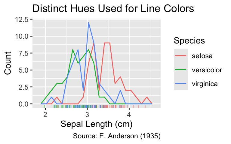
If categories are unordered, the hues used to represent them should be distinct from one another. When an unordered categorical variable belongs to the factor class, ggplot2 selects a unique color for each level, choosing evenly spaced colors with high chroma and medium luminance. When provided with a character vector, ggplot2 internally converts it to an unordered factor.
Color is a suitable visual property for the representation of any unordered categorical variable. In that case, select colors with comparable chroma and luminance but clearly distinct hues.
For instance, the following code creates a scatter plot of the iris data set, with the three categories in the Species column mapped to distinct line colors:
ggplot(iris, aes(Sepal.Width, color = Species)) +
  geom_freqpoly(bins = 20) +
  geom_rug(
    aes(y = 0),
    position = position_jitter(height = 0),
    alpha = 0.5,
    sides = "b"
  ) +
  labs(
    x = "Sepal Length (cm)",
    y = "Count",
    title = "Distinct Hues Used for Line Colors",
    caption = "Source: E. Anderson (1935)"
  )
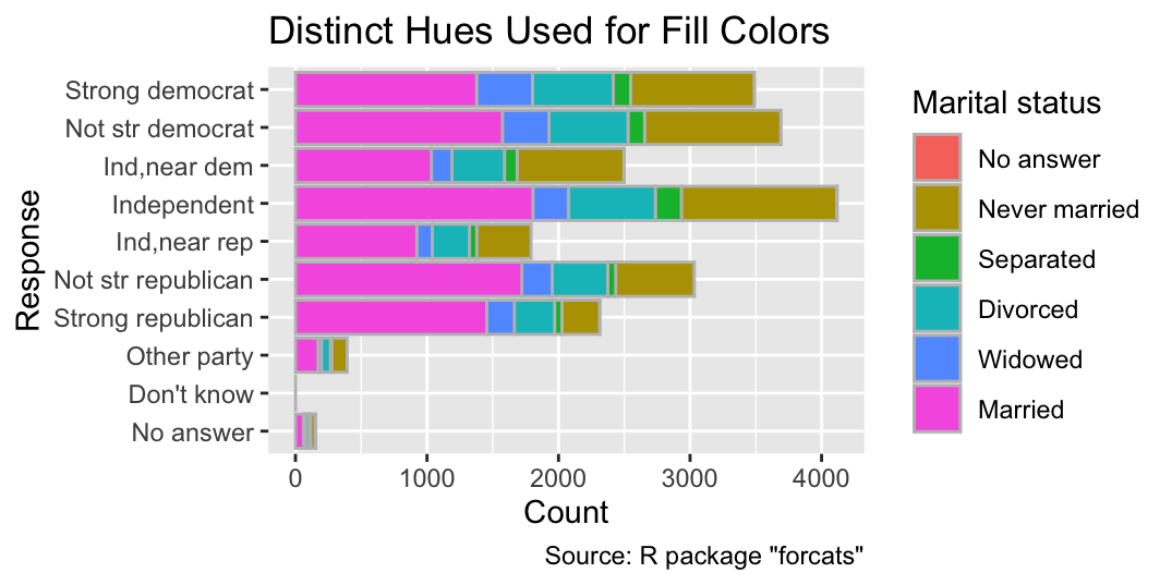
Similarly, the six different categories of marital status in the General Social Survey are plotted as six evenly spaced colors in the following example:
ggplot(gss_cat, aes(y = partyid, fill = marital)) +
  geom_bar(color = "gray", width = 0.75) +
  labs(
    x = "Count",
    y = "Response",
    fill = "Marital status",
    title = "Distinct Hues Used for Fill Colors",
    caption = 'Source: R package "forcats"'
  )
Although ggplot2’s default palette is adequate for exploratory data analysis, the ColorBrewer project provides better choices for production-quality plots. ColorBrewer palettes and their implementation in ggplot2 will be discussed in Section 9.3.
8.1.1.2 Ordered Categories
While colors for unordered categories should have distinct hues, palettes for ordinal data should exhibit an intuitive progression from low to high. By default, ggplot2 uses a palette progressing in hue from blue to yellow and from low to high luminance, keeping the chroma consistently high. An example can be seen in the following plot, visualizing the cut quality of diamonds. This plot illustrates that most diamonds have a medium clarity of SI1 (Slightly Included to the 1st degree). Diamonds of the highest clarity IF (Internally Flawless) in the data set tend to have better cuts than those of lowest clarity I1 (inclusions visible to the naked eye):
When visualizing ordinal data, use a palette that is gradually changing in luminance.
ggplot(diamonds, aes(y = clarity, fill = cut)) +
  geom_bar(color = "gray") +
  labs(
    x = "Count",
    y = "Clarity",
    fill = "Cut",
    title = "Diamond Quality",
    caption = 'Source: R package "ggplot2"'
  )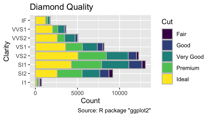
Note that ggplot2 chooses this palette because cut is encoded as an ordered factor:
is.ordered(diamonds$cut)[1] TRUENot all ordinal categorical variable can be meaningfully represented by color. In particular, cumulative properties—such as abundance on a three-point scale (“rare – occasional – frequent”)—are ill-suited to color, since perception of hue or saturation doesn’t scale with magnitude. Ideally, you would express such observations directly using quantitative instead of ordinal variables. Instead, reserve color for intrinsic characteristics of individual data points—such as diamond cut quality in the earlier illustration. The reason is that color perception is independent of the magnitude of the colored object. For example, a red circle does not appear more red when it is larger.
Only use color for ordinal data if each value represents an intrinsic property of each individual data point.
8.1.2 Colors for Quantitative Data
Similar to ordinal data, colors can be used for some but not all quantitative variables. To be suitable for aesthetic mapping, the data must be intensive. That is, the quantities can be reasonably expected to be independent of the number or data points. For other quantitative data, symbol size or line width might be used instead, as discussed in Section 8.2.
A quantitative variable should only be mapped to color if the data are intensive. That is, the expectation value is independent of system size.
To understand the distinction between intensive and non-intensive variables, let us consider the columns of the gss_cat tibble. The income of an individual participant in the General Social Survey is an example of an intensive variable because it does not depend on the number of participants. Similarly, the mean income of all Republican party members is intensive because, assuming that survey participants form a representative sample of the U.S. population, the expectation value of the sample mean is independent of the number of Republican survey participants. Furthermore, the percentage of participants earning less than $1,000 is intensive. In contrast, the number of Republicans and the total income in the participant pool are non-intensive variables because their expectation values increase with the number of participants.
Colors share an important feature with intensive variables: an ensemble of multiple, identically colored objects has the same color as the individual objects. For instance, one green point is just as green as the combination of a thousand green points. Therefore, colors can be more intuitively linked to intensive rather than non-intensive quantities. In many applications, non-intensive variables can be converted into intensive variables by normalization (e.g., dividing one additive variable by another).
For example, let us visualize the relationship between the age of participants in the General Social Survey and the number of hours per day they spent watching television, stored in the tvhours column of gss_cat. As a first step, you may count the number of observations for each combination of age and tvhours:
tv <-
  gss_cat |>
  drop_na(age, tvhours) |>
  count(age, tvhours, name = "count")
tv
# A tibble: 868 × 3
age tvhours count
<int> <int> <int>
1 18 0 7
2 18 1 12
3 18 2 7
4 18 3 10
5 18 4 4
6 18 5 4
7 18 7 1
8 18 13 1
9 19 0 18
10 19 1 32
# ℹ 858 more rowsYour first instinct might be to use color to represent the count variable, with age and tvhours mapped to spatial coordinates. However, count is a non-intensive variable because a survey with twice as many participants would be expected to result in twice as many counts for each group. Therefore, color is unsuitable to represent count. Instead, area could be used as a visual variable. For example, you might apply the geom_count() function, which you encountered in Section 6.1.3.2, directly to gss_cat instead of tv.
However, a slight change of the represented data renders color a meaningful visual property for representing two-dimensional distributions. For instance, an intensive variable can be generated by dividing two variables that both scale in proportion to the number of data points. Hence, you can divide count by the number of participants in each age group to obtain an intensive variable, namely the percentage of television consumption at a specific age:
tv <- mutate(
  tv,
  cohort_size = sum(count),
  pct = (count / cohort_size) * 100,
  .by = age
)
tv
# A tibble: 868 × 5
age tvhours count cohort_size pct
<int> <int> <int> <int> <dbl>
1 18 0 7 46 15.2
2 18 1 12 46 26.1
3 18 2 7 46 15.2
4 18 3 10 46 21.7
5 18 4 4 46 8.70
6 18 5 4 46 8.70
7 18 7 1 46 2.17
8 18 13 1 46 2.17
9 19 0 18 135 13.3
10 19 1 32 135 23.7
# ℹ 858 more rowsNow, the fill aesthetic can be used for the pct column:
ggplot(tv, aes(x = tvhours, y = age, fill = pct)) +
  geom_tile(color = "gray") +
  labs(
    x = "Hours",
    y = "Age (years)",
    fill = "% of age group",
    title = "Hours Spent Watching TV by Age Group",
    caption = 'Source: R package "forcats"'
  )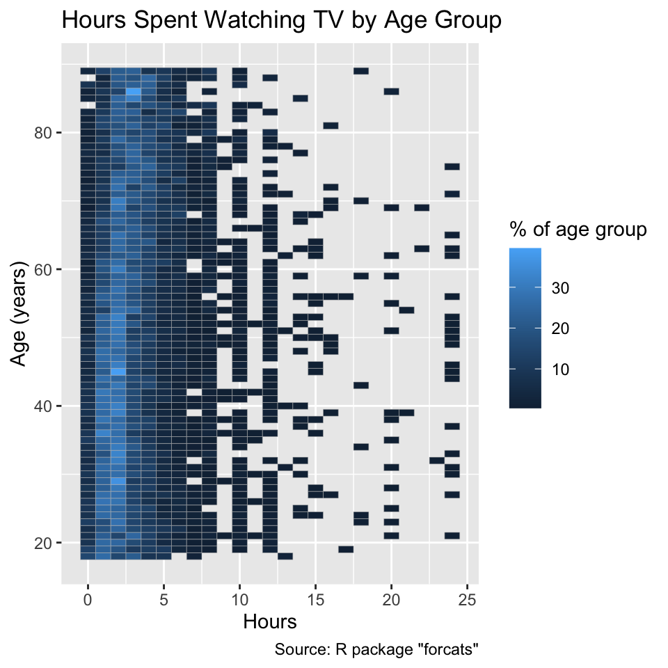
This plot indicates that the number of hours spent watching television is distributed similarly across all age groups. By default, ggplot2 uses a continuous palette with a gradient in luminance, but keeping hue and chroma nearly constant, for representing quantitative data. While the chosen palette is not ideal, it is sufficient for exploratory data analysis. You will be equipped with better choices when we discuss the ColorBrewer palettes in Section 9.3.
8.1.3 Section Summary: Color
This section has pointed out good practices for using color in data visualization. Color can be used for categorical and quantitative data with several caveats.
If the data are categorical, the type of palette depends on whether the data are nominal (unordered) or ordinal (ordered). In the unordered case, each hue should be clearly distinct. If the data are ordinal, color should only be used to represent intrinsic properties of individual observations rather than properties obtained by counting or adding individual values. Furthermore, for ordinal data, a progression of discrete colors, representing a gradient in luminance, should be used.
If the data are quantitative, color should be used only if the variable is intensive. That is, the quantity should not depend on the number of data points.
Although ggplot2’s default palettes are adequate for exploratory data analysis, they are not optimized for user-friendliness. In Section 9.3, you will learn how to change the palettes using ggplot2’s scale_*() functions.
8.2 Size
The size of a plotted element effectively conveys quantitative variables that are extensive—that is, variables whose value for each unit equals the sum of nonnegative values associated with its subunits. Examples of such variables include population or gross domestic product (GDP) by country, which are the sums of the population or GDP of the country’s administrative units, respectively. In contrast, normalized variables, such as population density (expressed as people per square kilometer) or per-capita GDP, are intensive and are better represented using color, as discussed in Section 8.1.2, rather than using size or line width.
Size (e.g., of points and text as well as line width), can be mapped meaningfully only to extensive variables. That is, the data must be the sum of nonnegative quantities associated with subunits.
This section demonstrates how to map a column of a data frame to the size of point symbols and text (Section 8.2.1), as well as the width of lines (Section 8.2.2). However, please note that ggplot2 typically uses unsuitable default scales for size and line width. You will learn how to correct this issue in Section 9.4.
8.2.1 Sizes of Point Symbols and Text
For mapping of an extensive variable to the sizes of point symbols and text, consider the following country-level data stored in the gapminder tibble from the gapminder package:
# A tibble: 1,704 × 6
country continent year lifeExp pop gdpPercap
<fct> <fct> <int> <dbl> <int> <dbl>
1 Afghanistan Asia 1952 28.8 8425333 779.
2 Afghanistan Asia 1957 30.3 9240934 821.
3 Afghanistan Asia 1962 32.0 10267083 853.
4 Afghanistan Asia 1967 34.0 11537966 836.
5 Afghanistan Asia 1972 36.1 13079460 740.
6 Afghanistan Asia 1977 38.4 14880372 786.
7 Afghanistan Asia 1982 39.9 12881816 978.
8 Afghanistan Asia 1987 40.8 13867957 852.
9 Afghanistan Asia 1992 41.7 16317921 649.
10 Afghanistan Asia 1997 41.8 22227415 635.
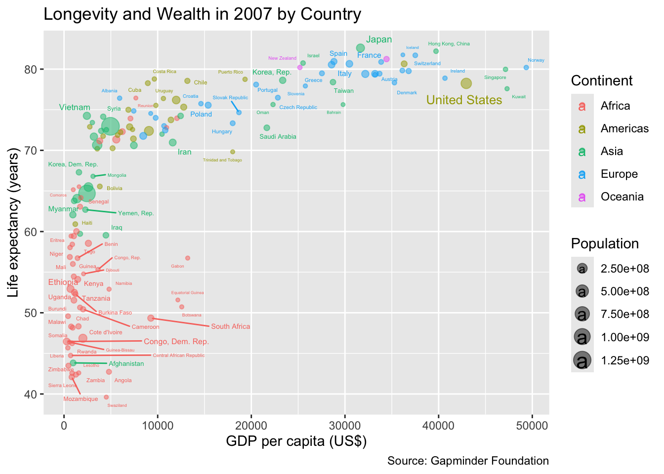
# ℹ 1,694 more rowsLet us create a scatter plot, in which GDP per capita and life expectancy are represented by the x-coordinate and y-coordinate, respectively. Sizes of circular point symbols and country labels will correspond to the population of each country. Please note that population is an extensive variable and, consequently, suitable for being mapped to the size aesthetic. In contrast, continent is an unordered categorical variable and can, thus, be mapped to color, but it should not determine the size of the points. If you attempt to do so, ggplot2 will issue a warning.
Please note that the warning issued by the following code is not caused by the choice of aesthetic mappings. Instead it stems from a lack of space for the country labels. Let us ignore this problem right now; it could be fixed by abbreviating or suppressing some labels:
ggplot(
  filter(gapminder, year == 2007),
  aes(
    gdpPercap,
    lifeExp,
    color = continent,
    size = pop,
    label = country
  )
) +
  geom_point(alpha = 0.5) +
  ggrepel::geom_text_repel() +
  labs(
    x = "GDP per capita (US$)",
    y = "Life expectancy (years)",
    color = "Continent",
    size = "Population",
    title = "Longevity and Wealth in 2007 by Country",
    caption = "Source: Gapminder Foundation"
  )
8.2.2 Line Width
Similar to the size aesthetic, linewidth can represent a statistical variable meaningfully only if is is extensive. For instance, the following code chunk replicates a feature from a famous map by Minard (Rendgen, 2018) depicting Napoleon’s Russian campaign, where the line width indicates the number of surviving soldiers in the French army. Additionally, color is used to indicate whether the troops were advancing (A) or retreating (R). For simplicity, longitude and latitude are mapped to x-coordinate and y-coordinate, respectively, which is not ideal; instead, a map projection should be used, as will be discussed in Section 14.3:
army_1 <- filter(
  HistData::Minard.troops,
  group == 1 # Only trace the main army
)
head(army_1)
long lat survivors direction group
1 24.0 54.9 340000 A 1
2 24.5 55.0 340000 A 1
3 25.5 54.5 340000 A 1
4 26.0 54.7 320000 A 1
5 27.0 54.8 300000 A 1
6 28.0 54.9 280000 A 1ggplot(army_1, aes(long, lat, linewidth = survivors, color = direction)) +
geom_path(lineend = "round") +
labs(
x = "Longitude (degree)",
y = "Latitude (degree)",
color = "Direction",
linewidth = "Survivors",
title = "Main French Army During 1812 Russian Campaign"
)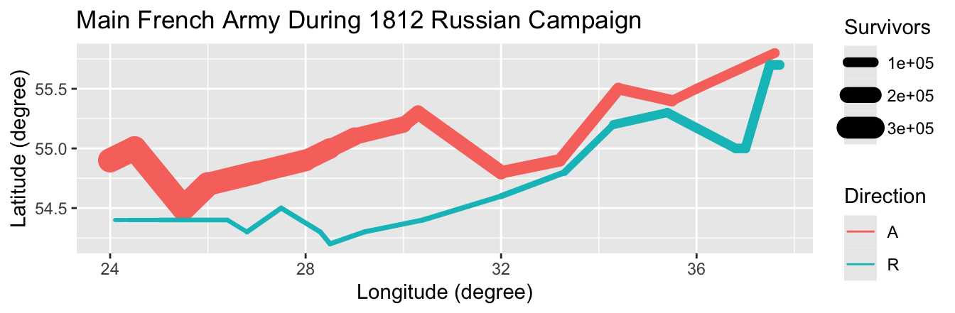
Tufte (1983) praised Minard’s map as “the best statistical graphic ever drawn.” Despite some inaccuracies in the historical data, Minard’s use of line width is indeed exemplary. Line width can also be effectively used in other scenarios, such as representing traffic volume on a road map or depicting trading volume in time series plots of stock market prices.
8.2.3 Section Summary: Size
In this section, you learned how to map extensive variables to the size of point symbols and text, as well as the width of lines. However, ggplot2’s default scales for size and line width are typically unsuitable except for exploratory data analysis. You will learn in Section 9.4 how to scale area and line width correctly in proportion to the numbers they represent. It is also worth noting that not all positive variables increasing with system size are extensive. Instead, they may increase with the square or square root of the system size or in an even more complex manner. In such cases, it is advisable to normalize the variable, for example, by dividing it by the expectation value of a statistical model for an object with comparable attributes. The resulting normalized variable is intensive; hence, color can be employed as an aesthetic.
When dealing with quantitative variables that are neither intensive nor extensive, consider normalizing them by dividing them by their expected value. The result is an intensive variable, suitable for representation using color.
8.3 Shape and Line Type
Data points can be represented by symbols of different shapes (e.g., circles, squares, and crosses) and connected by lines of different types (e.g., solid, dashed, and dotted). Shape and line type are discrete and, hence, unsuitable as a representation of quantitative data, unlike color, size, and line width, which can change continuously. Additionally, neither shape nor line type can be meaningfully sorted and, consequently, should not be used for ordinal data either.1 However, as demonstrated in this chapter, shape and line type are useful for representing unordered categorical data, either alone or in combination with color.
Shape and line type can be mapped meaningfully only to unordered categorical variables.
8.3.1 Shapes of Point Symbols
For the use of shape as an aesthetic, consider the crown_rad data frame from the likelihood package. It contains fictitious data for diameter at breast height (DBH) and radii for three tree species:
library(likelihood)
glimpse(crown_rad)
Rows: 99
Columns: 3
$ DBH <dbl> 1.2, 29.9, 28.9, 6.5, 15.4, 34.1, 7.0, 1.0, 36.4, 18.0, 11.0, …
$ Species <int> 1, 1, 1, 1, 1, 1, 1, 1, 1, 1, 1, 1, 1, 1, 1, 1, 1, 1, 1, 1, 1,…
$ Radius <dbl> 0.70, 3.78, 2.92, 1.10, 1.90, 3.57, 1.58, 0.20, 3.70, 2.70, 2.…Trying to map Species to shape throws an error because, while Species is a categorical variable, it is implemented as an integer:
gg_crown_rad <- function(data, mapping) {
  library(ggplot2)
  ggplot(data, mapping) +
    geom_point() +
    labs(
      x = "Diameter at breast height (cm)",
      y = "Crown radius (m)",
      shape = "Species",
      title = "Measurements of Three Tree Species",
      caption = 'Source: R package "likelihood"'
    )
}
gg_crown_rad(crown_rad, aes(DBH, Radius, shape = Species))
Error in `geom_point()`:
! Problem while computing aesthetics.
ℹ Error occurred in the 1st layer.
Caused by error in `scale_f()`:
! A continuous variable cannot be mapped to the shape aesthetic.
ℹ Choose a different aesthetic or use `scale_shape_binned()`.To fix this issue, Species should be converted to a factor:
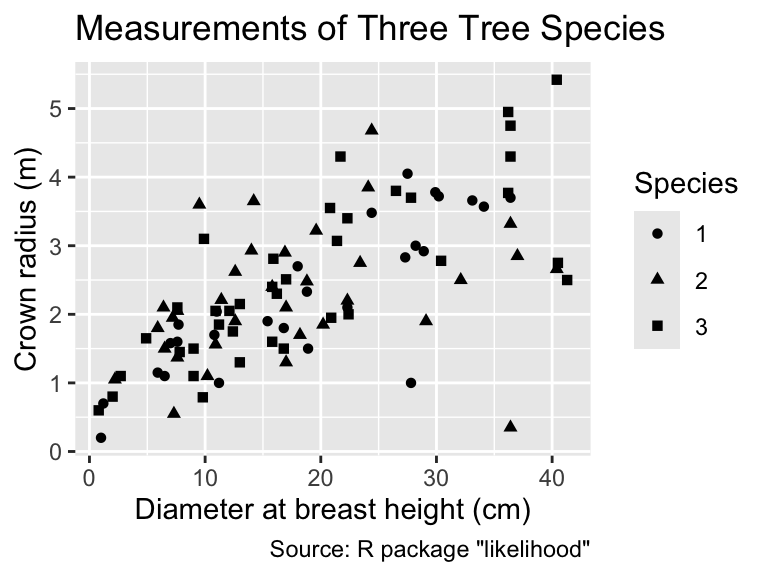
Although it is possible, in principle, to extract information about the species from the shape of each point, detecting overall differences between the species solely based on the symbol shapes is challenging. Therefore, when shape represents a categorical variable, it is often beneficial for readability to map the categories additionally to color. Although redundant mapping to two categories should usually be avoided, shape and color generally work well together. Differences in color are easier to spot but differences in shape can assist the colorblind or when the plot is printed in black and white:
Mapping the same categorical variable to color and shape can often improve readability.
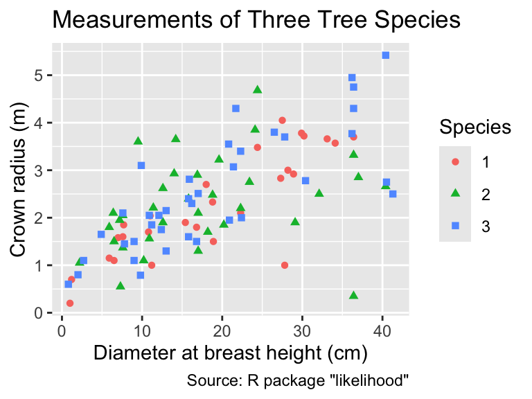
This plot demonstrates that ggplot2 combines the information about color and shape into a single legend rather than two separate legends, one for each aesthetic mapping, if the same categorical variable is mapped to both.
8.3.2 Line Type
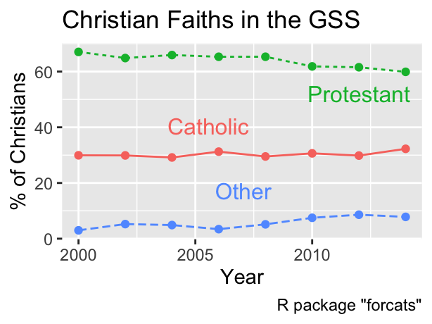
Line type refers to the visual pattern of a line, such as being solid, dashed, or dotted. Similar to the shape aesthetic for point symbols, the line-type aesthetic can be employed to distinguish between unordered categories, but it should not be used for ordinal or quantitative data. In the following plot, which displays the percentage of Christians in the General Social Survey identifying as Protestant, Catholic, or followers of another faith over time, different line types are used to represent the faiths of the participants:
gss_christian <-
  gss_cat |>
  filter(
    relig %in% c(
      "Inter-nondenominational",
      "Christian",
      "Orthodox-christian",
      "Catholic",
      "Protestant"
    )
  ) |>
  mutate(relig = fct_other(relig, keep = c("Protestant", "Catholic"))) |>
  count(year, relig, name = "count") |>
  mutate(
    pct = (count / sum(count)) * 100,
    .by = year
  )
gg_christian_aes <- function(...) {
  library(ggplot2)
  ggplot(
    gss_christian,
    aes(year, .data$pct, linetype = .data$relig, ...)
  ) +
    geom_point() +
    geom_line() +
    labs(
      x = "Year",
      y = "% of Christians",
      linetype = "Responses",
      title = "Christian Faiths in the GSS",
      caption = 'R package "forcats"'
    )
}
gg_christian_aes()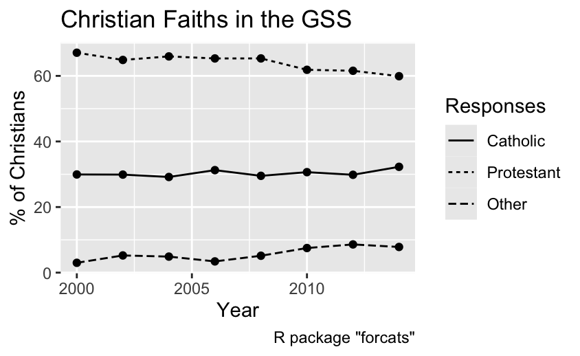
Similar to the shape aesthetic, incorporating color as a redundant aesthetic in conjunction with the line type can enhance readability. Additionally, directly labeling the lines facilitates matching the lines with the corresponding categories, rendering the legend unnecessary. Consequently, the following code chunk removes the legend using the guides() function, as will be explained in Section 10.3:
As for shape, it is also advisable to map line type additionally to color for improved readability.
8.3.3 Section Summary: Shape and Line Type
This section demonstrated how point shape and line type can be used for mapping categorical data. While theoretically redundant, mapping the same categorical variable also to color can improve readability in practice. In this case, ggplot2 combines as many aesthetic mappings as possible into a single legend. If space permits it, direct labeling of points or lines may eliminate the need for a legend altogether.
8.4 Aesthetic Mappings for All and for Individual Geoms
In most of the previous examples, the aes() function was used as an argument inside the ggplot() function. However, it is also possible to specify the mappings inside any geom_*() function. To demonstrate the difference, consider the following example:
dfr <- tribble(
  ~x, ~y, ~class, ~word,
  0, -1, "i", "1. This",
  2, 2, "i", "2. That",
  1, -2, "ii", "3. Other",
  3, 0, "ii", "4. Same",
  1, 1, "iii", "5. Different"
)
dfr <- tibble(
  x = c(0, 2, 1, 3, 1),
  y = c(-1, 2, -2, 0, 1),
  class = c("i", "i", "ii", "ii", "iii"),
  word = c("1. This", "2. That", "3. Other", "4. Same", "5. Different")
)
Let us create a scatter plot with points and text labels, mapping class to color. If the color = class argument appears in the ggplot() function, all subsequent geoms will map class to color. Consequently, both points and text are colored in this example:
Aesthetic mappings specified in the ggplot() function apply to all geoms in the plot.
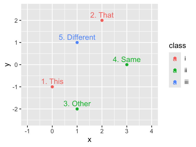
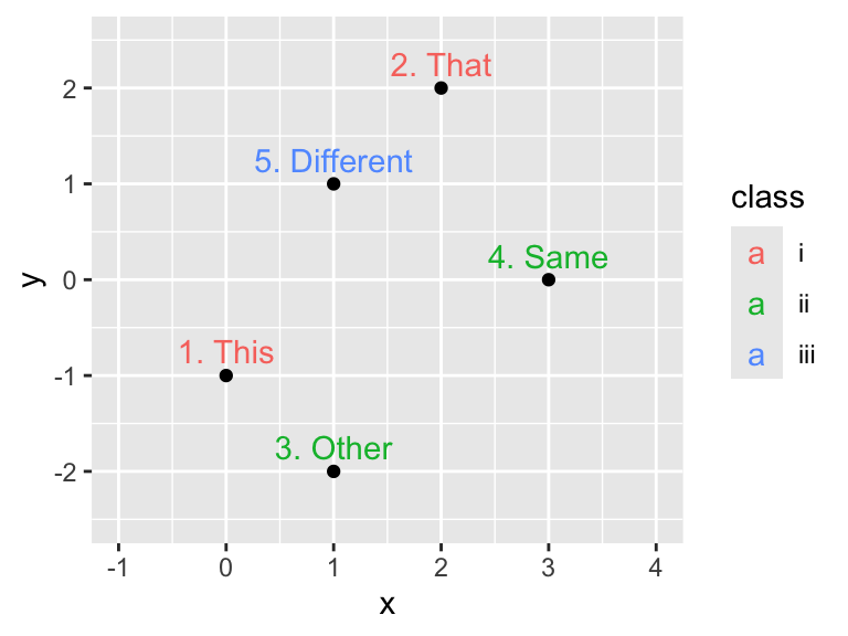
However, if color = class is moved to an aesthetic mapping inside the geom_point() function, only the points will be colored but not the text. Conversely, if color = class is moved to geom_text(), only the text will be colored but not the points:
Aesthetic mappings specified in the geom_*() functions apply only to the respective geoms.
ggplot(dfr, aes(x, y, label = word)) +
  geom_point(aes(color = class)) + # Color mapping in geom_point()
  geom_text(nudge_y = 0.25) +
  xlim(-1, 4) +
  ylim(-2.5, 2.5)
ggplot(dfr, aes(x, y, label = word)) +
  geom_point() +
  geom_text(
    aes(color = class), # Color mapping in geom_text()
    nudge_y = 0.25
  ) +
  xlim(-1, 4) +
  ylim(-2.5, 2.5)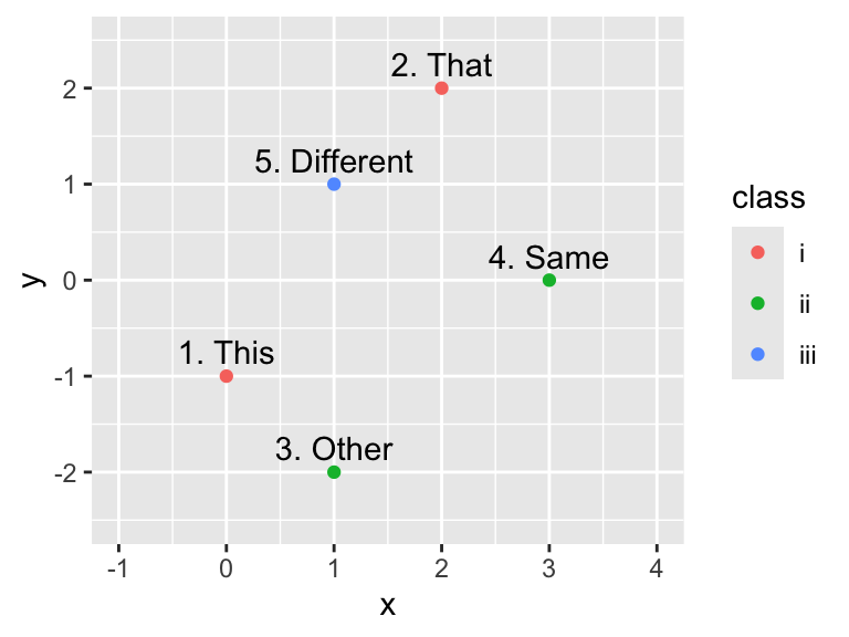
While the changes in the previous example appear to be subtle, moving an aesthetic mapping from the plot level to the geom level can have a significant impact on the plot. For example, consider the following two scatter plots of Anderson’s iris data in which the points are jittered, color is mapped to species, and geom_smooth() is called. In the first plot, color = Species is specified in geom_jitter() but not in geom_smooth(), and the result is a single trend curve. In the second plot, color is mapped to Species inside ggplot(); thus, this mapping applies to both geom_jitter() and geom_smooth(), forcing ggplot2 to draw three differently colored trend curves, one for each species:
iris_labs <- function(iris_title) {
  ggplot2::labs(
    x = "Sepal Width (cm)",
    y = "Petal Width (cm)",
    title = iris_title,
    caption = "Source: E. Anderson (1935)"
  )
}
ggplot(iris, aes(Sepal.Width, Petal.Width)) +
  geom_jitter(
    aes(color = Species), # Color mapping in geom_jitter()
    alpha = 0.5,
    size = 0.5
  ) +
  geom_smooth() +
  iris_labs("Color Mapped Only to Jitter Geom")
ggplot(
  iris,
  aes(Sepal.Width, Petal.Width, color = Species) # Color mapping in ggplot()
) +
  geom_jitter(alpha = 0.5, size = 0.5) +
  geom_smooth() +
  iris_labs("Color Mapped to All Geoms")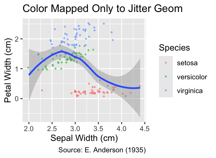
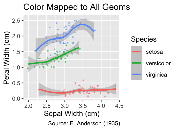
These two plots exemplify a general rule, applicable to geoms that summarize data, such as the trend curves computed by geom_smooth(). If any aesthetic mapping to a categorical variable is instantiated, regardless whether inside ggplot() or the geom_() function itself, the geom will produce a separate summary for each level of the categorical variable. If this feature is undesired by the user, the mapping should be moved from the ggplot() function to the non-summarizing geoms, such as geom_jitter().
8.5 Geom-Specific Arguments versus Aesthetic Mappings
Many geoms can accept equally named arguments either inside or outside the aes() function. If the argument is inside aes(), it is treated as an aesthetic mapping, determining the appearance of each constituent part of the geom based on its corresponding data value. However, if the argument is outside aes(), it serves as a geom-specific argument, affecting the appearance of all constituent parts in the same manner, independently of the data.
If a visual property is an argument of aes(), its appearance is determined by the data value. If, instead, it is an argument of the geom, its appearance is uniform across all data values.
For instance, consider a box plot of sepal length for each species in the iris data set. The default fill color of the boxes is white, as the following example proves:
sepal_labs <- function(...) {
  ggplot2::labs(
    x = "Sepal Length (cm)",
    ...,
    caption = "Source: E. Anderson (1935)",
  )
}
ggplot(iris, aes(Sepal.Length, Species)) +
  geom_boxplot() +
  sepal_labs(title = "Default Fill Color")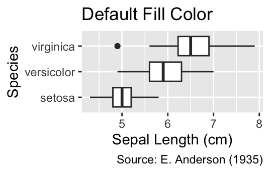
If you want to change the fill color of all boxes to gray, use the fill = "gray" argument inside geom_boxplot() without wrapping it inside aes():
ggplot(iris, aes(Sepal.Length, Species)) +
  geom_boxplot(fill = "gray") +
  sepal_labs(title = "Gray Fill Color")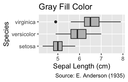
In contrast, when passing the aes(fill = Species) argument to geom_boxplot(), each box will be filled with a different color for each species, and a fill legend is automatically generated:
ggplot(iris, aes(Sepal.Length, Species)) +
  geom_boxplot(aes(fill = Species)) +
  sepal_labs(title = "Mapping Fill Color to Species")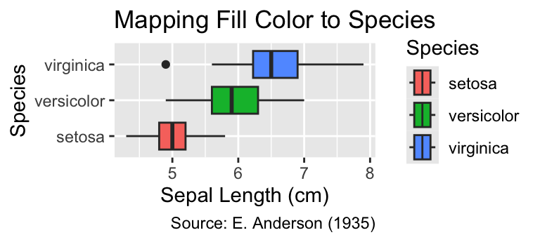
In this plot, the labels on the y-axis already effectively function as a fill legend. Hence, it would be advisable to reduce clutter by removing the added fill legend:
ggplot(iris, aes(Sepal.Length, Species)) +
  geom_boxplot(aes(fill = Species)) +
  sepal_labs(title = "Fill Legend Removed") +
  guides(fill = "none") # Remove fill legend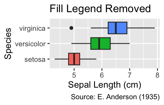
The principle showcased here applies to other geoms and arguments, such as color for the color of the exterior border, alpha for transparency, and size for the size of points and text. If the argument is wrapped inside aes(), it is treated as an aesthetic mapping from data values to visual properties. Otherwise, the argument determines the appearance of all geometric objects created by the geom.
8.6 Weighted Data
So far, all aesthetic mappings have corresponded to visual properties of individual geometric elements, such as position, color, and shape. In contrast, the weight aesthetic is a special case that affects the plot only through the statistical model rather than immediately visible properties. In this context, weight is a measure for the relative importance of each observation for the model output.
The most common use case for the weight aesthetic is curve fitting using the geom_smooth() function. For instance, in the following plot, each point represents a country, and two LOESS curves are fitted as models for the dependence of life expectancy on GDP per capita. The blue curve is fitted by calling geom_smooth() without any additional arguments; as a result, the model weighs all countries equally. In contrast, the black curve weighs countries by their population. Populous countries, such as China, India, and the United States, therefore, exert more influence on the black curve such that it passes nearer to these countries than the unweighted blue curve.
The weight aesthetic assigns relative importance attributed to the data when calculating summary statistics. It is often used when calling geom_smooth to fit a trend curve.
ggplot(filter(gapminder::gapminder, year == 2007), aes(gdpPercap, lifeExp)) +
  geom_point(aes(color = continent, size = pop)) +
  ggrepel::geom_text_repel(
    aes(
      label = if_else(min_rank(-pop) <= 5, country, ""),
      color = continent,
      size = pop
    ),
    max.overlaps = Inf
  ) +
  labs(
    x = "GDP per capita (US$)",
    y = "Life expectancy (years)",
    color = "Continent",
    size = "Population",
    title = "Longevity and Wealth in 2007 by Country",
    caption = "Source: Gapminder Foundation"
  ) +
  geom_smooth(method = "loess") +
  geom_smooth(aes(weight = pop), color = "black", method = "loess")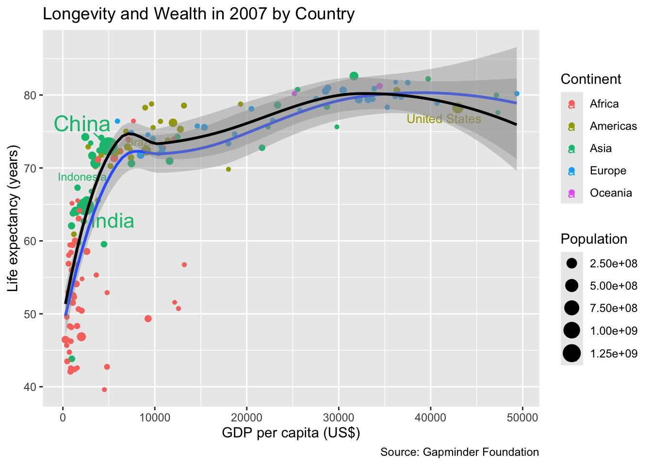
It depends on the application whether weighting is sensible. For instance, if the objective is to predict the life expectancy of a random country not included in the data, an unweighted approach is appropriate. In contrast, if the objective is to model life expectancy of a random person on the planet, a weighted fit makes more sense.
Statistical variables for weighting should be extensive. That is, if a unit represented by one data point is replaced with multiple data points representing its sub-units, the sum of the weights should remain the same. In the example above, the country’s population is extensive because splitting the country into smaller regions (e.g., administrative divisions) does not change the total population although the population in each region is smaller.
Weighting is suitable only for extensive variables.
8.7 Grouped Data
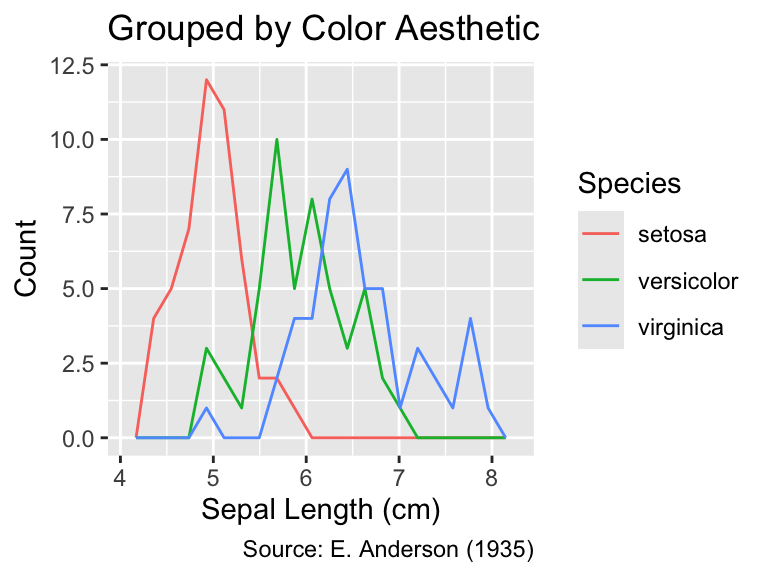
Data are automatically grouped when a categorical variable is mapped using the aes() function. For instance, in the following code, the first call to gg_iris_aes() creates a single frequency polygon. However, when color = Species is added in the subsequent call, this assignment is passed to the aes() function and, consequently, the data are split into separate groups such that three different frequency polygons (one for each species) are generated:
The aesthetic mapping of any categorical data splits the data into groups, causing the display of separate statistical summaries for each group.
gg_iris_aes <- function(...) {
  library(ggplot2)
  ggplot(iris, aes(...)) +
    geom_freqpoly(bins = 20) +
    labs(
      x = "Sepal Length (cm)",
      y = "Count",
      caption = "Source: E. Anderson (1935)",
    )
}
gg_iris_aes(Sepal.Length) +
  labs(title = "Ungrouped")
gg_iris_aes(Sepal.Length, color = Species) +
  labs(title = "Grouped by Color Aesthetic")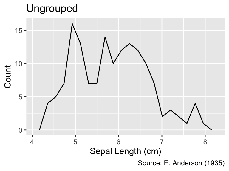
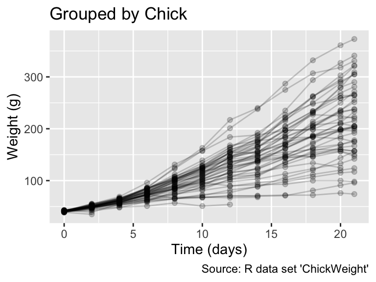
In the previous example, the color mapping resulted in the grouping. Now, let us consider another example to demonstrate where we use the group aesthetic directly. R’s built-in ChickWeight data frame represents a longitudinal study of the impact of different diets on chick body weights. The data frame contains information about the body weights of 50 different chicks, measured every second day from birth until the 20th day, with an additional measurement on day 21. Chicks were divided into four groups, and each group was fed a different protein diet to study the diets’ effects on growth:
head(ChickWeight)Grouped Data: weight ~ Time | Chick
weight Time Chick Diet
1 42 0 1 1
2 51 2 1 1
3 59 4 1 1
4 64 6 1 1
5 76 8 1 1
6 93 10 1 1When plotting the data using geom_line(), the outcome is significantly influenced by whether ggplot() accounts for the diet groups. In the following output, the left plot, which does not group the data, displays a sawtooth pattern connecting the points chronologically by age. In contrast, the right plot, which includes aes(group = Chick), presents a separate line for each chick, offering a clearer view of individual growth patterns. Such visualizations, known as “spaghetti plots” due to their resemblance to tangled strands of pasta, can be effective for visualizing individual trajectories while still communicating the overall trend. Note that, in the code below, weight refers to a specific column in ChickWeight, not to be confused with ggplot2’s weight aesthetic:
The group aesthetic allows grouping data without changing the group’s visual properties.
gg_chick_aes <- function(...) {
  library(ggplot2)
  ggplot(ChickWeight, aes(...)) +
    geom_line(alpha = 0.2) +
    geom_point(alpha = 0.2) +
    labs(
      caption = "Source: R data set 'ChickWeight'",
      x = "Time (days)",
      y = "Weight (g)"
    )
}
gg_chick_aes(Time, weight) + labs(title = "Ungrouped")
gg_chick_aes(Time, weight, group = Chick) + labs(title = "Grouped by Chick")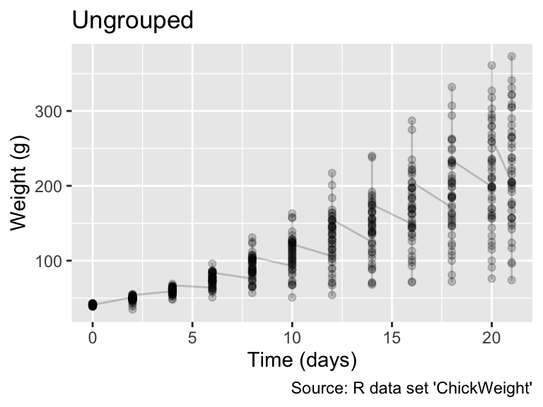
In general, applying a group aesthetic to geom_line(), geom_path(), or geom_smooth() generates a separate polyline (i.e., a group of connected lines) for each group. Opting for group instead of visible aesthetics, such as color or linetype, is advantageous when a plot’s legend would become overcrowded with group labels.
Applying group to line or path geoms creates separate lines for each groups.
8.8 Conclusion
This chapter explored various types of aesthetic mappings in ggplot2. You learned that categorical data can usually be represented by color. If the categories are unordered, hues should be clearly distinct, whereas, for ordinal data, there should be a natural progression in the colors from one level to the next (e.g., from light to dark). When visualizing quantitative data, it is important to determine whether the variable is intensive, extensive, or neither. Intensive variables can be mapped to color, whereas extensive variables can be mapped to size or line width. Shape and line type are suitable for representing only unordered categorical data.
Unlike most other aesthetics, weight and group are not directly mapped to a visual property. Instead, weight is used to determine the importance of data points when plotting statistical summaries, such as trend curves. The group aesthetic is used to group observations, which is useful when you want to connect data belonging to the same group using geom_line() but no lines should be drawn between points in different groups.
In addition to introducing different types of aesthetic mappings, this chapter explained the difference between aesthetic mappings and function arguments passed to geoms outside the aes() function. It also discussed the effect of aesthetic mappings passed to the ggplot() function versus those passed to individual geoms.
Exceptions to this rule exist. For example, if all symbols used in a plot are regular polygons, then they can be sorted by the number of sides. Another example are the star-shaped symbols in sunflower plots (see Section 6.5.1), which can be sorted by the number of arms.↩︎