7 Geoms
The previous chapter showcased the potential of ggplot2 through hands-on examples covering various plot types, including scatter plots, histograms, and box plots. While it is possible to continue exploring ggplot2 without plumbing the depths of the underlying grammar of graphics, creating more complex plots becomes much easier if you’re familiar with its key grammatical terms:
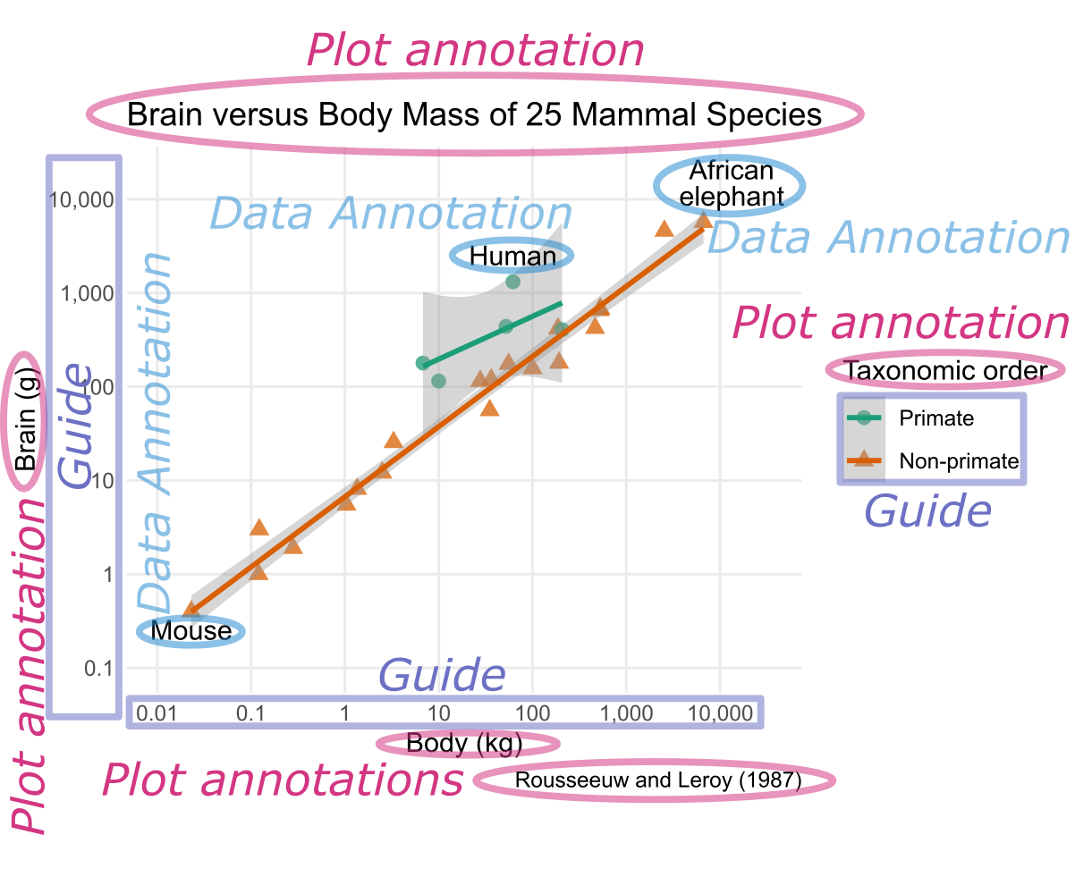
Key grammatical concepts of ggplot2 include geom, aesthetic mapping, annotation, scale, guide, coord, faceting, and theme.
- Geom:
- Geometric object that represents data in the plot. Examples include points, lines, and rectangles.
- Aesthetic mapping, also referred to as “aesthetic” for short:
-
Relationship between a statistical variable and the visual property representing it. For instance, in Figure 7.1, the
xaesthetic is mapped to the body mass, while the taxonomic order is mapped to theshapeaesthetic. - Annotation:
- Textual or graphical element providing background information about the plot or its elements. There are two types: data annotations, which add details about specific geometric elements, and plot annotations, which serve as headers or footers for the entire plot or its parts. For example, the text “Human” in Figure 7.1 is a data annotation, whereas the x-axis label “Body (kg)” in Figure 7.1 is a plot annotation.
- Scale:
- While the aesthetic mapping defines which statistical variable is mapped to which general type of visual property, the scale determines how the variable’s value is translated into a concrete visual representation. For example, the logarithmic x-scale in Figure 7.1 determines the position of a point relative to the plot’s origin based on body mass. Similarly, the shape scale determines that primates are mapped to circles, whereas non-primates are mapped to triangles.
- Guide:
- Feature in a plot that enables the reader to convert visual appearance into statistical values. In Figure 7.1, the coordinate axes and the shape legend serve as guides.
- Coordinate system:
-
Mathematical function that determines how
xandycoordinates are mapped to positions in the plot. For example, in a Cartesian coordinate system, x-coordinates correspond to horizontal positions, whereas, in a polar coordinate system, x-coordinates are mapped to angles with respect to the horizontal direction. - Faceting, also known as trellising:
- Process of creating multiple plots, each representing a subset of the data for distinct groups.
- Theme:
- Collection of layout choices affecting the overall appearance of the plot, such as background color and the font family of the plot title.
This chapter will focus on geoms, particularly for bar charts (Section 7.1), heatmaps and contour plots (Section 7.2), as well as text (Section 7.3). Subsequent chapters will cover the remaining grammatical elements.
7.1 Geoms for Bar Charts
In this section, you will discover how to visualize the distribution of categorical data as a bar chart using geom_bar(). Bar charts are suitable for data partitioned into groups by either one or two categorical variables, as described in Section 7.1.1 and Section 7.1.2, respectively. While these sections assume that the data are given as one row per individual observation, sometimes data are already summarized as counts of individuals in each category or combination of categories. Section 7.1.3 will discuss that the geom_bar() function should be replaced with geom_col() in such cases.
The examples in this section use the gss_cat data frame, a sample of categorical variables from the U.S. General Social survey (GSS), which you previously encountered in Section 4.10.5:
gss_cat# A tibble: 21,483 × 9
year marital age race rincome partyid relig denom tvhours
<int> <fct> <int> <fct> <fct> <fct> <fct> <fct> <int>
1 2000 Never married 26 White $8000 to 9999 Ind,near … Prot… Sout… 12
2 2000 Divorced 48 White $8000 to 9999 Not str r… Prot… Bapt… NA
3 2000 Widowed 67 White Not applicable Independe… Prot… No d… 2
4 2000 Never married 39 White Not applicable Ind,near … Orth… Not … 4
5 2000 Divorced 25 White Not applicable Not str d… None Not … 1
6 2000 Married 25 White $20000 - 24999 Strong de… Prot… Sout… NA
7 2000 Never married 36 White $25000 or more Not str r… Chri… Not … 3
8 2000 Divorced 44 White $7000 to 7999 Ind,near … Prot… Luth… NA
9 2000 Married 44 White $25000 or more Not str d… Prot… Other 0
10 2000 Married 47 White $25000 or more Strong re… Prot… Sout… 3
# ℹ 21,473 more rows7.1.1 Single-Category Bar Charts
Let us focus on the partyid variable, representing the political party affiliation of each participant. The following code illustrates the use of geom_bar() by creating a bar chart visualizing the counts for each level of partyid. Because aes() converts partyid into the y-coordinate, counts are automatically mapped to the x-coordinate, resulting in horizontal bars. Alternatively, if partyid is mapped to the x-coordinate, vertical bars are obtained; however, horizontal bars are generally preferable because they tend to provide more horizontal space for bar labels:
Use geom_bar() to make a bar chart from data given as one row per individual observation. Specify only either x or y in aes(). The counts will be automatically plotted along the other axis.
gss_cat_labs <- function(...) {
  ggplot2::labs(
    x = "Count",
    y = "Response",
    ...,
    title = "Party Affiliation of GSS Participants",
    caption = "Source: forcats (R package)"
  )
}
ggplot(gss_cat, aes(y = partyid)) +
  geom_bar() +
  gss_cat_labs()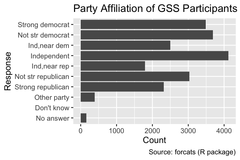
The default fill color of single-category bar charts is dark gray. It is advisable to eliminate unnecessary ink by removing the fill color and only keeping the border colored. Additionally the default width (0.9) can be reduced, for example, to 0.75:
ggplot(gss_cat, aes(y = partyid)) +
  geom_bar(fill = NA, color = "black", width = 0.75) +
  gss_cat_labs()
The bars are sorted from the bottom to the top in the order of the factor levels:
If the x or y aesthetic is a factor, the bars are sorted in the order of the factor levels.
levels(gss_cat$partyid) [1] "No answer" "Don't know" "Other party"
[4] "Strong republican" "Not str republican" "Ind,near rep"
[7] "Independent" "Ind,near dem" "Not str democrat"
[10] "Strong democrat" As you learned in Section 4.10.5, you can use functions from the forcats package to sort the levels in a different order. For example, fct_infreq() sorts the bars by frequency, with the most frequent category at the bottom:
ggplot(gss_cat, aes(y = fct_infreq(partyid))) +
  geom_bar(fill = NA, color = "black", width = 0.75) +
  gss_cat_labs()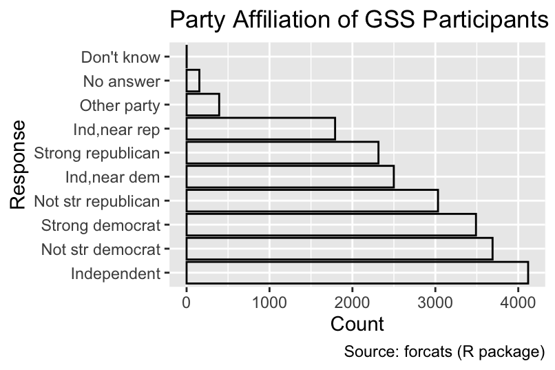
If partyid were a character vector instead of a factor, the bars would be sorted in alphabetical order, a poor choice in this case:
If the x or y aesthetic is a character vector, the bars are sorted in alphabetical order.
ggplot(gss_cat, aes(y = as.character(partyid))) +
  geom_bar(fill = NA, color = "black", width = 0.75) +
  gss_cat_labs()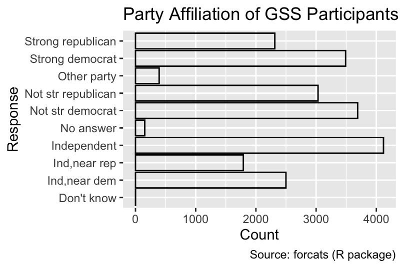
Conversely, it is often advisable to convert character vectors into factors to ensure that the bars are sorted in a meaningful order.
7.1.2 Two-Category Bar Charts
Bar charts are not limited to showing a single categorical variable as x- or y-coordinate. By mapping a second variable to the fill aesthetic, you can partition each bar into differently colored segments that reveal the distribution of the secondary category within each primary category. The following code generates a bar chart depicting the distribution of marital status within each level of partyid. By default, the segments are stacked along the non-categorical axis, as demonstrated in Figure 7.2:
Create a two-category bar plot by specifying one category as either x or y and the other as fill in aes(). The segments will be stacked by default.
ggplot(gss_cat, aes(y = partyid, fill = marital)) +
  geom_bar(color = "gray", width = 0.75) +
  gss_cat_labs(fill = "Marital status")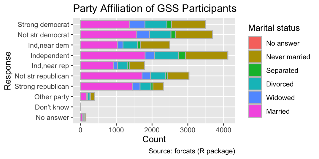
Because of the stacked layout, the x-coordinate at the right end of each segment is not directly meaningful because the left x-coordinate needs to be subtracted from it to obtain the count of the segment.
Alternatively, the segments can be aligned along the categorical axis by setting the position argument of geom_bar() to "dodge", as shown in Figure 7.3. The dodged layout facilitates comparing the counts for each segment but impedes comparing the total counts for each party affiliation:
Use the position = dodge argument of geom_bar() to align segments along the categorical axis.
ggplot(gss_cat, aes(y = partyid, fill = marital)) +
  geom_bar(position = "dodge", width = 0.75) +
  gss_cat_labs(fill = "Marital status")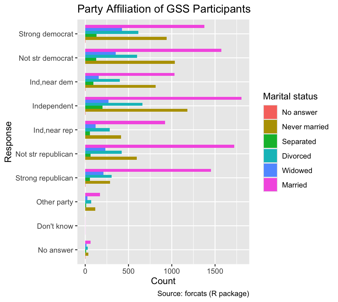
7.1.3 Bar Charts for Data Already Summarized as Counts
Each row in the gss_cat data frame represents a single participant, necessitating ggplot2 to tally the party affiliations before it can infer the length of each bar. However, sometimes the data are already available as counts. For instance, let us use dplyr’s count() function to summarize the counts of each party affiliation:
gss_by_partyid <- count(gss_cat, partyid, name = "count")
gss_by_partyid
# A tibble: 10 × 2
partyid count
<fct> <int>
1 No answer 154
2 Don't know 1
3 Other party 393
4 Strong republican 2314
5 Not str republican 3032
6 Ind,near rep 1791
7 Independent 4119
8 Ind,near dem 2499
9 Not str democrat 3690
10 Strong democrat 3490When applying geom_bar() with its default arguments to gss_by_partyid, it produces bars of equal length, each representing a count of 1 instead of a count of party affiliations:
ggplot(gss_by_partyid, aes(y = partyid)) +
  geom_bar(fill = NA, color = "black", width = 0.75) +
  gss_cat_labs()
This outcome is caused by each party affiliation being represented by a single row in gss_by_party_id. A convenient method for scaling bar lengths according to the counts is to substitute geom_bar() with geom_col() while also specifying an aesthetic mapping of counts to a spatial coordinate. In the following code, count is mapped to the x-axis:
Use geom_col() instead of geom_bar() if data are already counted.
ggplot(gss_by_partyid, aes(count, partyid)) +
  geom_col(fill = NA, color = "black", width = 0.75) +
  gss_cat_labs()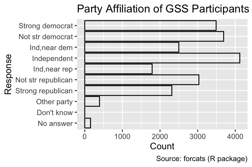
Similarly, the geom_col() function can be employed to visualize the counts of marital status within each party affiliation if the counts are grouped by all combinations of partyid and marital:
gss_by_partyid_marital <- count(gss_cat, partyid, marital, name = "count")
ggplot(gss_by_partyid_marital, aes(count, partyid, fill = marital)) +
  geom_col(position = "dodge", width = 0.75) +
  gss_cat_labs(fill = "Marital status")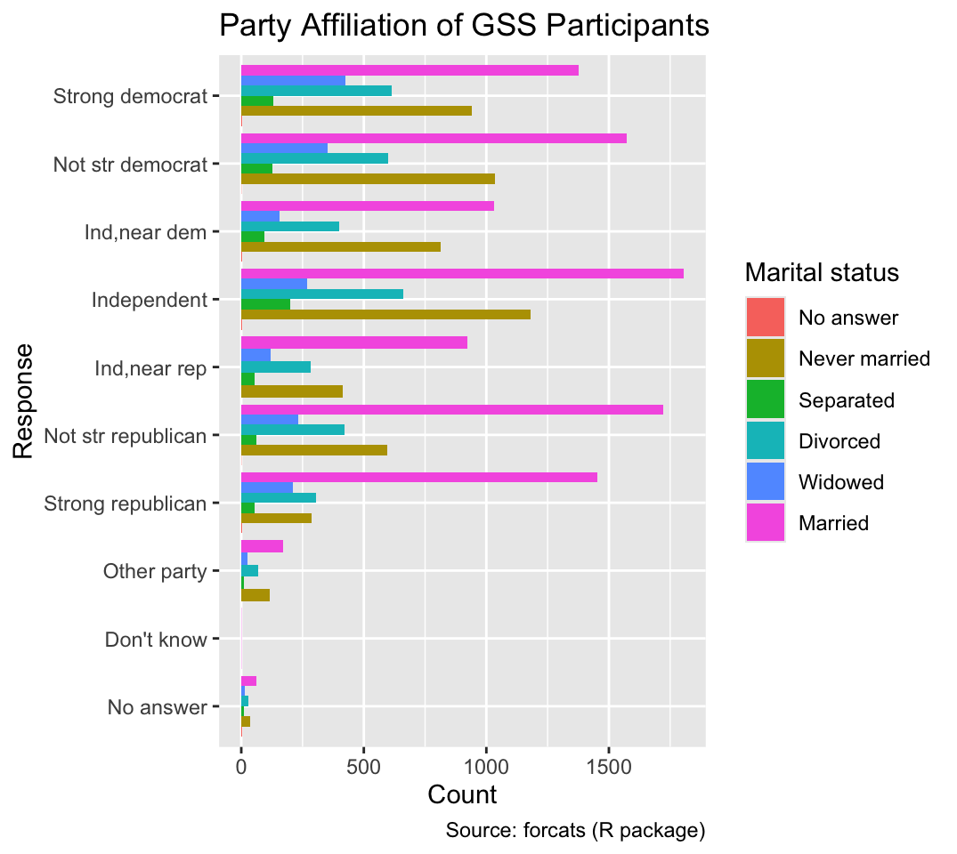
7.1.4 Section Summary: Geoms for Bar Charts
Bar charts constitute a fundamental visualization tool for depicting the distribution of a single categorical variable or the joint distribution of two categorical variables. The geom_bar() function should be used when the input data consist of one row for each unit of observation (e.g., survey participant). However, if the input data contain counts of each category, the geom_col() function should be used instead. For two-category bar charts, geom_bar() and geom_col() choose a stacked layout by default. However, a dodged layout can be obtained by setting the position argument to "dodge".
Although bar plots provide a straightforward way to display counts of categorical variables, lollipop charts convey the same information with less ink. In a lollipop chart, each category’s count is represented by a line segment drawn from the baseline (xend = 0 in the following code) to the count value. These segments can be created using geom_segment(). Placing a small circle at the end of each segment further emphasizes the count as the important variable:
ggplot(gss_by_partyid, aes(count, partyid)) +
  geom_segment(xend = 0) +
  geom_point() +
  gss_cat_labs()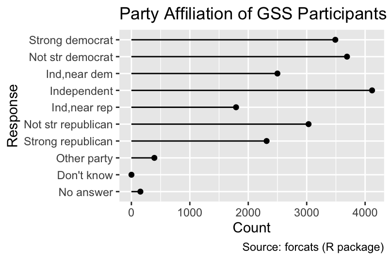
7.2 Geoms for Trivariate Data: Heatmaps and Contour Plots
Data visualization often involves representing three variables, two of which are mapped to spatial coordinates. While it might seem natural to regard the third variable as another spatial coordinate, static three-dimensional plots are challenging to interpret on flat surfaces, such as paper or computer screens, because the depth of a geometric object is lost and an object in the foreground may occlude an object in the background. For this reason, ggplot2 does not directly support three-dimensional plots.
Although add-on packages—such as rayshader—can produce three-dimensional animated effects, two-dimensional heatmaps and contour plots remain effective alternatives for static media, such as printed pages. Heatmaps represent the third variable using colors, whereas contour plots represent a third quantitative variable using a series of lines of equal value (also known as isolines, derived from the Greek word for “equal”: ἴσος). This section will demonstrate how to create heatmaps and contour plots using ggplot2.
Heatmaps and contour plots can be used for the combined visualization of three variables.
As a practical example, let us consider R’s built-in volcano data set, which contains elevation data for Maunga Whau, a volcano on the outskirts of Auckland, New Zealand, on a 10-meter by 10-meter grid. Although R’s original volcano object is not a data frame, it can be converted using the code below. The resulting volcano_dfr data frame contains three columns: elevation as well as the x and y coordinates on an 87 \(\times\) 61 grid:
volcano_dfr <-
  tibble(elevation = c(volcano)) |>
  mutate(
    x = 10 * (row_number() - 1) %% nrow(volcano),
    y = 10 * (row_number() - 1) %/% nrow(volcano)
  )
volcano_dfr
# A tibble: 5,307 × 3
elevation x y
<dbl> <dbl> <dbl>
1 100 0 0
2 101 10 0
3 102 20 0
4 103 30 0
5 104 40 0
6 105 50 0
7 105 60 0
8 106 70 0
9 107 80 0
10 108 90 0
# ℹ 5,297 more rowsTo generate a heatmap, the geom_tile function can be used. Alternatively, because all the tiles in this example have the same size, geom_raster() can be employed. In both cases, x and y values are mapped to the centers of tiles:
Use geom_tile() or geom_raster() to create a heatmap.
volcano_labs <- function(...) {
  ggplot2::labs(
    x = "x (meters)",
    y = "y (meters)",
    ...,
    caption = "Source: volcano (R data set)"
  )
}
ggplot(volcano_dfr, aes(x, y, fill = elevation)) +
  geom_tile() +
  volcano_labs(fill = "Elevation (meters)", title = "Maunga Whau Volcano")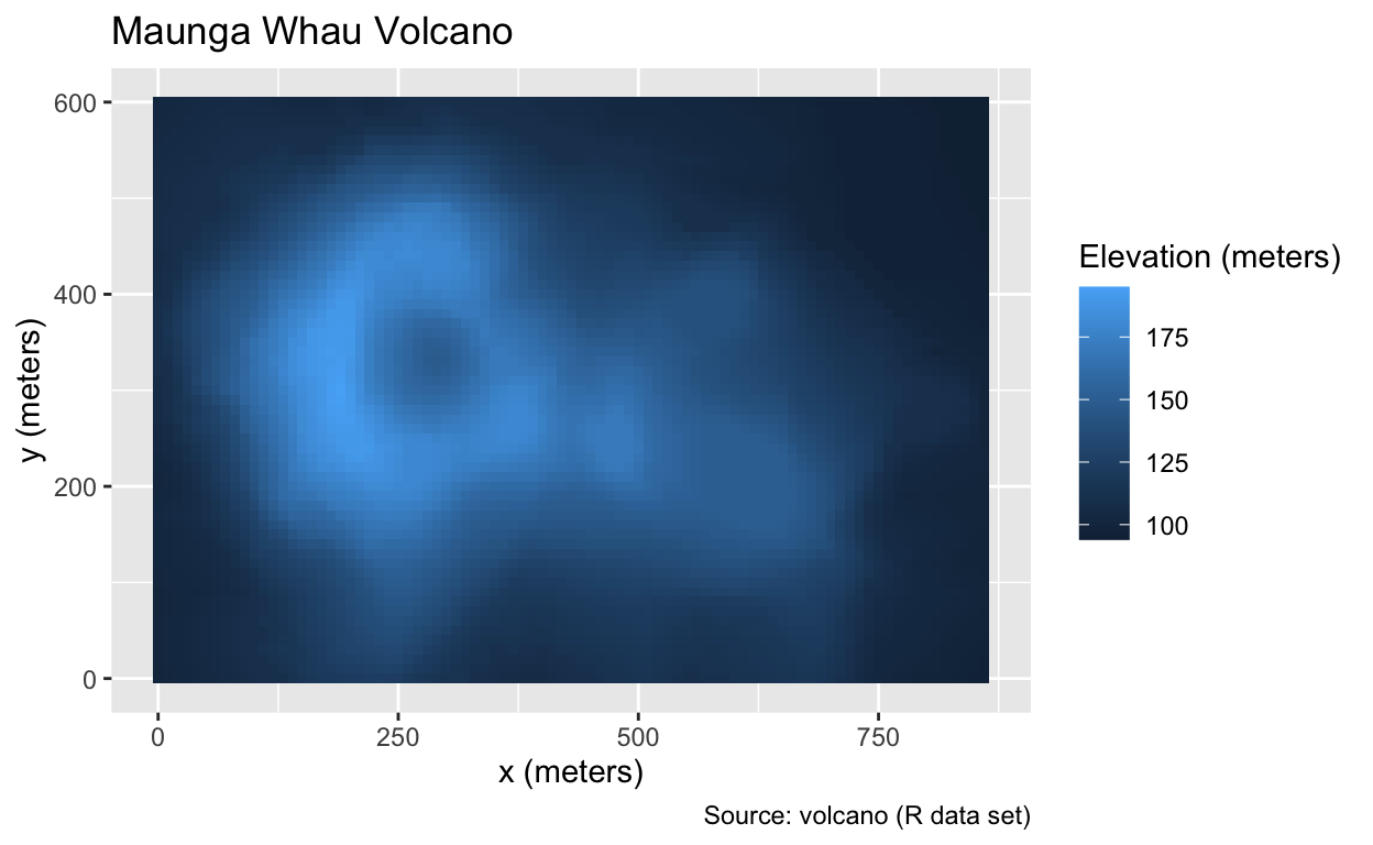
The geom_contour_filled() function provides an alternative to geom_tile() and geom_raster(). Instead of fill, geom_contour_filled() maps the elevation to a z aesthetic and employs a binned rather than a continuous palette. Although binning may result in a loss of quantitative information, the color steps enhance the perception of the volcano’s shape:
Use geom_contour_filled() to create a filled contour plot.
ggplot(volcano_dfr, aes(x, y, z = elevation)) +
  geom_contour_filled() +
  volcano_labs(fill = "Elevation (meters)", title = "Filled Contours")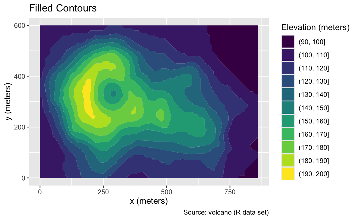
An alternative to geom_contour_filled() is geom_contour(), which keeps the space between contour lines transparent and uses colors exclusively for the contour lines themselves. Line heights can be mapped to colors using the color = after_stat(level) argument. The absence of a fill color would permit placing an additional layer, such as a street map, underneath the contour lines:
Use geom_contour() to display only the contour lines.
ggplot(volcano_dfr, aes(x, y, z = elevation, color = after_stat(level))) +
  geom_contour() +
  volcano_labs(color = "Elevation (meters)", title = "Contour Lines")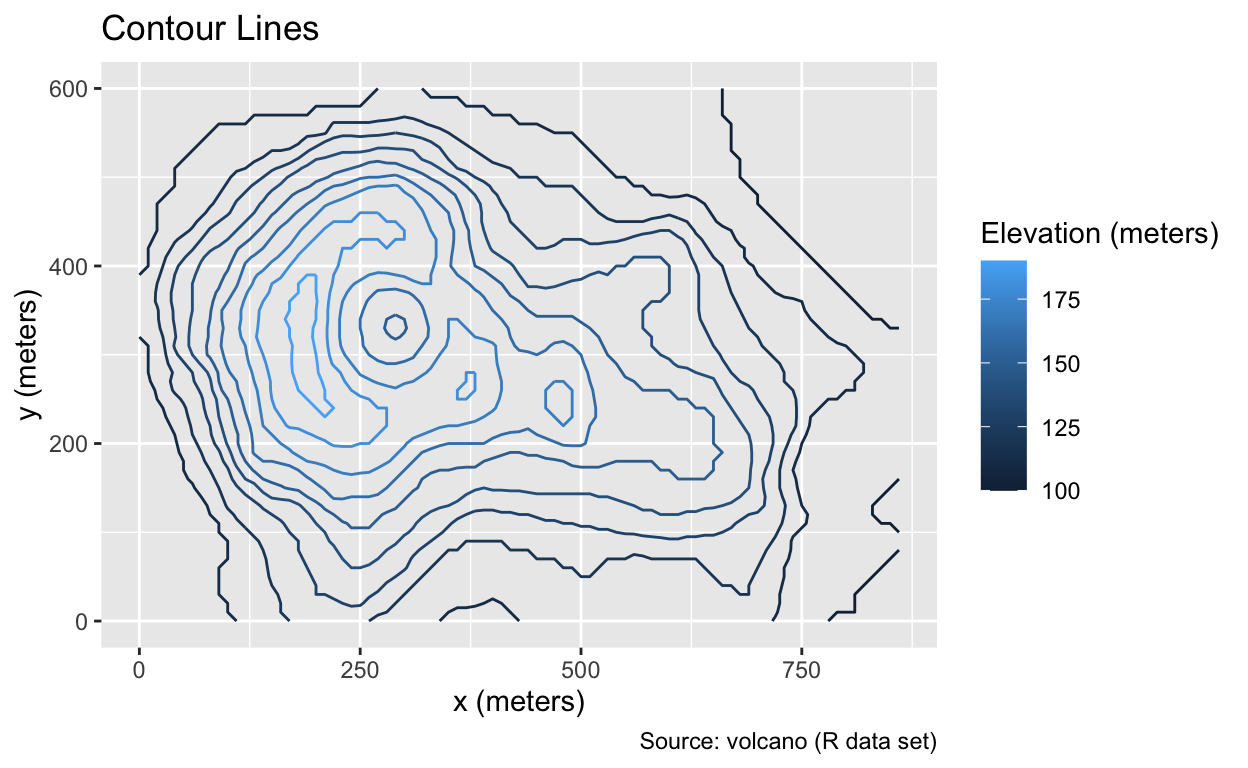
Height labels are helpful additions to contour plots. The geom_label_contour() function from the metR package automatically generates these labels. When employing geom_label_contour(), the colorbar becomes unnecessary and can be removed using guides(color = "none"):
Use metR::geom_label_contour() to add labels to the contour lines.
ggplot(volcano_dfr, aes(x, y, z = elevation, color = after_stat(level))) +
  geom_contour() +
  metR::geom_label_contour() +
  volcano_labs(title = "Contour Lines", subtitle = "Elevation in meters") +
  guides(color = "none")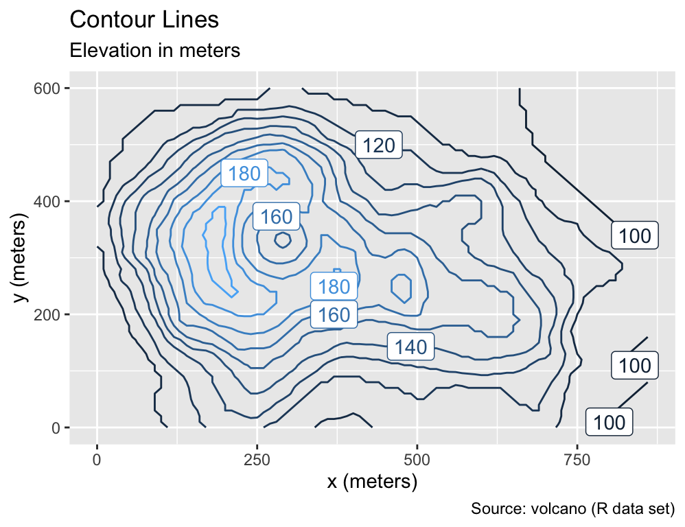
This plot demonstrates that text-based geoms, like geom_label_contour(), have the potential to eliminate the need for legends, allowing readers to focus more on the center of the plot rather than its margins. Building on this observation, the following section will explore several additional geoms for incorporating text into plots.
7.3 Geoms for Text
Text constitutes a more abstract form of geometry compared to points, lines, and rectangles. It requires the reader to recognize characters and interpret their meaning. However, text can establish an immediate semantic relationship between the plotted object and the data.
Section 7.3.1 introduces two essential text-rendering geoms available in ggplot2: geom_text() and geom_label(). As Section 7.3.2 will explain, both geoms offer options to align, shift, and resize text, which is particularly useful for avoiding overplotting of text and data points. While these geoms provide solutions for many basic scenarios, various add-on packages provide valuable extensions. For instance, the geom_text_repel() function from the ggrepel package, discussed in Section 7.3.3, automatically adjusts text positions to prevent overplotting. Furthermore, functions from the directlabels and ggforce packages, introduced in Section 7.3.4, facilitate the placement of text labels next to groups of data points, eliminating the need for additional legends.
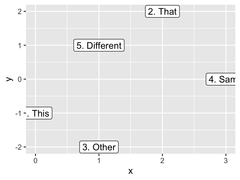
7.3.1 geom_text() and geom_label()
The ggplot2 package provides text-based geoms through the geom_text() and geom_label() functions. While geom_text() only places the text, geom_label() adds a rectangle around the text, with an optional background color (white by default) to improve readability. Both geoms require x, y, and label aesthetics, as exemplified by the following code:
Use geom_text() to place text at specified coordinates. Alternatively, use geom_label() for text enclosed within a rectangle.
dfr <- tibble(
  x = c(0, 2, 1, 3, 1),
  y = c(-1, 2, -2, 0, 1),
  word = c("1. This", "2. That", "3. Other", "4. Same", "5. Different")
)
g <- ggplot(dfr, aes(x, y, label = word))
g + geom_text()
g + geom_label()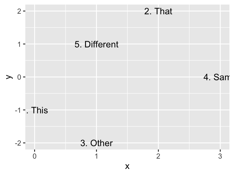
Although ggplot2 automatically chooses suitable axis limits for most geoms, text is an exception. As noted in ggplot2’s documentation, text size remains constant regardless of the plot dimensions, impeding an automatic adjustment of the axis limits. Therefore, the axis limits may need to be manually adjusted to ensure that all text elements are visible, for example, by using the xlim() and ylim() functions. Both functions take two arguments each for the respective minimum and maximum coordinates. By default, ggplot2 expands the plot area slightly beyond the limits set by xlim() and ylim() to create a small margin between the plotted data and the plot boundaries:
Use xlim() and ylim() to adjust axis limits.
g <- g + xlim(-1, 4) + ylim(-2.5, 2.5)
g + geom_text()
g + geom_label()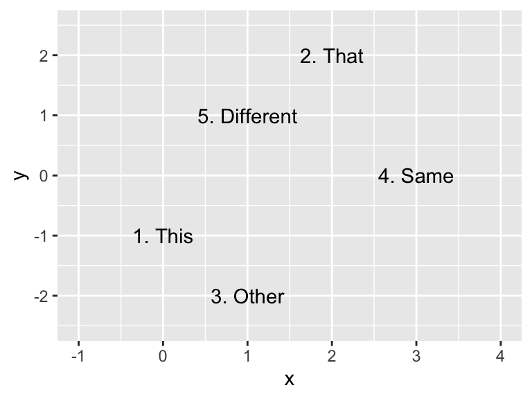

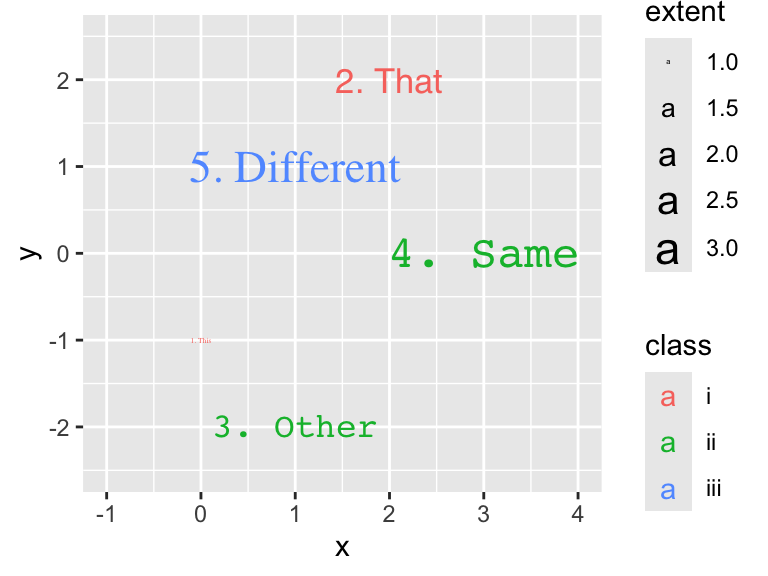
In addition to x, y, and label, geom_text() and geom_label() support several other aesthetics, including color, size, and font family:
7.3.2 Aligning, Nudging, and Resizing Text
By default, geom_text() and geom_label() center the text horizontally and vertically on the specified coordinates. The alignment can be adjusted using the hjust and vjust arguments. Both arguments accept values between 0 and 1, with 0 indicating left or bottom justification, whereas 1 signifies right or top justification.
For instance, consider the bar chart from Section 7.1.3 alongside the count of each party affiliation displayed on the right side of each bar. Without using hjust, the text is horizontally centered on the right edge of each bar, resulting in a vertical line intersecting each number:
Specify the hjust and vjust arguments as values between 0 and 1 to adjust the horizontal and vertical text alignment, respectively.
gss_by_partyid <- count(gss_cat, partyid, name = "count")
gg_partyid <-
  ggplot(gss_by_partyid, aes(count, partyid, label = count)) +
  geom_col(fill = NA, color = "black", width = 0.75) +
  labs(
    x = "Count",
    y = "Response",
    title = "Party Affiliation of GSS Participants",
    caption = "Source: forcats (R package)"
  ) +
  xlim(0, 4500)
gg_partyid + geom_text()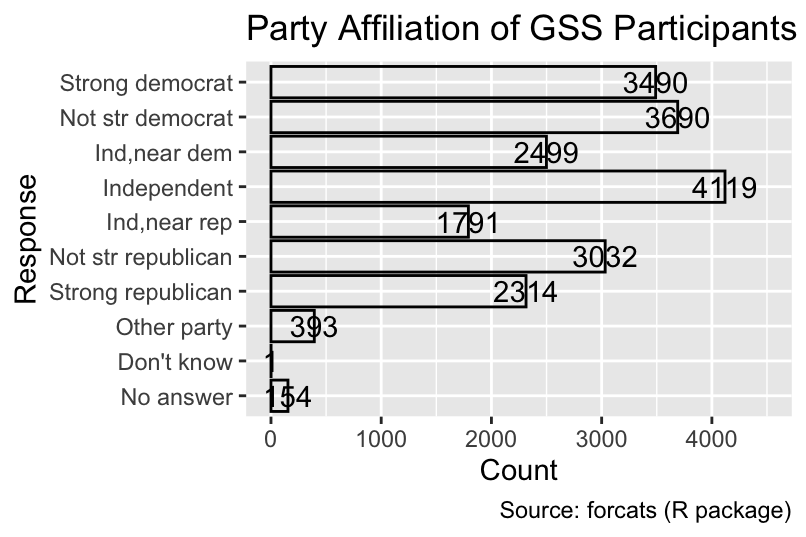
To improve the plot, the hjust = 0 argument shifts the text to the right of each bar:
gg_partyid + geom_text(hjust = 0)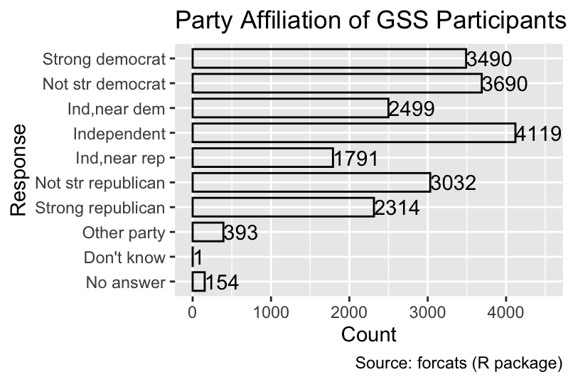
While left-justification improved the plot, it did not create a margin between the left edge of the text and the right edge of the bar. To improve readability, the nudge_x argument of geom_text() can be used for shifting text by a specified distance along the x-direction, measured in the units of the original data. The nudge_y argument would perform the analogous operation along the y-direction. Additionally, the size of the text can be changed from the default value 3.88 using the size argument:
Use nudge_x and nudge_y to shift text by a specified distance.
gg_partyid <- gg_partyid + geom_text(hjust = 0, size = 3, nudge_x = 75)
gg_partyid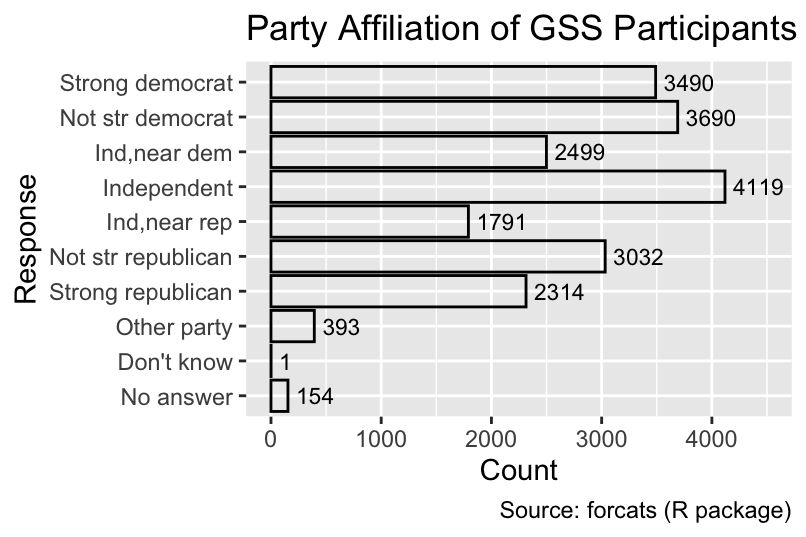
At this stage, the numbers to the right of each bar obviate the need for the x-axis as a conversion tool from x-coordinates to counts. Consequently, excess ink in the plot can be reduced by removing the x-axis, for example, by passing the x = "none" argument to the guides() function. Additionally, the x-axis label can be removed using labs(x = NULL). In this example, the y-axis label can also be removed because it is self-evident that the party affiliations are assigned based on the participants’ responses:
Use guides(... = "none") to remove an axis or legend and labs(... = NULL) to remove an axis label or legend title.
gg_partyid +
  labs(x = NULL, y = NULL) +
  guides(x = "none")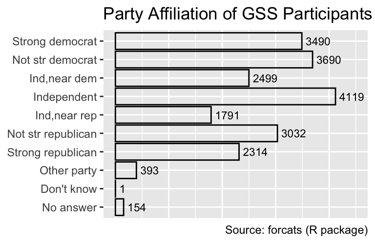
For dodged bar charts, the situation is more complicated. Because the labels need to be both dodged (i.e., aligned with the right edge of each segment) and nudged, the position_dodgenudge() function from the ggpp package is required. The width argument specifies the amount of dodging, and the x argument determines the amount of horizontal nudging:
gss_by_partyid_marital <-
  gss_cat |>
  mutate(
    partyid = fct_collapse( # Combine minor categories
      partyid,
      "Other/Missing" = c("No answer", "Don't know", "Other party")
    )
  ) |>
  count(partyid, marital, name = "count")
ggplot(
  gss_by_partyid_marital,
  aes(count, partyid, fill = marital, color = marital, label = count)
) +
  geom_col(position = "dodge") +
  geom_text(
    position = ggpp::position_dodgenudge(width = 0.9, x = 20),
    hjust = 0,
    size = 3
  ) +
  labs(
    x = NULL,
    y = NULL,
    fill = "Marital Status",
    color = "Marital Status",
    title = "Party Affiliation of GSS Participants",
    caption = "Source: forcats (R package)"
  ) +
  xlim(0, 2000) +
  guides(x = "none")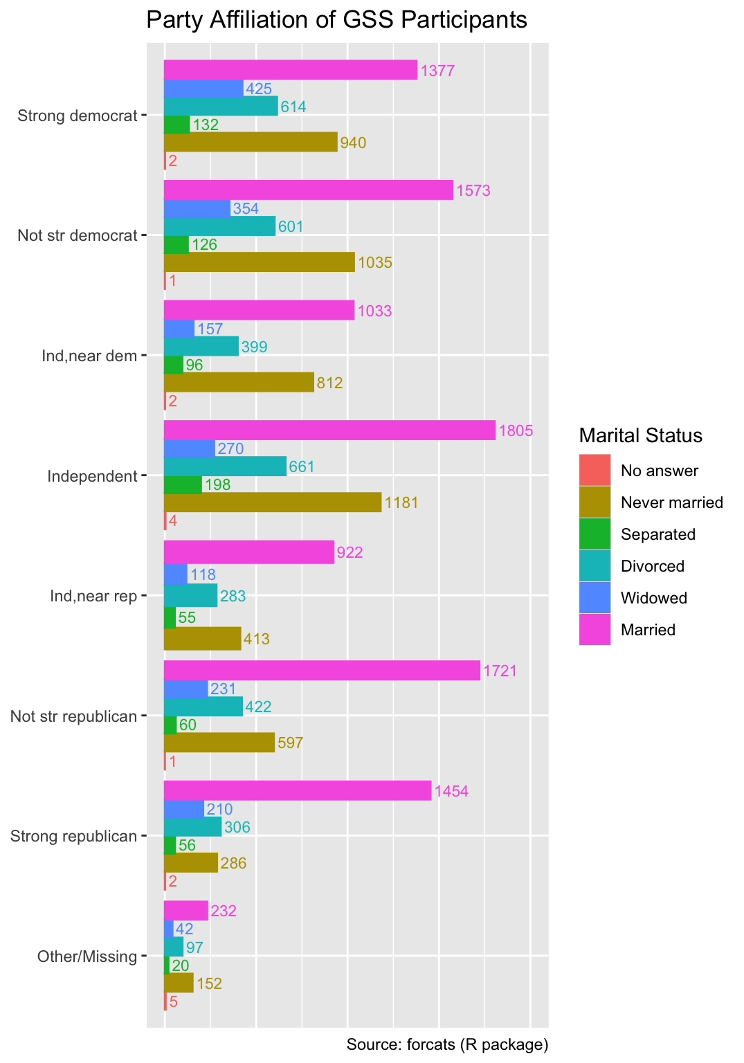
Note that, in the code above, the fill and color aesthetics are both mapped to the marital status, and the labs function assigns the same legend title to both aesthetics. Consequently, ggplot2 produces only a single legend applying to both fill and color.
7.3.3 Reducing Overplotting of Text Through Repulsion
When plotting a large number of text elements, they often overlap, rendering them difficult to read. To mitigate this issue, the ggrepel package provides the geom_text_repel() function, which automatically shifts text labels away from each other and from the plotted points. To demonstrate the use of geom_text_repel(), let us generate a scatter plot of Nobel laureates per 10 million people versus the annual per-capita chocolate consumption for 22 countries. The data, originally analyzed by Messerli (2012), is available in CSV format from the textbook website:
Use geom_text_repel() from the ggrepel package to reduce overplotting of text.
nobel <- read_csv("nobel.csv")
nobel
# A tibble: 22 × 3
country chocolate prizes_per_10m
<chr> <dbl> <dbl>
1 China 0.758 0.117
2 Japan 1.79 1.35
3 Portugal 1.98 2.17
4 Greece 2.52 1.58
5 Brazil 2.87 0.059
6 Spain 3.62 1.41
7 Italy 3.70 2.81
8 Canada 3.87 5.80
9 Belgium 4.40 8.44
10 Australia 4.48 5.34
# ℹ 12 more rowsWhen applying ggplot2’s geom_text() function, several country names overlap with each other and with the point symbols:
gg_nobel <-
  ggplot(nobel, aes(chocolate, prizes_per_10m, label = country)) +
  geom_point() +
  labs(
    x = "Per-capita chocolate consumption (kg/year)",
    y = "Nobel laureates per 10 million people",
    title = "Does Chocolate Enhance Cognitive Function?",
    caption = "Source: Messerli (2012)"
  )
gg_nobel + geom_text()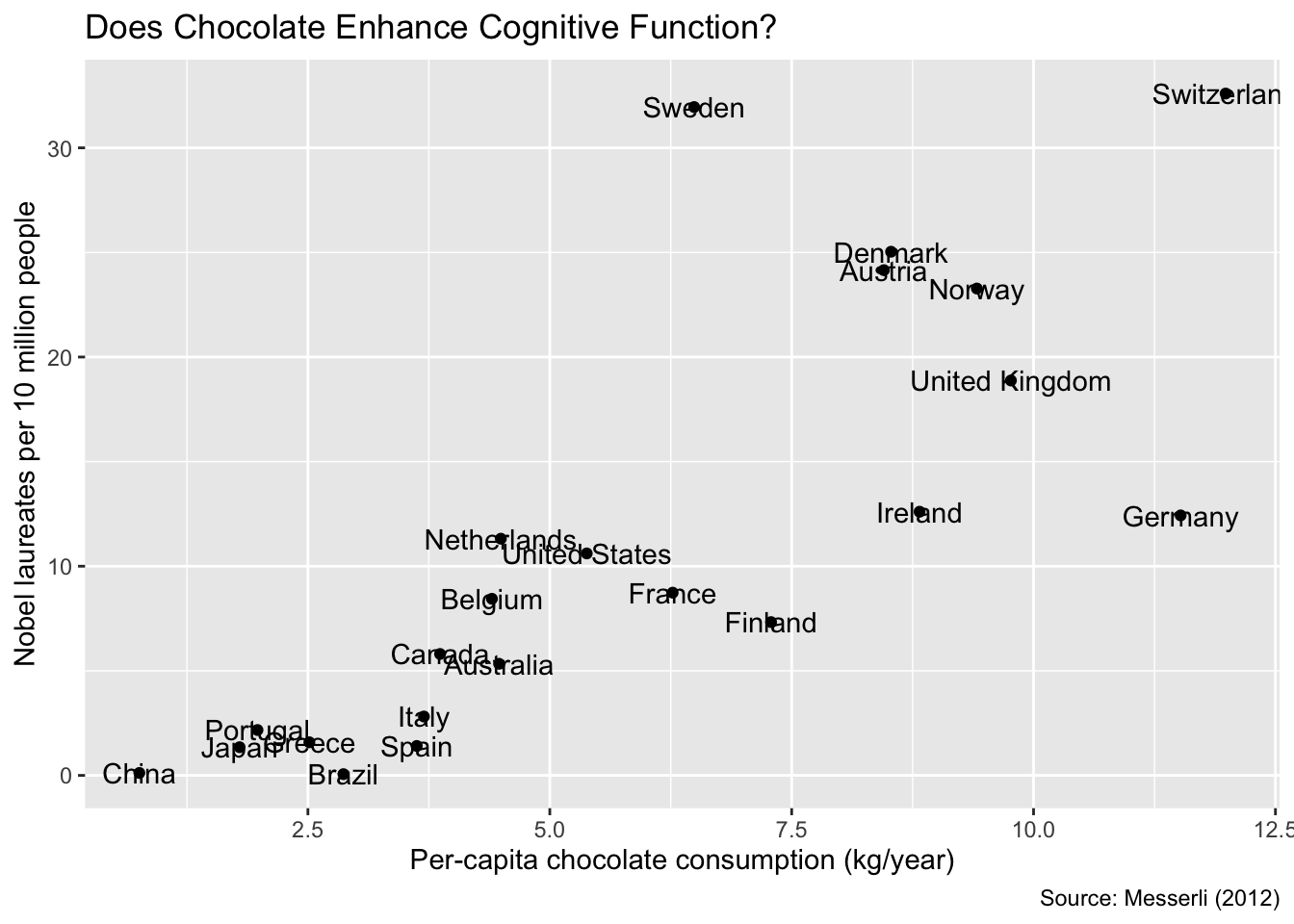
Replacing geom_text() with geom_text_repel() reduces overplotting of the country names. The algorithm used for label placement by geom_text_repel() relies on random numbers. Consequently, different runs of geom_text_repel() typically yield different label positions. However, for reproducible plots, the seed argument can be specified with an arbitrary integer value. It is advisable to experiment with several seeds and compare the resulting plots. The seed that produces the best result can then be selected for the final version of the plot:
gg_nobel + ggrepel::geom_text_repel(seed = 1)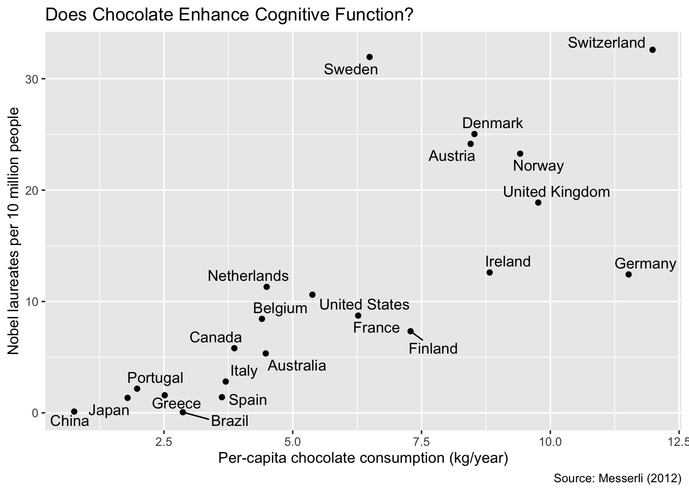
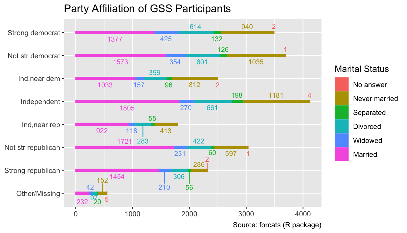
The use of geom_text_repel() is not limited to scatter plots. It can also be applied to various other plot types, such as bar charts. The code below generates a stacked bar chart of the marital status of GSS participants by party affiliation. The geom_text_repel() function is used to reduce overplotting of the count labels:
ggplot(
  gss_by_partyid_marital,
  aes(count, partyid, fill = marital, color = marital, label = count)
) +
  geom_col(width = 0.1) +
  ggrepel::geom_text_repel(
    position = position_stack(
      vjust = 0.5 # Align text with the horizontal mid-point of each segment
    ),
    size = 3,
    direction = "y", # Only adjust vertical text positions
    seed = 11
  ) +
  labs(
    x = NULL,
    y = NULL,
    fill = "Marital Status",
    color = "Marital Status",
    title = "Party Affiliation of GSS Participants",
    caption = "Source: forcats (R package)"
  )
7.3.4 Text for Groups of Data Points
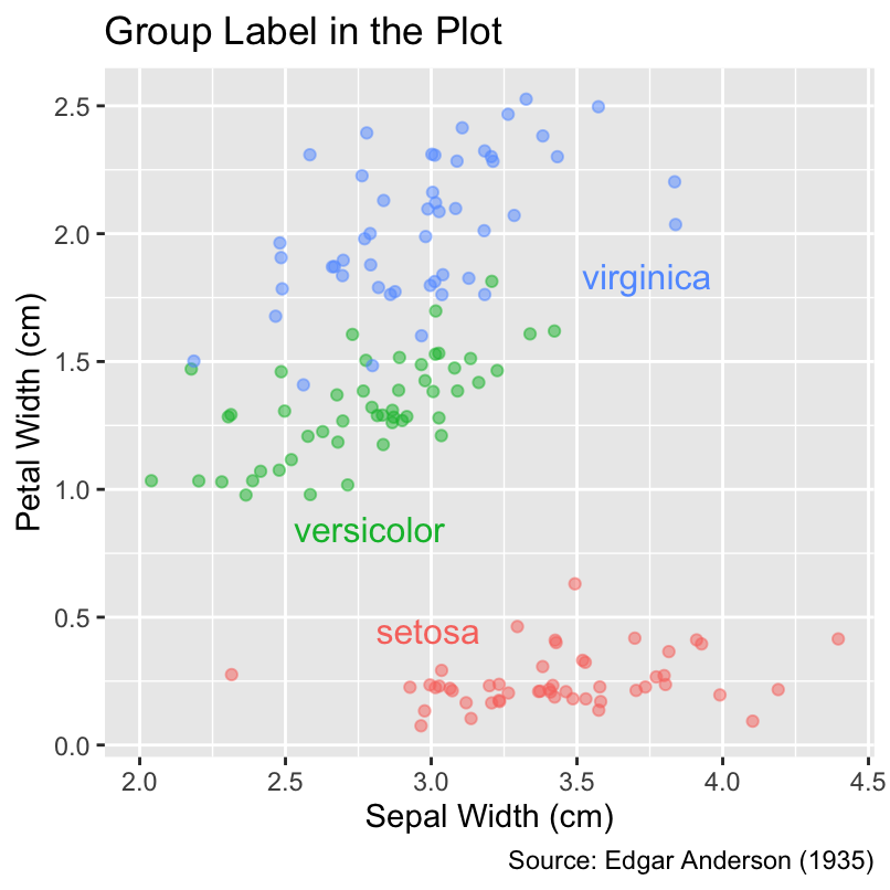
When plotting multiple groups of data points, it often saves space and improves readability to place labels for each group directly in the plot instead of relying on a separate explanatory legend. For instance, both of the following plots depict the relationship between petal width and sepal width for three species of iris flowers. While the first plot uses a color legend to identify the species, the second plot employs geom_dl() from the directlabels package to position the species names near the corresponding data points, allowing the legend to be omitted without loss of information:
Use directlabels::geom_dl() to print group labels in close proximity to the corresponding data points and remove the corresponding legend.
gg_iris <-
  ggplot(
    iris,
    aes(Sepal.Width, Petal.Width, color = Species, label = Species)
  ) +
  geom_jitter(alpha = 0.5) +
  labs(
    x = "Sepal Width (cm)",
    y = "Petal Width (cm)",
    caption = "Source: Edgar Anderson (1935)"
  )
gg_iris + labs(title = "Category Names in the Legend")
gg_iris <- gg_iris + guides(color = "none") # Remove legend
gg_iris +
  directlabels::geom_dl(method = "smart.grid") +
  labs(title = "Group Label in the Plot")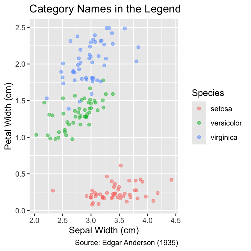
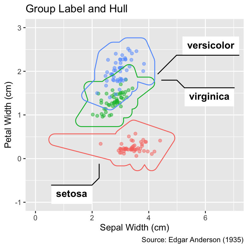
The ggforce package offers additional geoms for labeling groups directly in the plot. Its geom_mark_ellipse() function draws enclosing ellipses around the data points belonging to each group. The area of an ellipse indicates the spread of the data, while the ellipticity hints at the strength of the association between the x-coordinates and y-coordinates. Alternatively, the geom_mark_hull() function draws nearly convex hulls around the data points of each group. Both geom_mark_ellipse() and geom_mark_hull() may require manual adjustments of the axis limits:
Use ggforce::geom_mark_ellipse() to draw enclosing ellipses around groups of data points. Alternatively, ggforce::geom_mark_hull() draws nearly convex hulls.
gg_iris <- gg_iris + xlim(0, 7) + ylim(-1, 3)
gg_iris +
  ggforce::geom_mark_ellipse() +
  labs(title = "Group Label and Enclosing Ellipse")
gg_iris +
  ggforce::geom_mark_hull() +
  labs(title = "Group Label and Hull")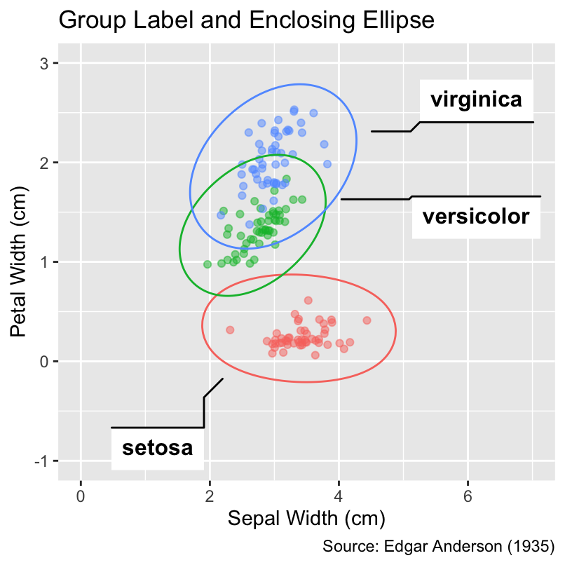
7.3.5 Section Summary: Geoms for Text
This section has introduced various geoms that render text in a plot. The geom_text() and geom_label() functions, both built into the ggplot2 package, are suitable for basic use cases. For more advanced tasks, such as ensuring non-overlapping text and automatically placing group labels, this section has suggested working with the ggrepel, directlabels, and ggforce packages. Additionally, the geom_richtext() function from the ggtext package deserves being mentioned for rendering text in Markdown or HTML.
7.4 Conclusion
This chapter explored various geoms for distinct visualization needs, encompassing bar charts, heatmaps, contour plots, and text. Because ggplot2 and its supplementary packages offer a plethora of additional geoms, our exploration is merely scratching the surface. As an important special case, Chapter 14 and Chapter 15 will discuss geoms for geospatial data. However, before discussing additional geoms, the following chapter will explain the nuances of aesthetic mappings, suggesting best practices for matching data with visual properties.