11 Coordinate Systems
For most aesthetic mappings, setting the scale is sufficient to control how the data are mapped to their visual appearance. An exception is the combination of the spatial scales x and y, which also require a coordinate system to translate the coordinates into positions in the two-dimensional plot space.
By default, ggplot2 uses a Cartesian coordinate system, where the x-coordinate and the y-coordinate are measured along straight axes that are perpendicular to each other. Axis limits are automatically set to the data range by ggplot2, and the available physical plotting area determines the aspect ratio. These defaults often suffice, but you can override them to zoom in on particular regions (Section 11.1) or to enforce a specific aspect ratio (Section 11.2).
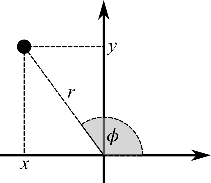
Although most statistical graphics use Cartesian coordinates, ggplot2 also supports alternative coordinate systems. In polar coordinates, for example, positions are specified by the distance \(r\) from the origin and the angle \(\phi\) with respect to the horizontal direction (Figure 11.1) Because \(\phi\) wraps around a circle, the angular axis is curved rather than straight. Polar coordinates are most commonly used to create pie charts, as illustrated in Section 11.3.
11.1 Using coord_cartesian() for Zooming into a Plot
Previously, you learned that the limits of the coordinate axes can be set using either the xlim() and ylim() functions (Section 7.3.1) or, equivalently, the limits arguments of the scale_x_*() and scale_y_*() functions (Section 9.1.1). Alternatively, limits can be entered in coord_cartesian() using the xlim and ylim arguments. However, even if the limits used in both options are equal, the resulting plots do not look identical.
To illustrate this difference, consider again the data from Section 6.1.1.2 on the number of hare and lynx pelts purchased by the Canadian Hudson Bay Trading Company. First, here is the plot with the default axis limits:
library(tidyverse)
library(astsa)
pelts <- tibble(
  hare = as.numeric(Hare),
  lynx = as.numeric(Lynx),
  year = as.numeric(time(Hare))
)
gg_pelts <-
  ggplot(pelts, aes(hare, lynx, color = year)) +
  geom_path() +
  geom_point()
gg_pelts + labs(title = "Default Axis Limits")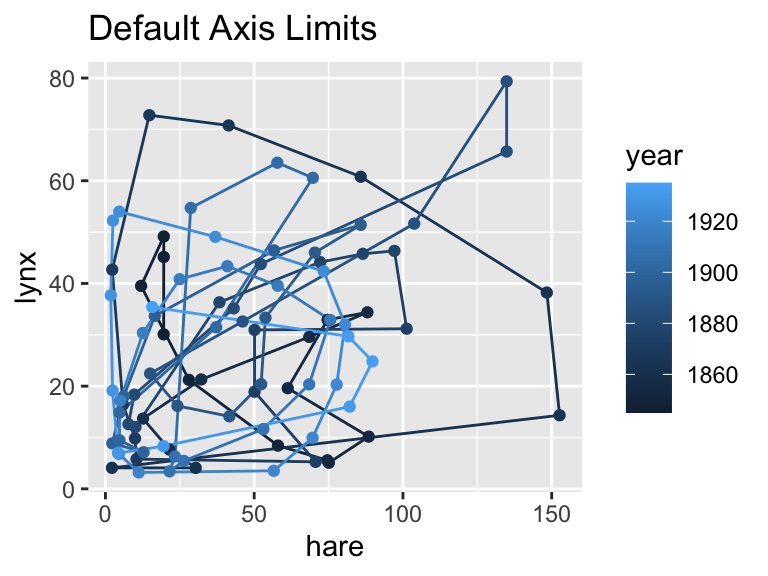
The subsequent two calls set axis limits in different ways.
-
Using
scale_*()functions:In this case, any data point outside the specified limits is treated as missing, which explains the warning issued below. Consequently, no lines are drawn that extend beyond the coordinate boundaries:
gg_pelts +
  scale_x_continuous(limits = c(0, 100)) +
  scale_y_continuous(limits = c(0, 60)) +
  labs(title = "Using Scale to Set Axis Limits")
Warning: Removed 11 rows containing missing values or values outside the scale range (`geom_point()`).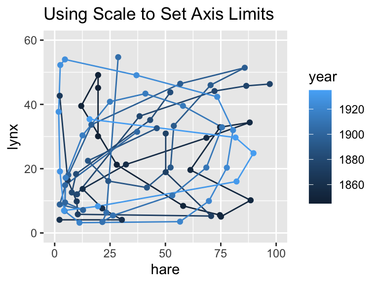
-
Using
coord_cartesian()Here, points outside the specified limits remain in the data but are not displayed. Lines connecting those points to others outside the limits are still drawn. Note that ggplot2 adds a small amount of padding by default, so points and parts of lines just outside the boundaries remain visible:
gg_pelts +
  coord_cartesian(xlim = c(0, 100), ylim = c(0, 60)) +
  labs(title = "Using Coord to Set Axis Limits")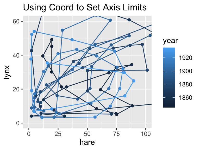
One way to think about the difference is that scale_*() filters the data (removing observations outside the limits), whereas coord_cartesian() simply zooms into the plot without dropping any points. Depending on your needs, one approach may be more appropriate than the other.
Pass axis limits as arguments to coord_cartesian() to zoom into a plot without removing any data points.
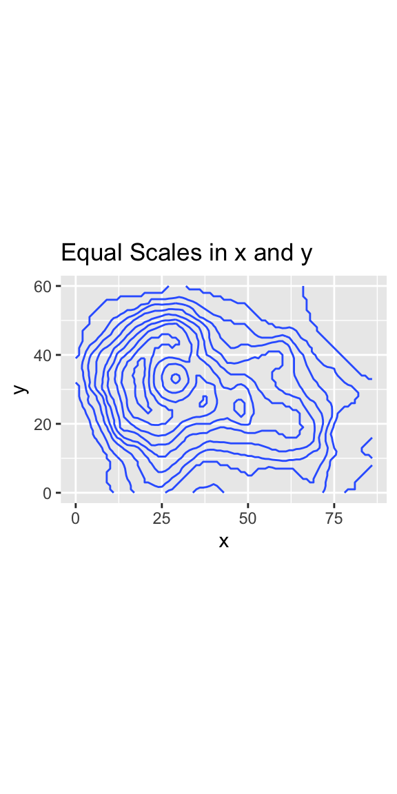
11.2 Cartesian Coordinates with Equal Scales in x-Direction and y-Direction
When working with spatial data, the x-coordinates and y-coordinates may represent values measured on the same length scale (e.g., 10-meter distances from the origin of the coordinate system). In such cases, 1 centimeter on the physical plot should correspond to the same length (e.g., 10 meters) on the ground, regardless of whether it is measured in the x-direction or the y-direction. This principle ensures that the spatial relationships are accurately represented in the plot.
The following two plots illustrate the importance of applying the same scale factor in both directions to accurately represent spatial data. Both plots depict the topography of the Maunga Whau Volcano. In the first plot, which uses ggplot2’s default coordinates, different scale factors are applied to the x-direction and the y-direction. The aspect ratio of the plot depends on the physical space available, such as the space on a computer monitor. In the example shown, the plot appears stretched in the y-direction, causing 1 cm in the y-direction to represent a smaller length on the ground compared to 1 cm in the x-direction. In the second plot, the coord_fixed() function is applied to ensure that x-coordinates and y-coordinates are measured on equal scales, addressing the distortion seen in the first plot:
Use coord_fixed() if you want to ensure that one unit in the x-direction is equally long as one unit in the y-direction.
volcano_tb <-
  tibble(elevation = c(volcano)) |>
  mutate(
    x = (row_number() - 1) %% nrow(volcano),
    y = (row_number() - 1) %/% nrow(volcano)
  )
ggplot(volcano_tb, aes(x, y, z = elevation)) +
  geom_contour() +
  labs(title = "Unequal Scales in x and y")
ggplot(volcano_tb, aes(x, y, z = elevation)) +
  geom_contour() +
  coord_fixed() +
  labs(title = "Equal Scales in x and y")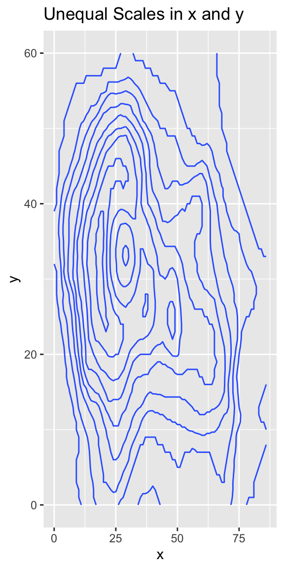
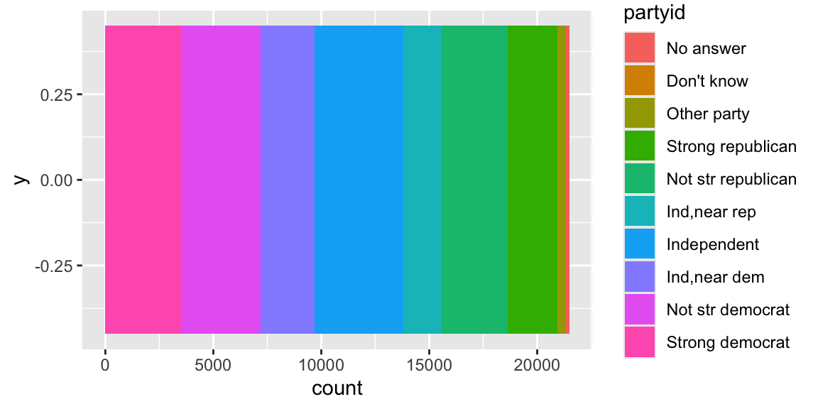
11.3 Creating Pie Charts Using coord_polar()
Pie charts can be created by transforming a stacked bar chart from Cartesian to polar coordinates. The trick is to set the y-aesthetic to a constant. Let us begin with a simple bar chart:
Then, we apply polar coordinates through the coord_polar() function so that the x-coordinate wraps once around a circle:
Use coord_polar() for polar coordinates. A common use case is to create pie charts.
ggplot(gss_cat, aes(y = 0, fill = partyid)) +
geom_bar() +
coord_polar()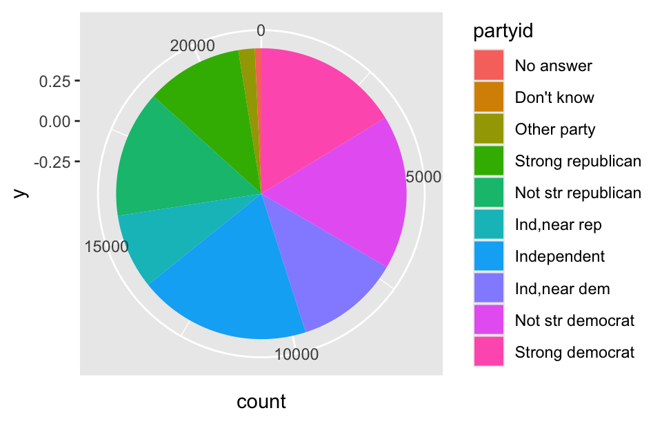
This plot still leaves much to be desired. For instance, the coordinate axes are difficult to interpret, and it would be better to print the party affiliation directly on the corresponding slices instead of relying on a legend. Because some slices are very thin, their labels would need to be carefully positioned outside the pie. These tasks are more challenging to accomplish in a pie chart than in a bar chart. Additionally, pie charts require readers to judge angles, which can be more difficult than judging lengths in a bar chart. Due to these reasons, pie charts are generally considered to be inferior to bar charts. However, pie charts effectively communicate that the combination of the slices adds up to a meaningful total (in this example, the number of participants in the General Social Survey). Therefore, pie charts will continue to have a role in future data visualization.
11.4 Conclusion
Coordinate systems provide the flexibility to map the x and y aesthetics onto axes that might not be linear or perpendicular to each other. In this chapter, you learned how using polar coordinates with coord_polar() enables the creation of pie charts. Curved coordinate axes also play a crucial role in geographic visualizations; we will explore geographic coordinate systems and map projections in Section 14.3.