1 Why You Should Read This Book
Data science is a growth area in industry, public service and academia. Although not everybody needs to become a professional data scientist, we should all strive to become critical consumers of data that are presented to us by news media, governments, and lobby groups. If you want to take the leap from being a consumer to being a mindful producer of data analysis and visualization, I invite you to join me on a journey from basic programming to publication-ready infographics.
1.1 Finding Programmatic Solutions for Data Analysis and Visualization Problems
Data analysis is the process of exploring, transforming, and modelling data to discover useful information, summarize the discoveries and draw informed conclusions. Data visualization is the graphical representation of information and data. Data visualization is also the name of a field of research that aims to develop effective visual techniques for data analysis at various stages (exploration, interpretation, and reporting).
The purpose of this book is to teach data analysis and visualization in a hands-on manner. Often, data need to be transformed before they are ready to be presented in visual form. We will learn how to apply the necessary transformations with computer programs. If you have worked with spreadsheet software before (e.g., Microsoft Excel or Google Sheets), you already have a basic understanding of how to store and represent data on a computer. However, spreadsheet software has limitations when data management tasks need to be automated (e.g., for producing automated reports whenever a data set is updated). Spreadsheet software also has limited support for creating bespoke customized infographics. By the end of this book, you will have mastered a state-of-the art approach to the programming language R, which offers a principled, customizable alternative to spreadsheet software.
1.2 Becoming a Responsible Producer of Data Visualization
Data visualization has a long history. Maps of the night sky are among the earliest attempts by humans to represent data (positions of stars and their brightness) in graphical form, dating back at least to 1534 BC (von Spaeth, 2000). While early approaches to data visualization were mostly ad hoc, Renaissance mathematicians began to systematically describe how to present data in graphical form. For example, René Descartes popularized one of the cornerstones of modern data visualization in 1637: the two-dimensional coordinate system that we now refer to as the “Cartesian” coordinate system in his honour (Hatfield, 2018). On the basis of Cartesian coordinates, the Scottish engineer William Playfair invented many types of diagrams that are still in common use today such as bar charts in 1786 and pie charts in 1801 (Friendly and Denis, 2001).
Thanks to advances in computer technology, we are currently experiencing a proliferation of infographics, both in quantity and variety. However, not every diagram produced by a computer is automatically well crafted. I now highlight some common problems with infographics encountered in the wild.
1.2.1 Area Principle
One of the fundamental rules of data visualization was articulated by Tufte (2001) as follows:
“The representation of numbers, as physically measured on the surface of the graphic itself, should be directly proportional to the numerical quantities represented.”
This rule is often referred to as the “area principle”: every part of a diagram should occupy an area proportional to the numerical quantity it encodes. Diagrams that violate the area principle can be misleading, as the following example shows.
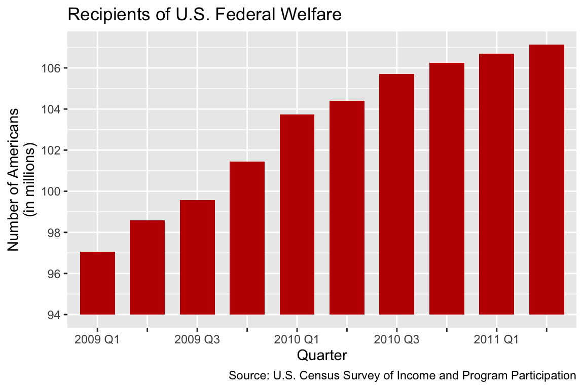
In an article with the headline “Over 100 Million Now Receiving Federal Welfare” (Halper, 2012), the U.S. newspaper Washington Examiner published a diagram resembling Figure 1.1. The diagram aims to show how the number of people on federal welfare increased from the first quarter of 2009 to the second quarter of 2011. The author of this figure chose to present the data in the form of a bar chart. A bar chart is a type of diagram in which data are binned by categories. Each category is represented by one bar, and the value associated with each category is shown as the height of the bar. In Figure 1.1, the categories are calendar quarters. Because each bar is equally wide, the area principle implies that the height of each bar should be proportional to the number of people on welfare in the corresponding quarter. Figure 1.1 violates the area principle because the bar for “2011 Q2” is about 4.3 times longer than the bar for “2009 Q1”. However, the number of welfare recipients only increased by a factor 1.1 (from 97 million to 107 million).
The problem with Figure 1.1 is that the y-axis (i.e., the vertical axis) starts from 94 million instead of zero. Consequently, small differences in the number of welfare recipients appear exaggerated. A better visualization is shown in Figure 1.2, where the y-axis starts from zero. From Figure 1.2, it becomes clear that the number of welfare recipients increased, but the increase is relatively small.
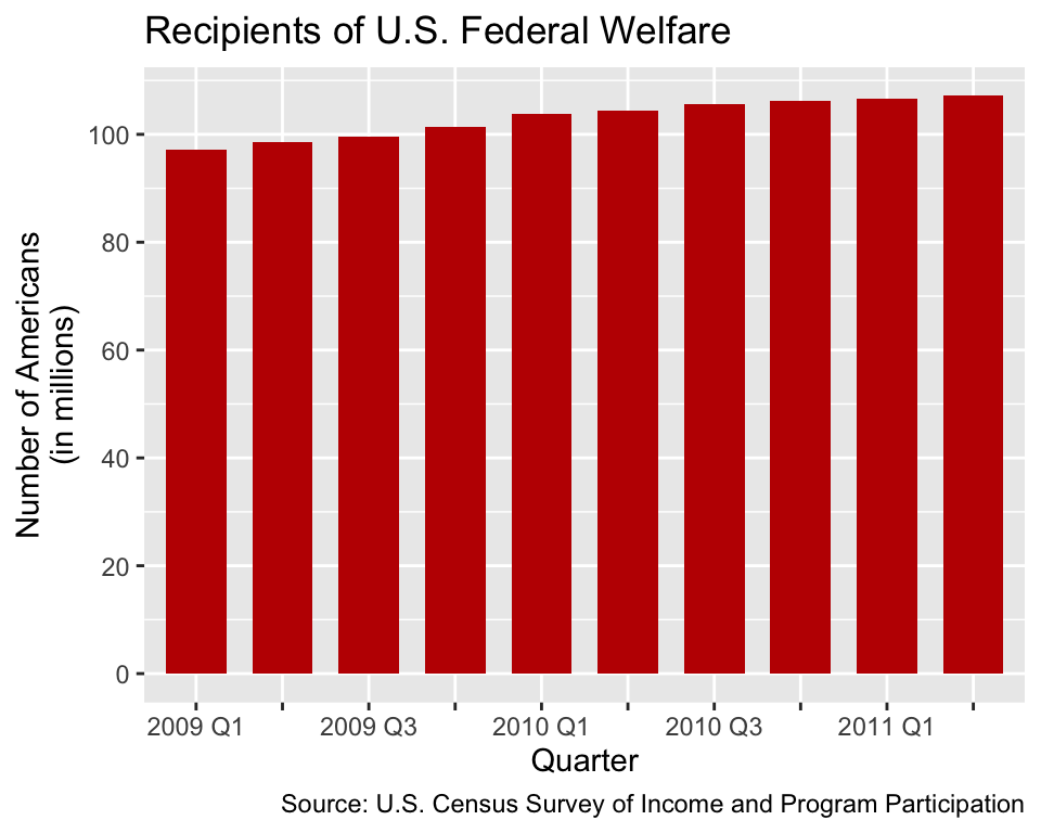
A critical reader may argue that the wider range of the y-axis in Figure 1.2 compresses the differences and, hence, makes it more difficult to accurately infer the number of recipients compared to Figure 1.1. This criticism is valid. However, if we want to scale the y-axis as in Figure 1.1, we should use a point-to-point chart (also known as a line chart) as shown in Figure 1.3 instead of a bar chart. Points are zero-dimensional objects; thus, they have neither a length nor an area. Therefore, point-to-point charts cannot violate the area principle; they do not represent numbers by areas but by positions along an axis.
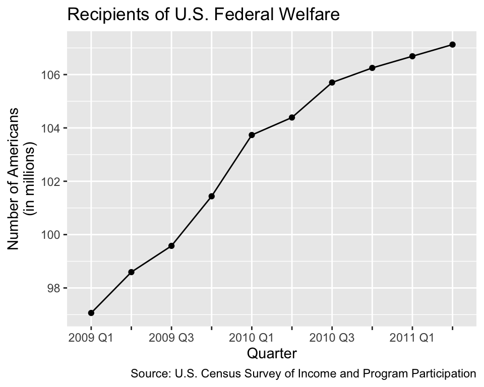
Figure 1.2 and Figure 1.3 are both good representations of the number of welfare recipients, and each plot has its strengths and weaknesses. While Figure 1.2 emphasises the total number of welfare recipients in different quarters, Figure 1.3 facilitates inferring the number of recipients from the y-axis. Figure 1.1 combines the weaknesses of both diagrams instead of their strengths. Consequently, Figure 1.1 makes readers believe that the increase in the number of welfare recipients is far more dramatic than the numbers actually imply.
Having to decide between Figure 1.2 and Figure 1.3, three further considerations beyond the area principle favor the line chart over the bar chart:
- Humans tend to be better at comparing positions along a common axis (here the y-axis) than comparing areas (Cleveland and McGill, 1984), so the areas in Figure 1.2 are superfluous.
- Given two equivalent diagrams, the one that uses less ink tends to be more effective because additional non-data ink acts as a distraction (Tufte, 2001). In the specific case of bar charts of time series, the visual weight of the individual bars distracts from the overall shape of the data (Few, 2012, pp. 107–108).
- Bar charts imply that the data are binned by categories. However, calendar quarters may be more intuitively perceived as points along a continuous timeline rather than categories. Therefore, point-to-point charts may communicate the data more naturally than bar charts.
As this example shows, there is often no single best way to visualize data. As designers of statistical diagrams, our job is to weigh the options carefully and choose the type of diagram judiciously.
1.2.2 Use Diagrams for Communicating Data, not for the Show Effect
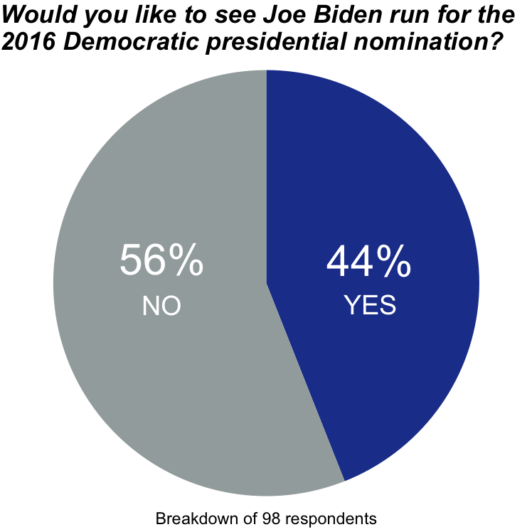
Diagrams attract the reader’s attention. As creators of data visualization, we need to be mindful that we should only attract the reader’s attention to a diagram if we have a good reason. Some data are more efficiently presented as part of the text or in a table. For example, the pie chart in Figure 1.4, resembling the example presented by Barnes (2015), takes up relatively much space, but it contains only two independent pieces of quantitative information:
- There were 98 respondents.
- 56% of respondents answered “No”. The pie chart is divided into two slices, so the only answer options seem to have been “Yes” and “No”. Hence, the percentage of respondents who answered “Yes” must necessarily be 44%.
Instead of showing a pie chart, it would be more efficient to state the quantitative information directly in the text, for example: “Out of 98 respondents, 56% prefer that Joe Biden would not run for the 2016 Democratic presidential nomination.”
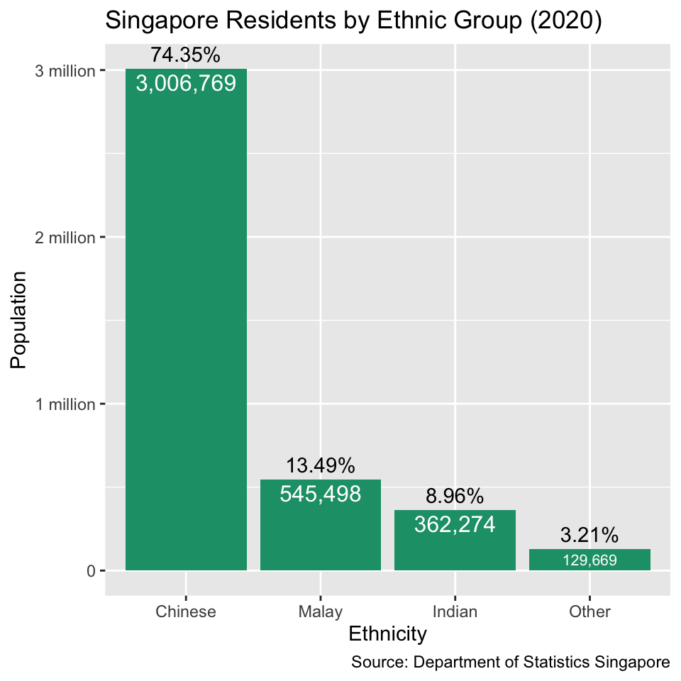
When there are more pieces of quantitative information, it may be impractical to include all the numbers in the text. For example, Figure 1.5 contains four pieces of quantitative information: the number of residents in each of the four ethnic groups that appear in the Singaporean census (Chinese, Malay, Indian and Other). If we want to express the same information in words, the text would become long: “According to the Department of Statistics Singapore, Chinese residents were the largest ethnic group (3,006,769; 74.3%) followed by Malay residents (545,498; 13.5%) and Indian residents (362,274; 9.0%). Only 129,669 residents (3.2%) belonged to other ethnic groups.” In this case, the bar chart in Figure 1.5 is arguably the more reader-friendly and intuitive alternative to the long-winded text.
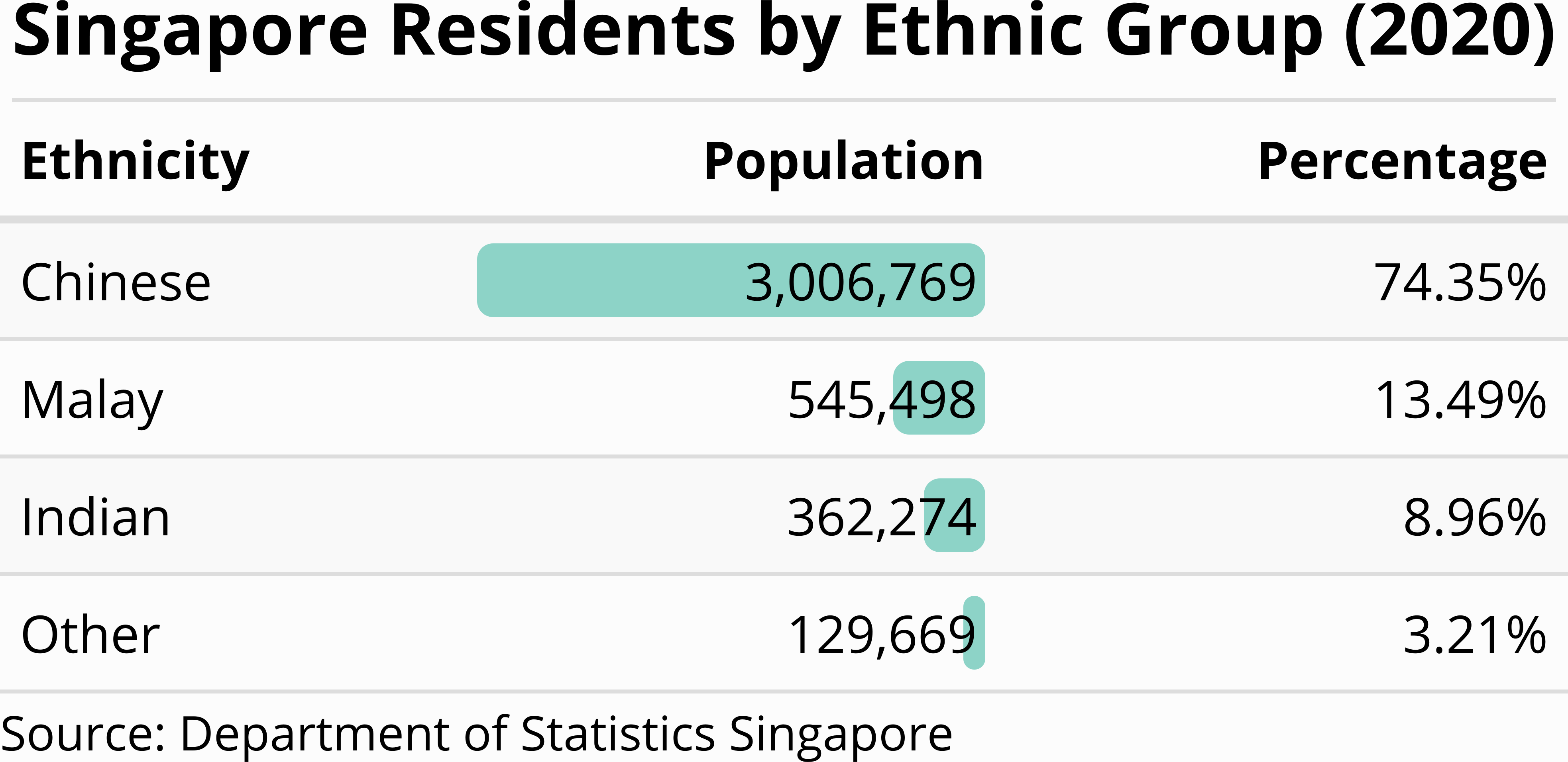
Text and diagrams are not the only tools that are available for communicating data. Tables are often a good alternative if there are relatively few numbers. For example, Figure 1.6 contains the same information as the bar chart in Figure 1.5. The tabular format of Figure 1.6 facilitates comparing the exact population numbers of different ethnicities because the reader’s eye can simply move down the second column in the table. As shown in the second column, we can even include a bar chart directly as part of the table. Compared with Figure 1.5, the only graphical element that is absent from Figure 1.6 are the axis tick marks (“0”, “1 million”, “2 million” and “3 million”). Omitting the tick marks does not come with a significant loss of information because it is easy to find the exact population numbers from the table. Therefore, the tabular format of Figure 1.6 is, in my opinion, preferable to Figure 1.5 because the table appears less cluttered. While preparing tables is outside the scope of this book, I encourage you to explore the gt and gtExtras packages for creating publication-ready tables in R.
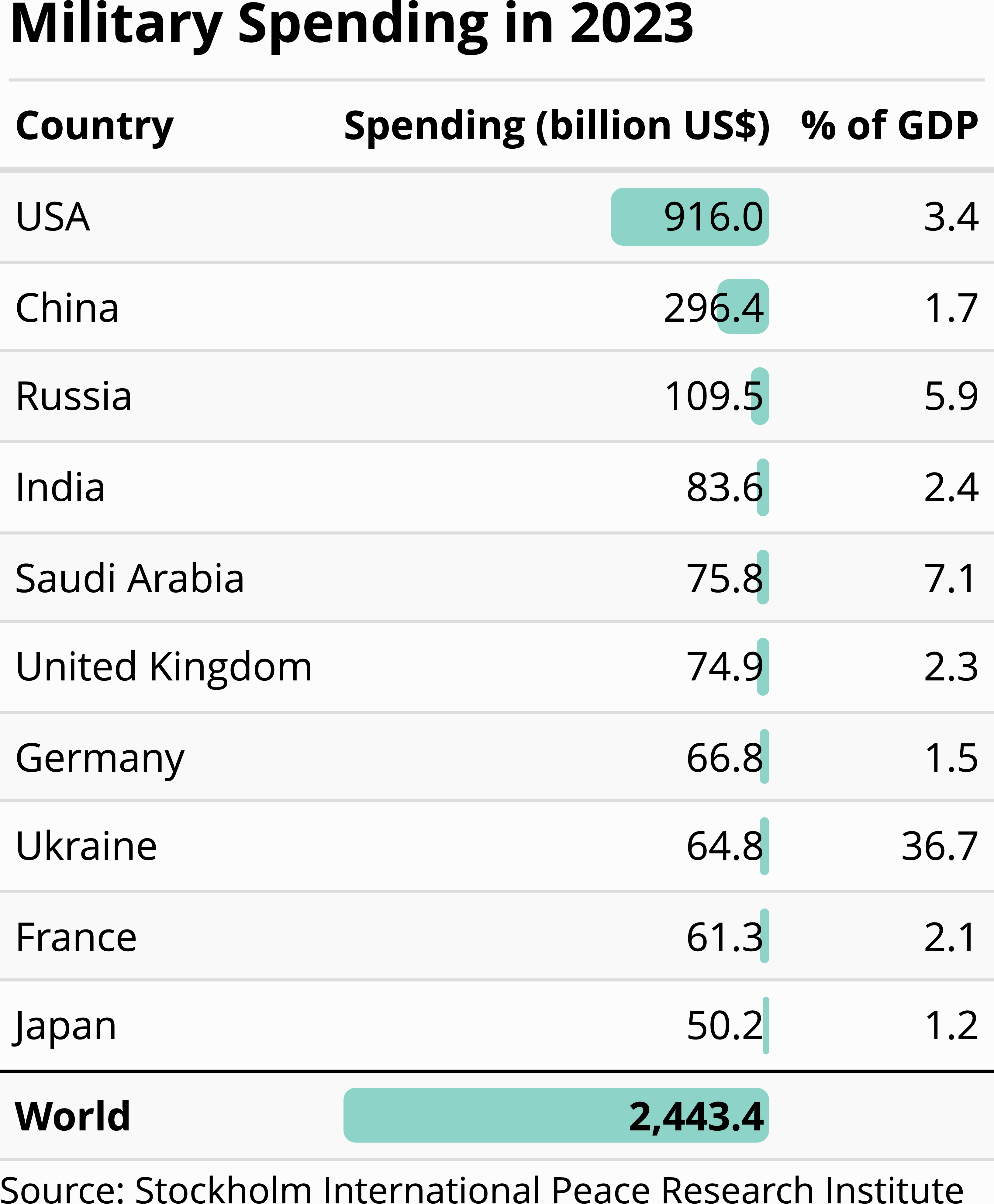
If you are new to data visualization, Figure 1.5 and Figure 1.6 might appear extremely plain. The only geometric features are rectangular bars, and all of them are in the same color. Would it not be more engaging for readers if we included more complex objects and a greater variety of colours? If you answered with yes, Figure 1.7 might be more to your taste. This figure was inspired by a similar figure in the Korea Herald (Chang-Duk, 2014), intended to visualize military spending by country in 2013. Instead of plain rectangular bars, Figure 1.7 represents each country by a missile. The bigger the missile, the higher the amount of military spending. In the top right corner, there are also other symbols of weapons systems (a plane, tank, soldier, helicopter, and a ship). These symbols clearly depict what the money is spent on; thus, the image arguably does its job from an artistic perspective.

However, artistic quality does not equate to successful communication. The missiles are lined up as in a bar chart, but, unlike the bars in a conventional bar chart, they have different widths. Thus, it is unclear whether the reader is supposed to compare the bullets on the basis of their heights, their surface areas or their volumes. The shades cast by the bullets emphasize the three-dimensional impression, but they do not add more information to the figure. The world map and the weapon symbols in the top right corner add even more clutter. The flags on the bullets add a splash of color, but they only duplicate information that is already implicit in the country names below each bullet. Moreover, it is confusing that the percentage values above the bullets refer to a different reference value (percent of national GDP) than the percentage value to the right of the world map (decrease compared to 2012).
Figure 1.8 shows an alternative visualization of the same data. The table looks admittedly less colorful, but its restrained design puts the data at the centre of the reader’s attention. We learn from this example that we should generally refrain from unnecessary ornamentation (e.g., variations in colour and three-dimensional effects). The goal of data visualization is to communicate data, not to impress the reader with artistic creativity.
1.3 Topics not included in this book
Technologies for data visualization are rapidly evolving and increasingly diverse. It would be impossible to cover every possible aspect of modern data visualization. Here are some topics that are not included in this book.
-
Interactive Graphics
Modern web technology enables designers to add a variety of interactive features to graphic displays. Some common effects found in web-based infographics are infotips (i.e., text boxes that reveal additional information when hovering over specific parts of the figure), morphing between different data sets and linked brushing (i.e., hovering over one part of a diagram highlights another, related part). If you are interested in interactive data visualization, I recommend that you have a look at the R packageshiny. -
Animations
Data sets that highlight changes over time (e.g., weather radar) are sometimes best shown as animations. The R packagegganimatecontains utilities for creating animations. -
Three-Dimensional Plots
Some data sets describe the relation of three continuous variables (e.g., weight, age, and cholesterol level). One can think of the observations as points in a three-dimensional space. Three-dimensional scatter plots can reveal patterns in the data, especially if the coordinate axes can be interactively rotated. There are several R packages that can produce interactive three-dimensional scatter plots (e.g.,plotlyorrgl).
Interactivity, animations and three-dimensional plots can enrich the user experience. However, beginners tend to be carried away by their possibilities; thus, I suggest that you first become a responsible producer of non-interactive, static and two-dimensional graphics before adding more tools to your tool kit.
To develop a basic set of tools, the content of this book is generally leaning towards hands-on instructions. Consequently, it does not touch on statistical theory. However, I recommend that you start developing a solid theoretical foundation by taking a statistics course if you have not done it yet. This book also omits the theory behind computer programming and algorithms. In R, the complexity of the algorithms tends to be hidden behind high-level function calls. This property makes R suitable for beginners. However, to reach a higher level of proficiency, I suggest that you take an introductory computer science course as one of the next steps in your learning trajectory.